Type Design Intermediate Workshop / 2022
For the past eight years, the Type Design Workshop has been a home to summer courses for graphic designers. This year, we introduced a next level version, the TDW Intermediate, inviting our alumni to join us first, followed by opening the doors to the public.
During the course, students polished their typeface projects, exploring the nuances of developing typeface families, Italics, extending language support, and character sets. They were also exposed to the engineering aspects of typeface design, including hinting and mastering. Our guest speakers: Anya Khorash, Krista Radoeva, Slava Kirilenko, Lena Novoselova, Tasya Petelina shared the industry secrets and process shortcuts with the students.
As always, the fall-winter intensive passed in a blink of an eye. We are immensely proud of our students and look forward to watching them flourish with their newfound skills.
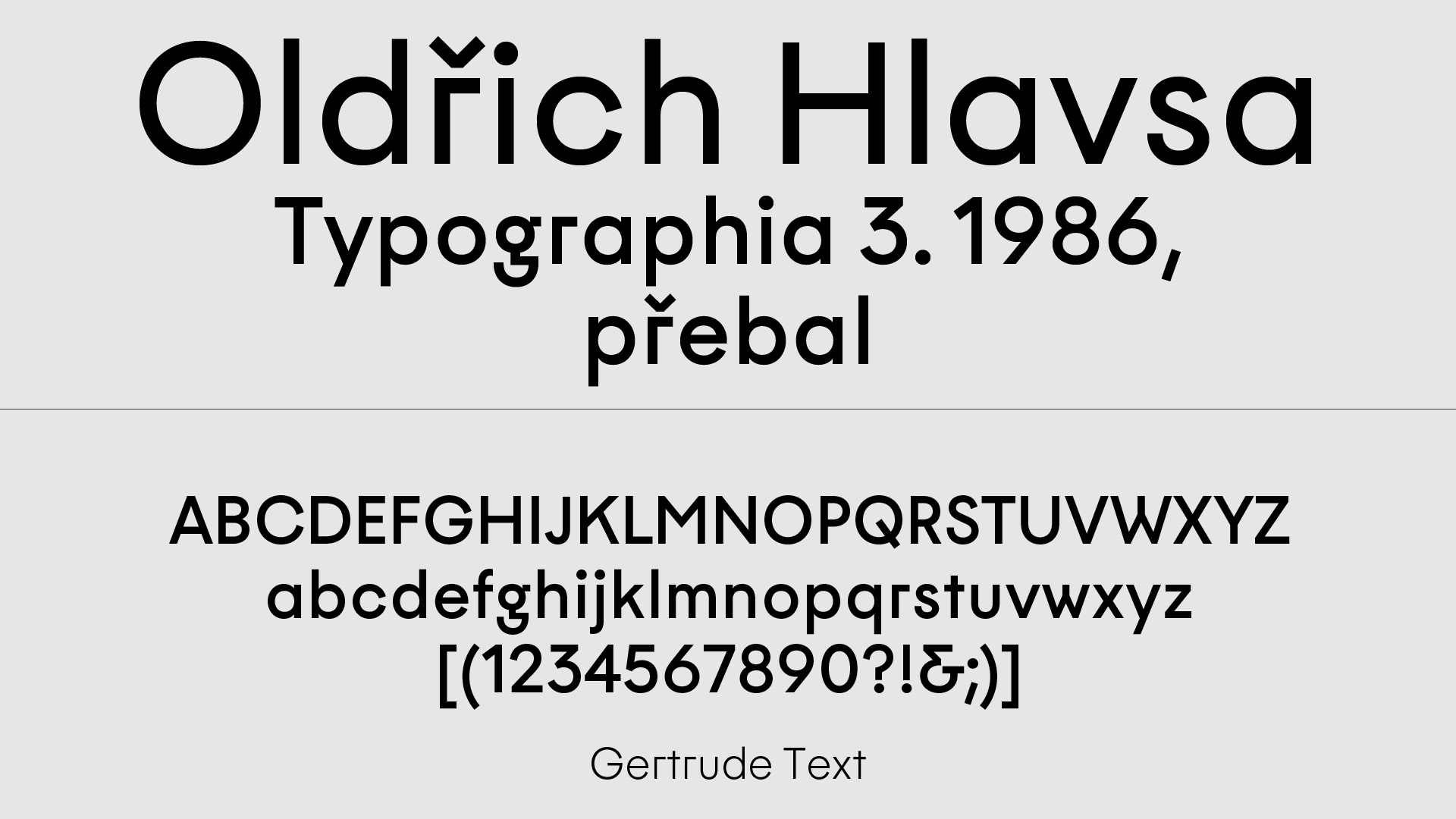
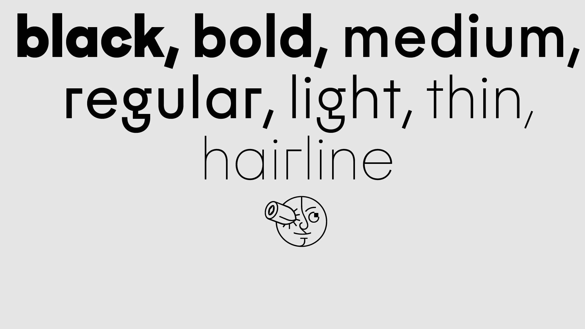
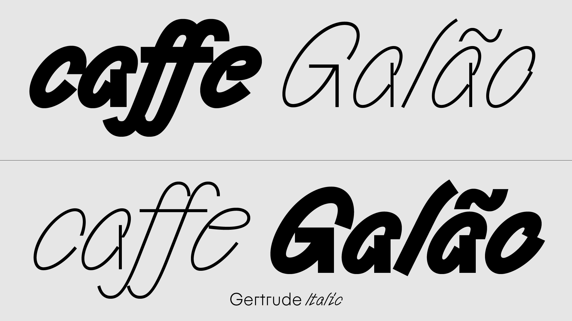
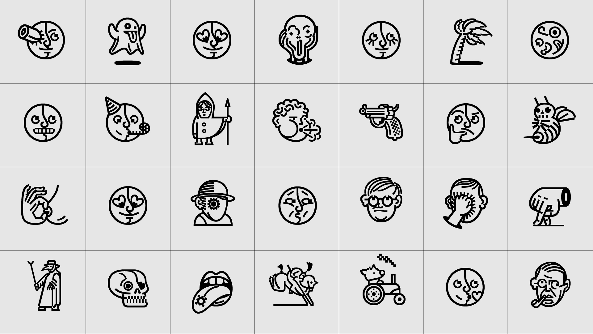
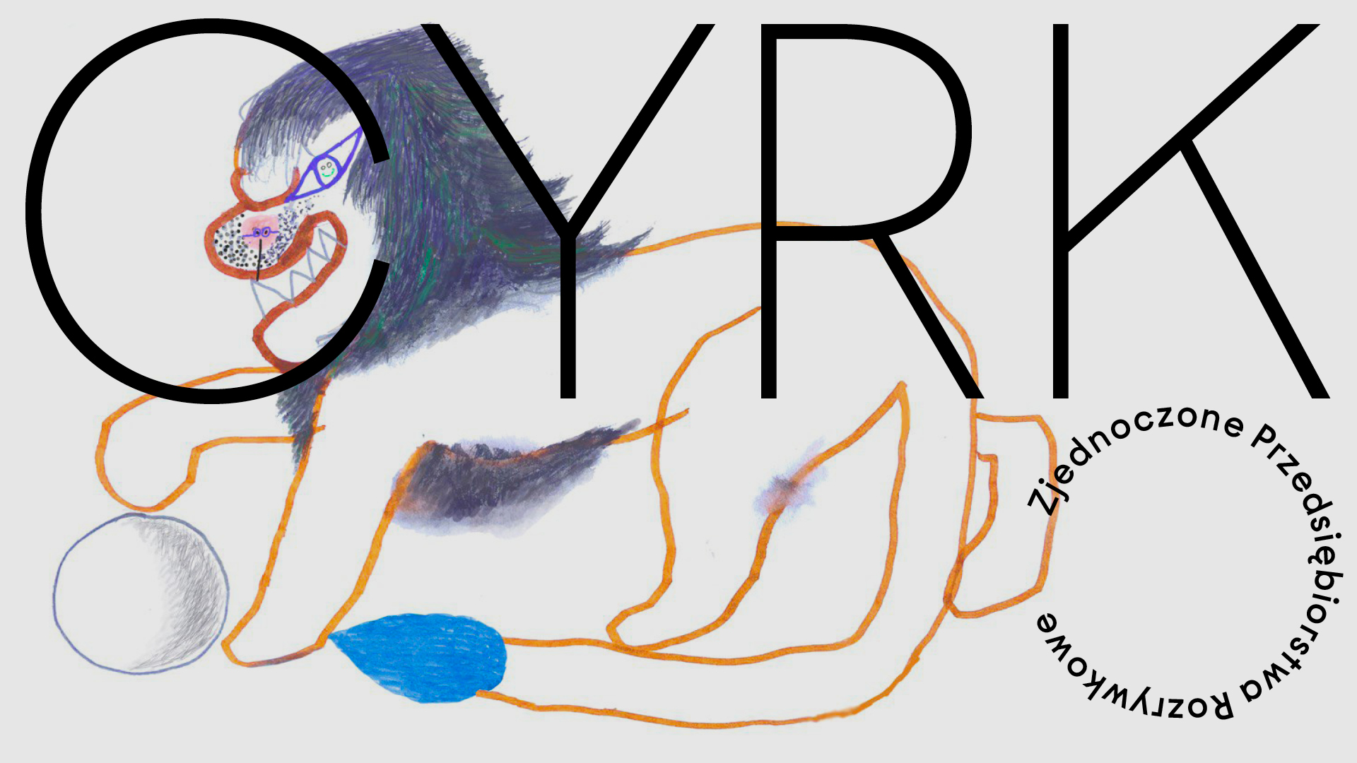
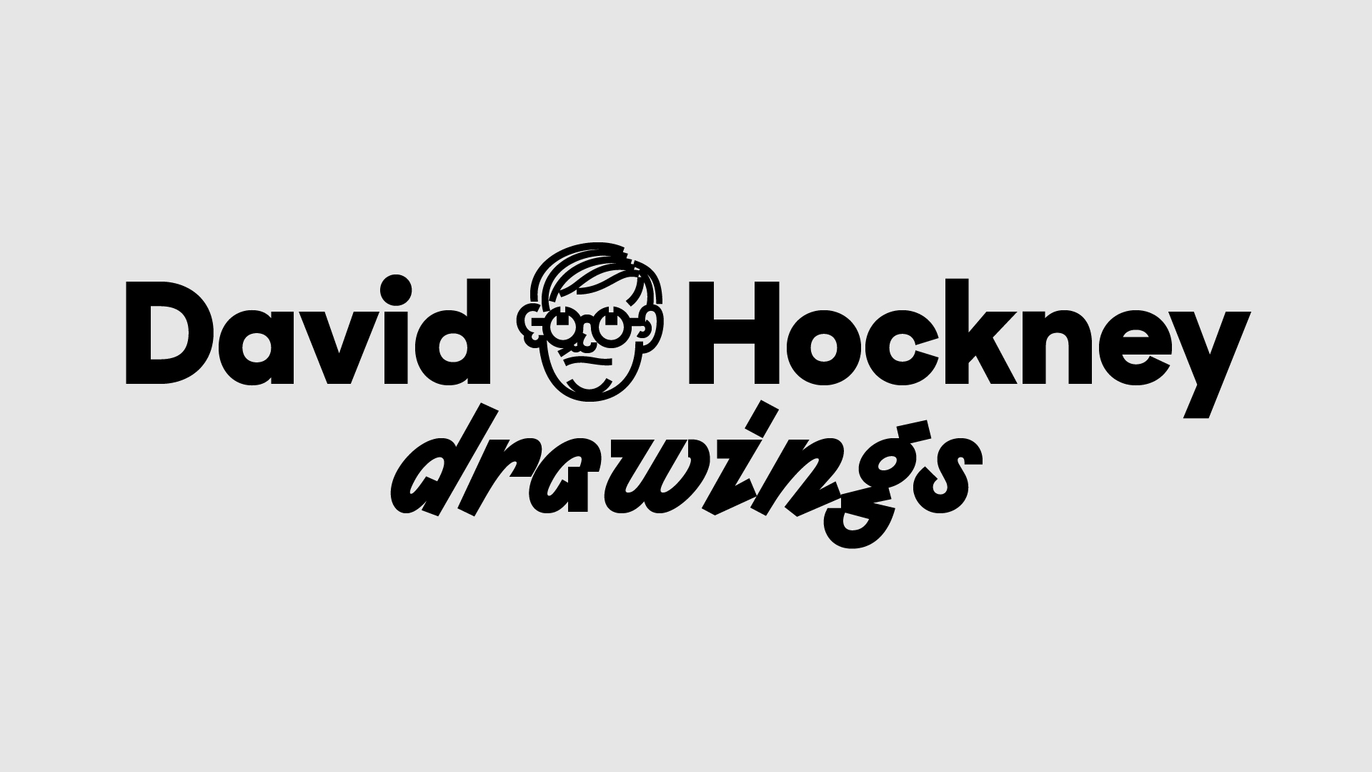
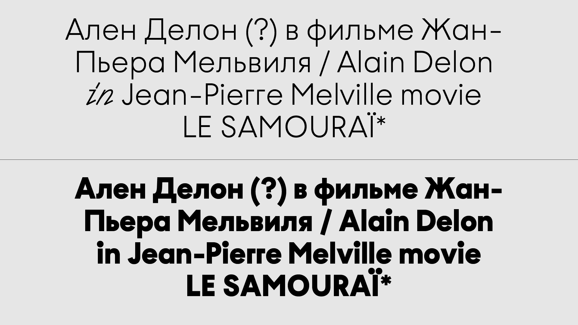
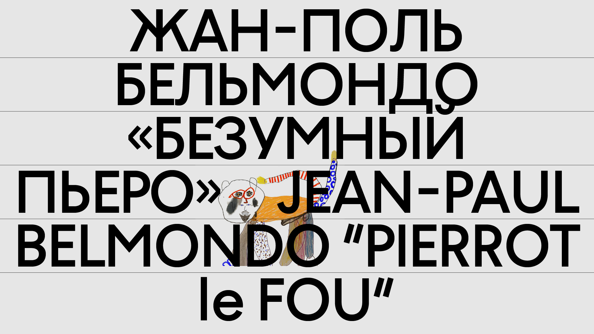
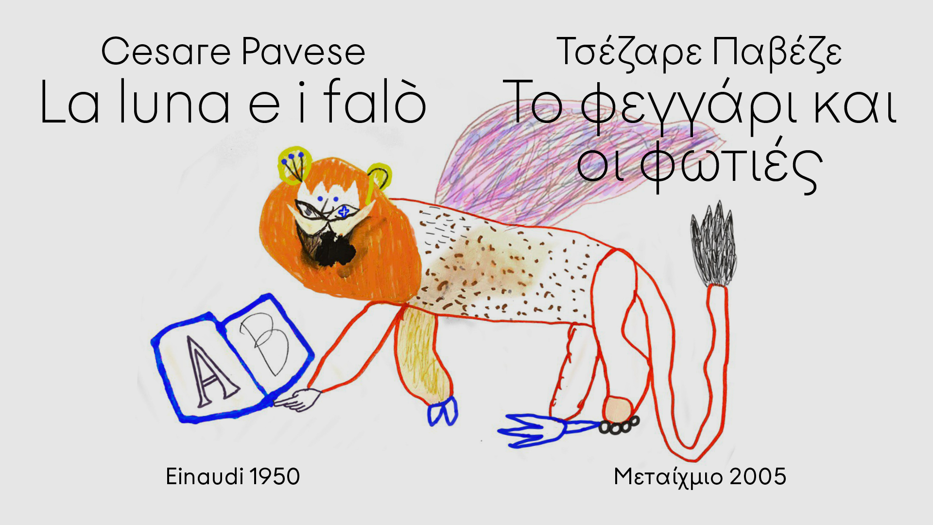
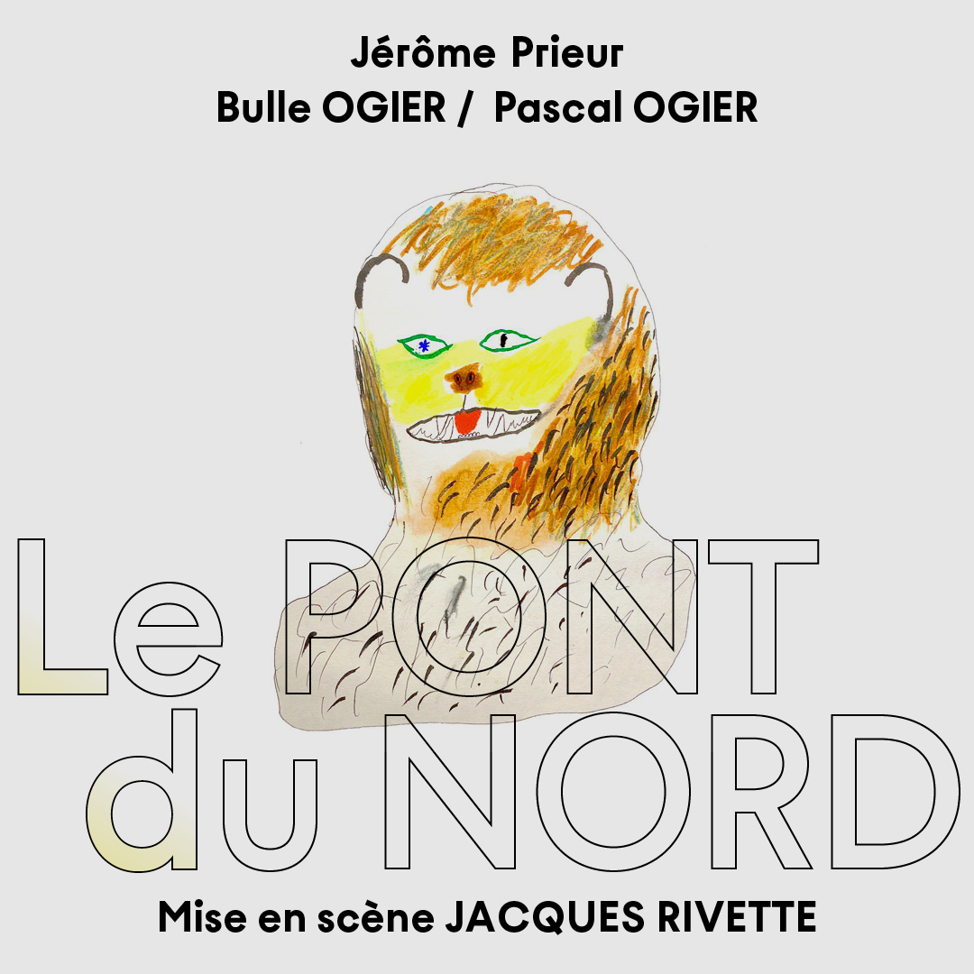
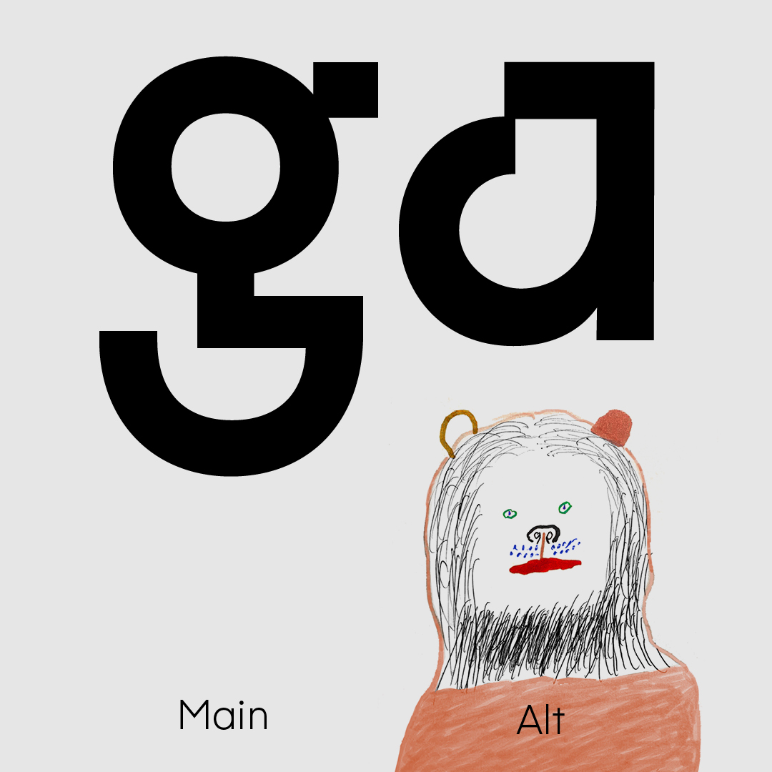
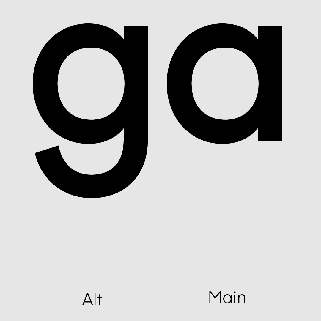
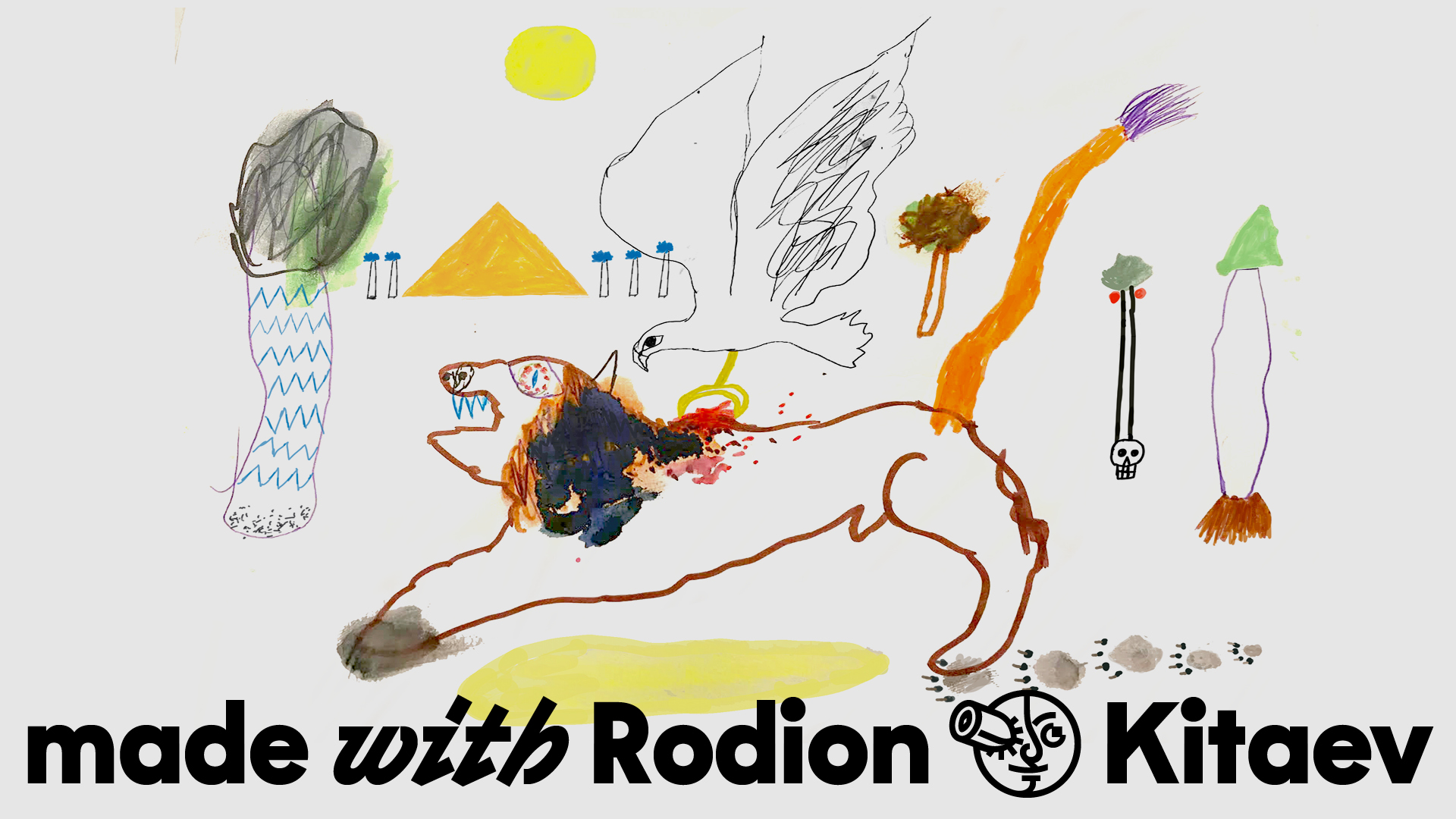
Gertrude is a very controversial typeface, formally and meaningfully. The typeface is an absurd interpretation of Futura. Geometry and plasticity of the letterforms, in a modernist way, are devoided from decorations and other impractical excesses: only straight lines and neat curves. The first half of the 20th century was in dire need of order. Through this seeming regularity, the unbridledness and inconsistency break through—that we now validated by the second half of the 20th century. At this point, Gertrude ceases to converge—crackles, crunches, grinds—that leans, and turns into Italic. Uncomfortable irrational plots emerge through the embossed strokes, disturbing with their inexplicability: three Jean-Pauls, а cherub, a pig from a children’s story, a scream from a canvas by a Norwegian artist, and the benevolent Stephen Hockney.

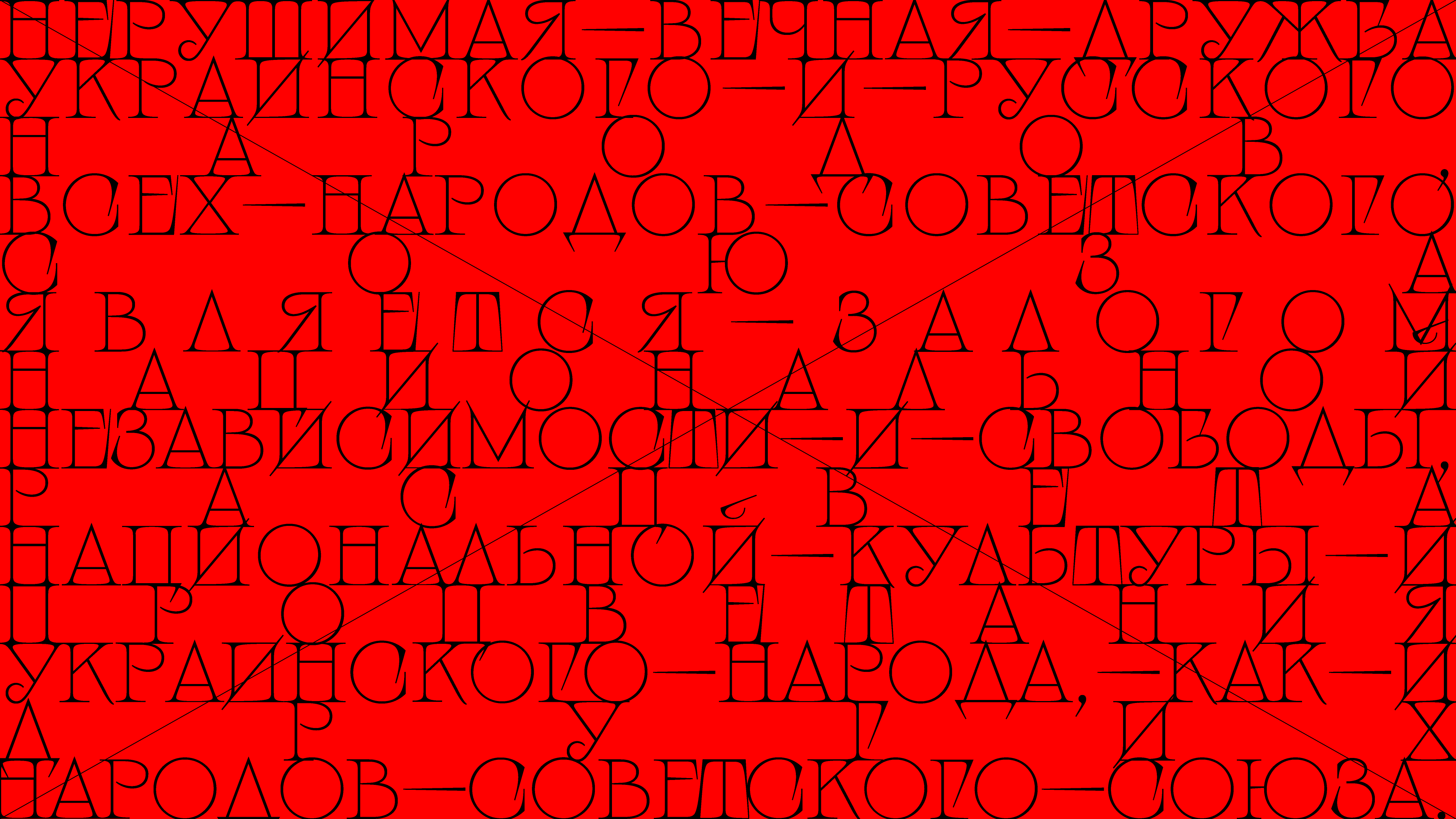
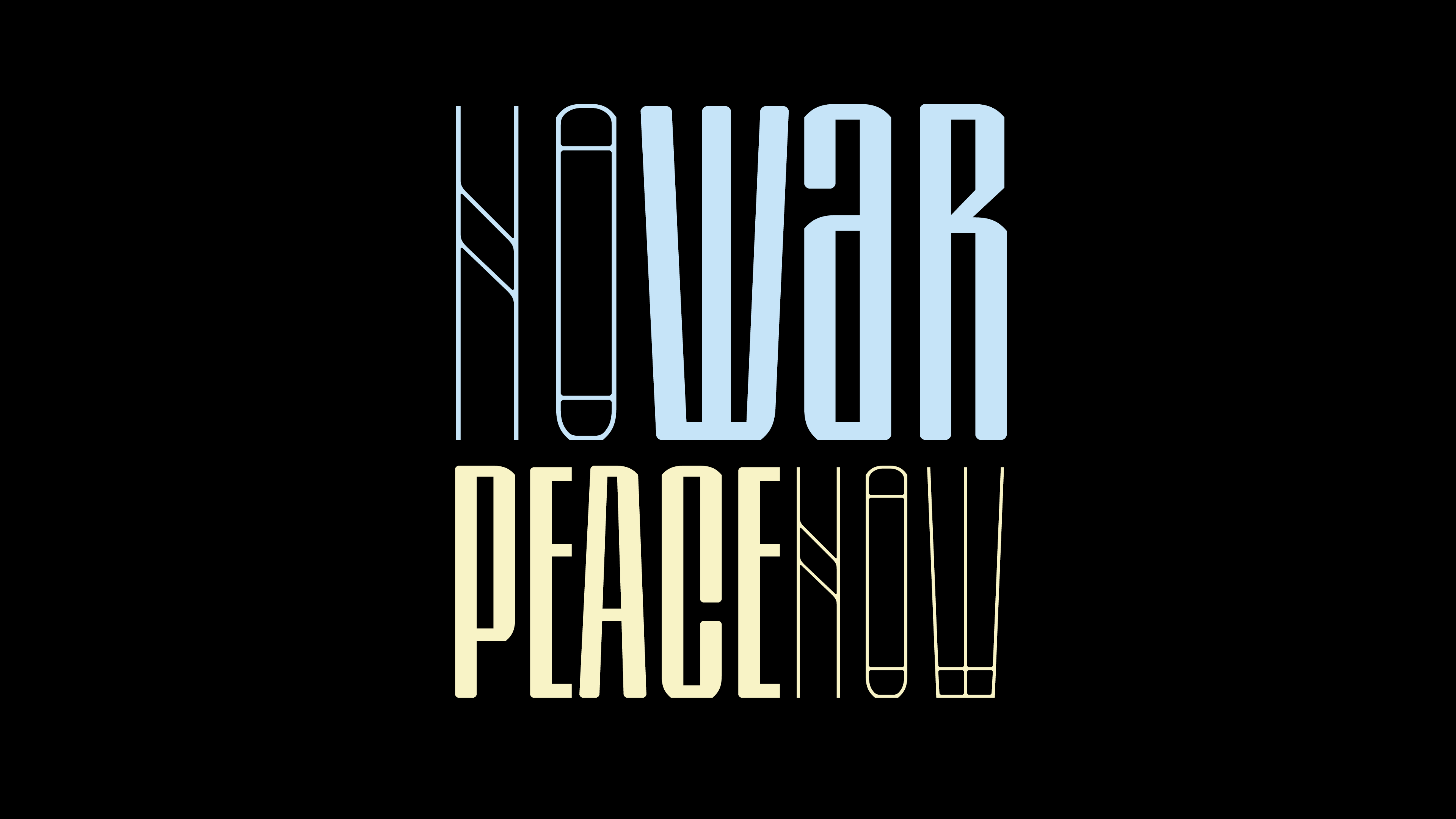
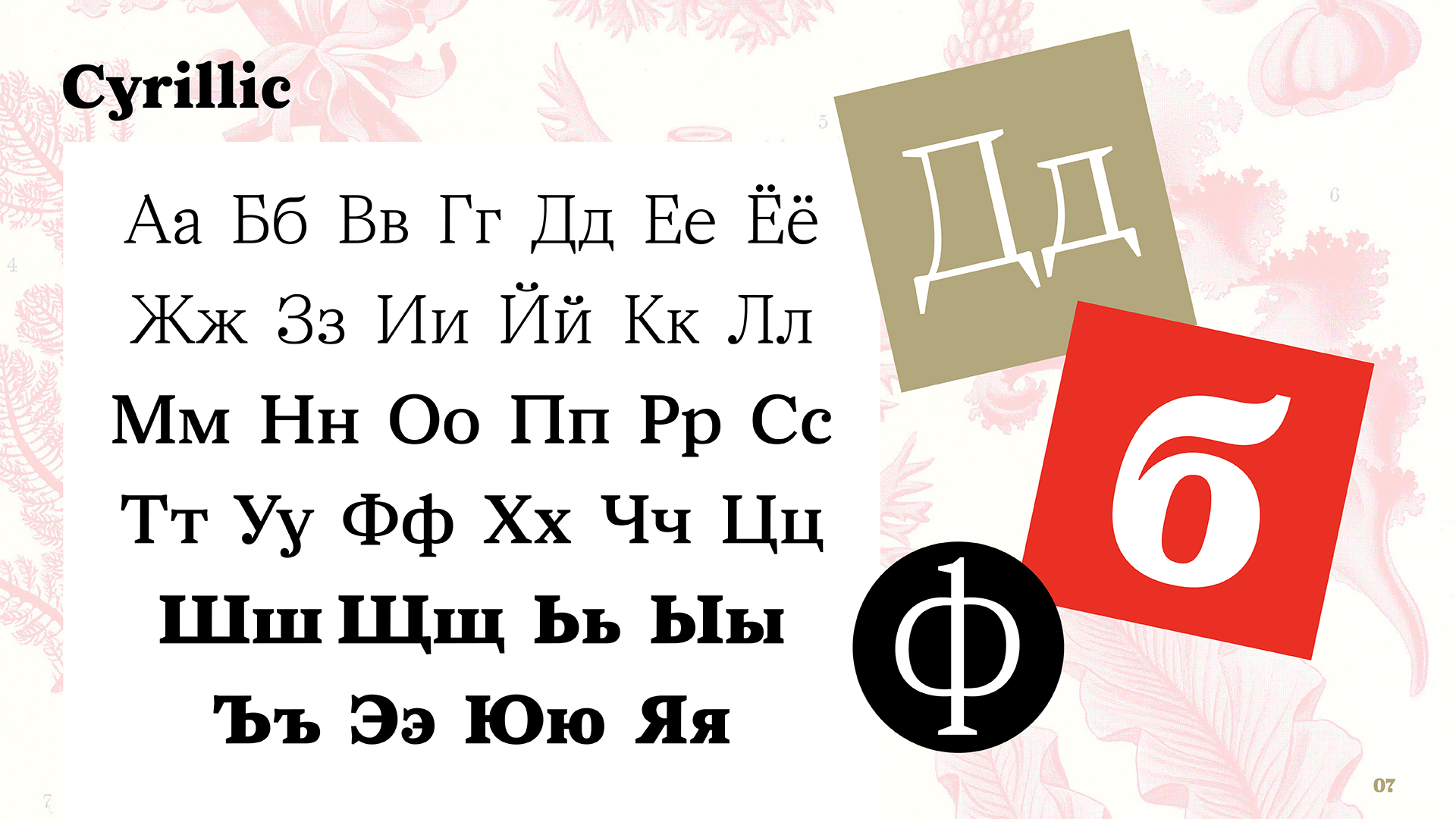
In February 2022, amidst shelling in Kyiv, a sign about the friendship between the Russian and Ukrainian people still hung in Moscow’s Kyivskaya metro station. The variable typeface Angst is an interpretation of the letters on this sign. Initially, I only redrawn the original inscription but ended up creating six basic variations and two axes of variability. The typeface includes extended Latin and Cyrillic sets, and I plan to develop it further.
The typeface is free and available on my website, and updates can be found on my Instagram account.
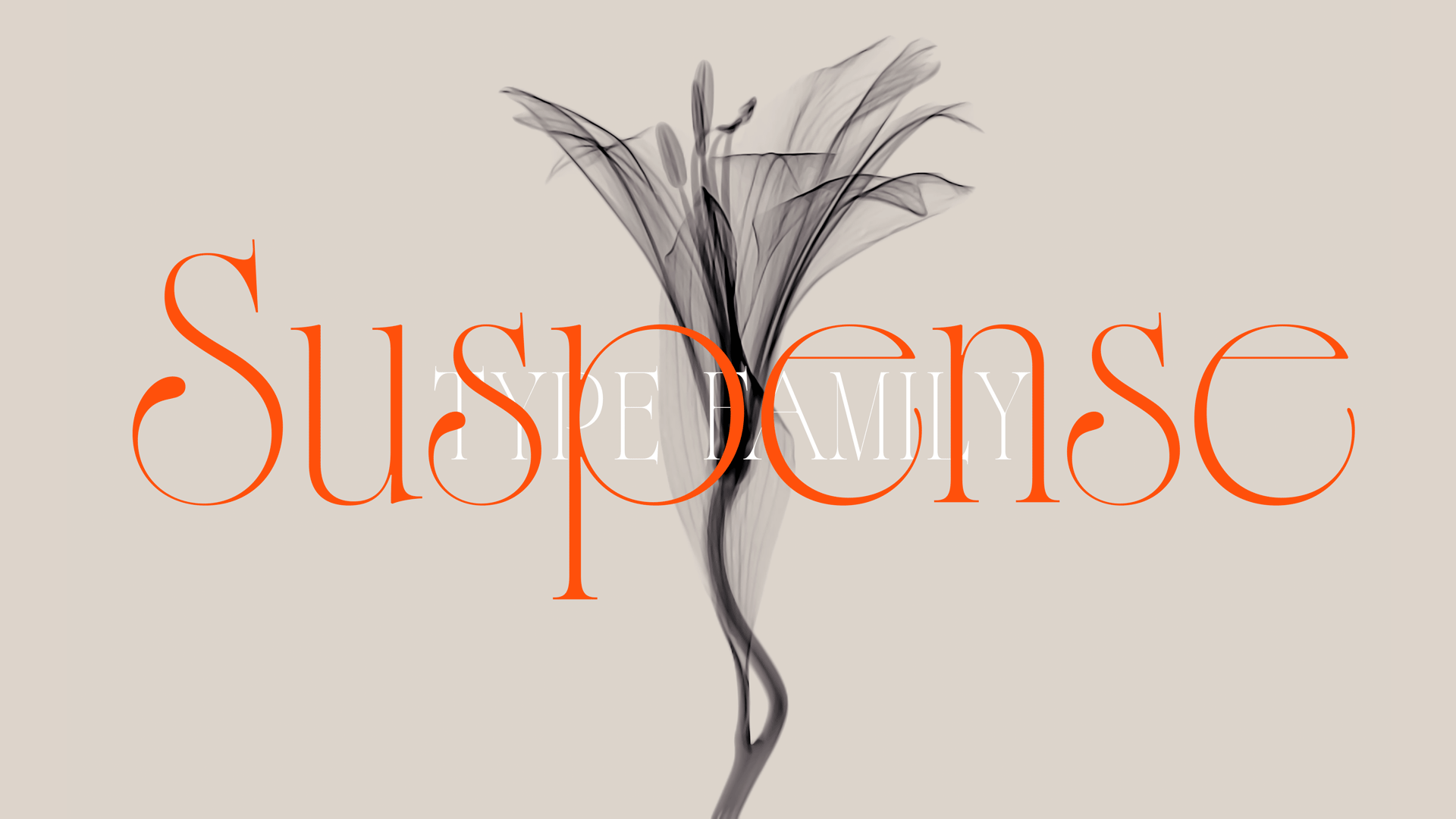
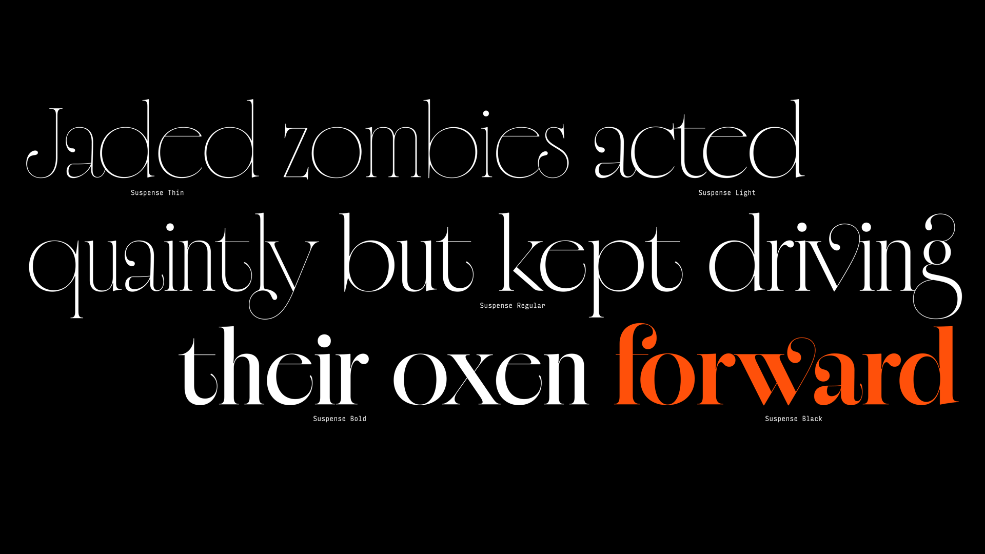
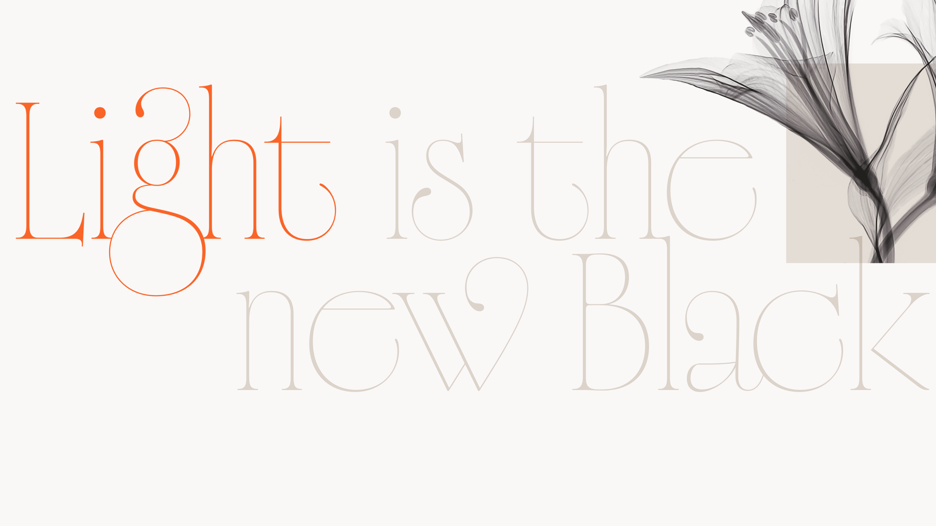
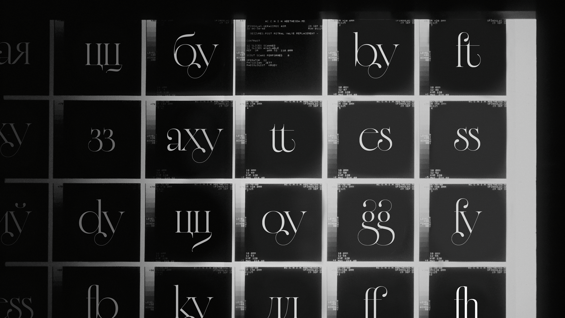
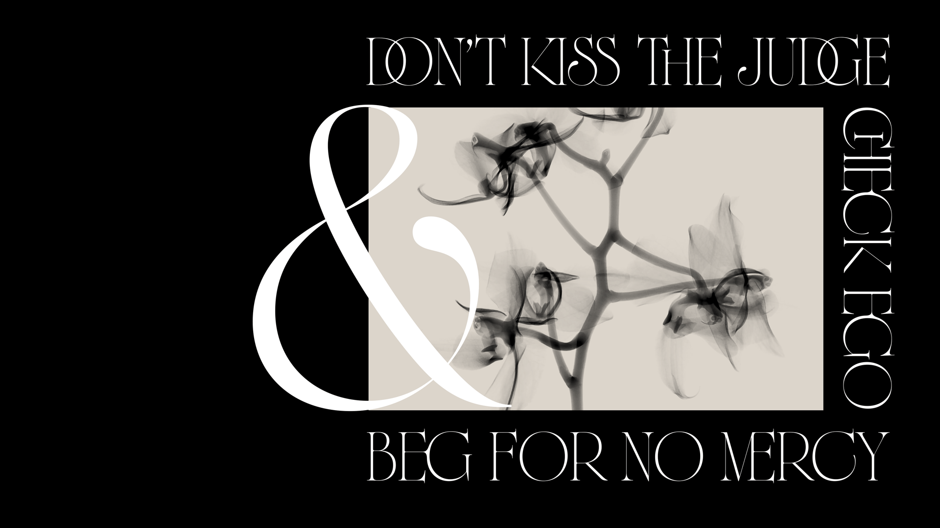
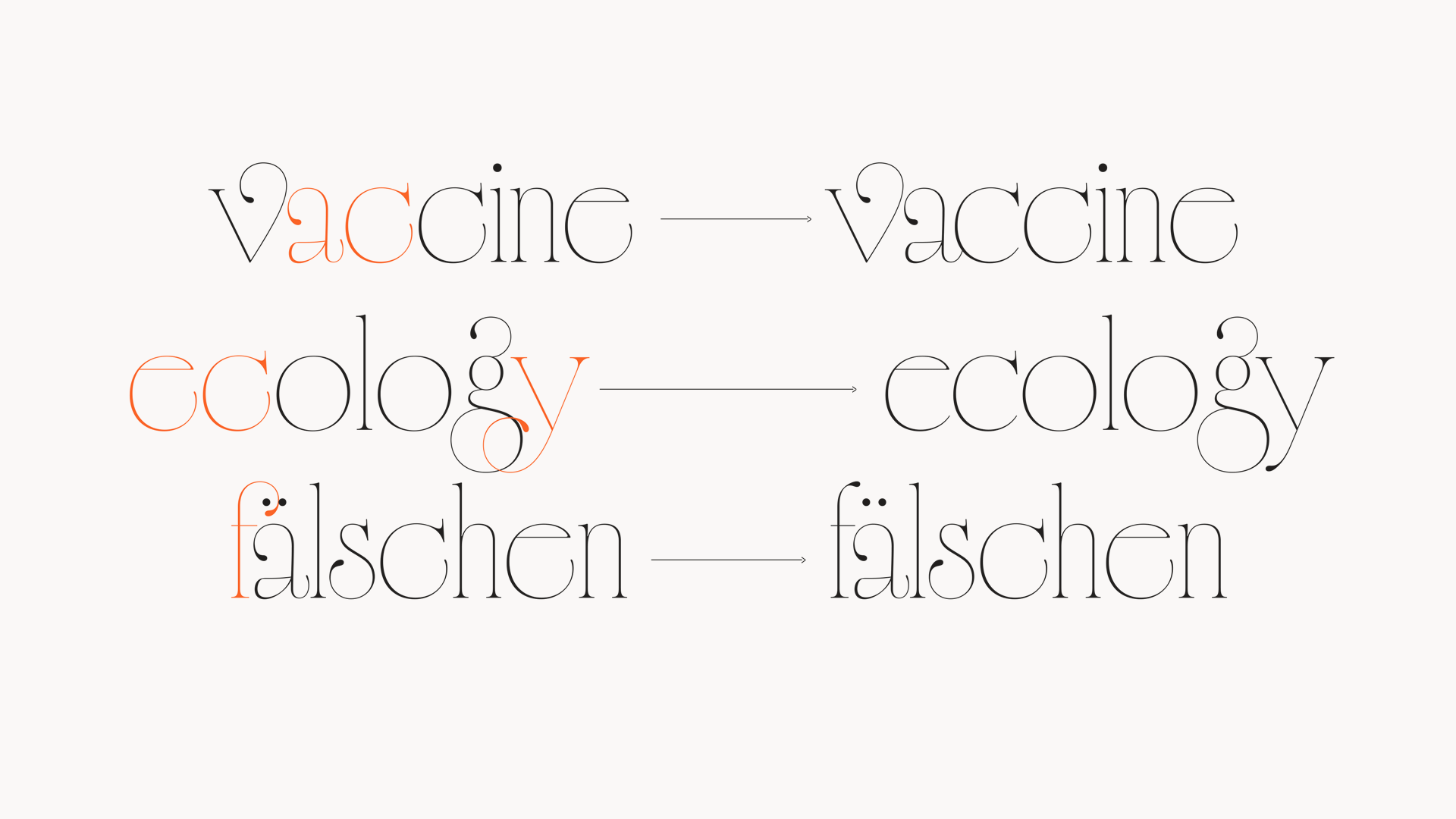
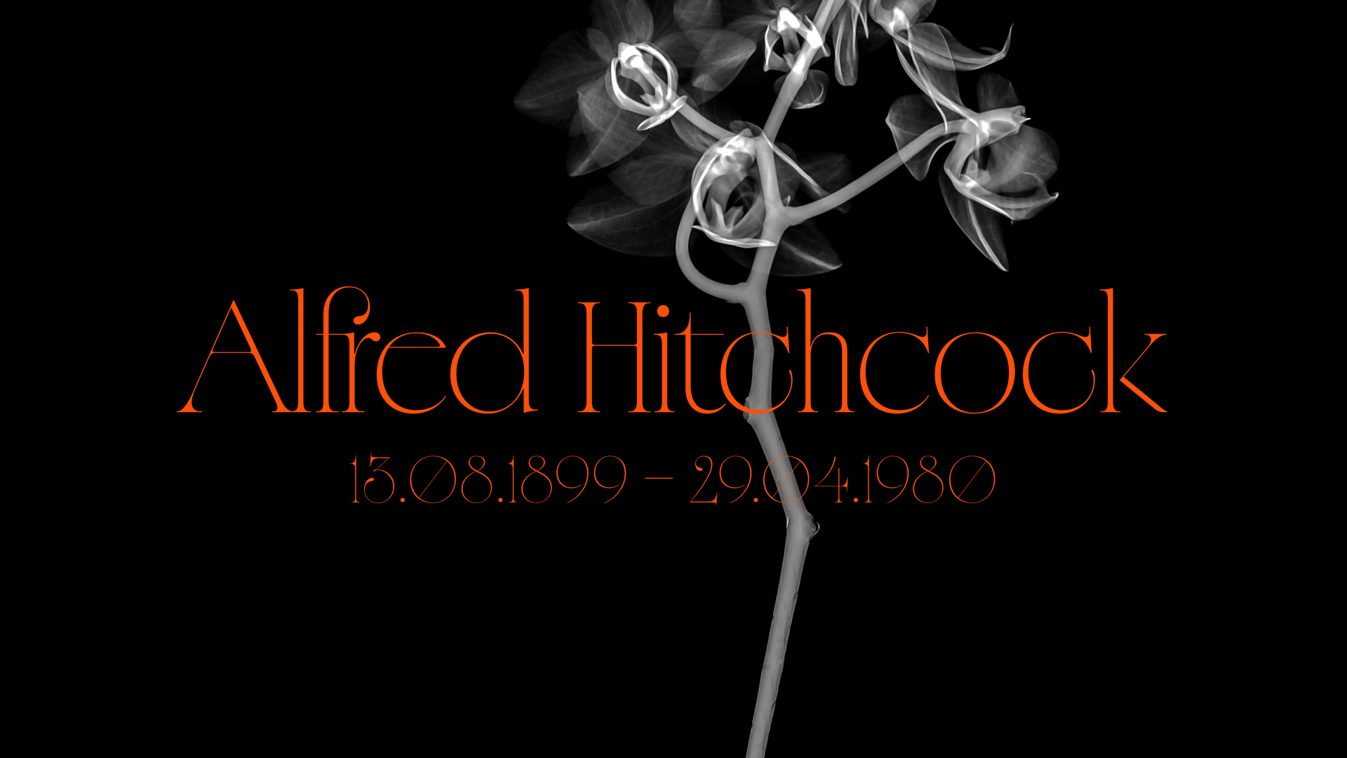
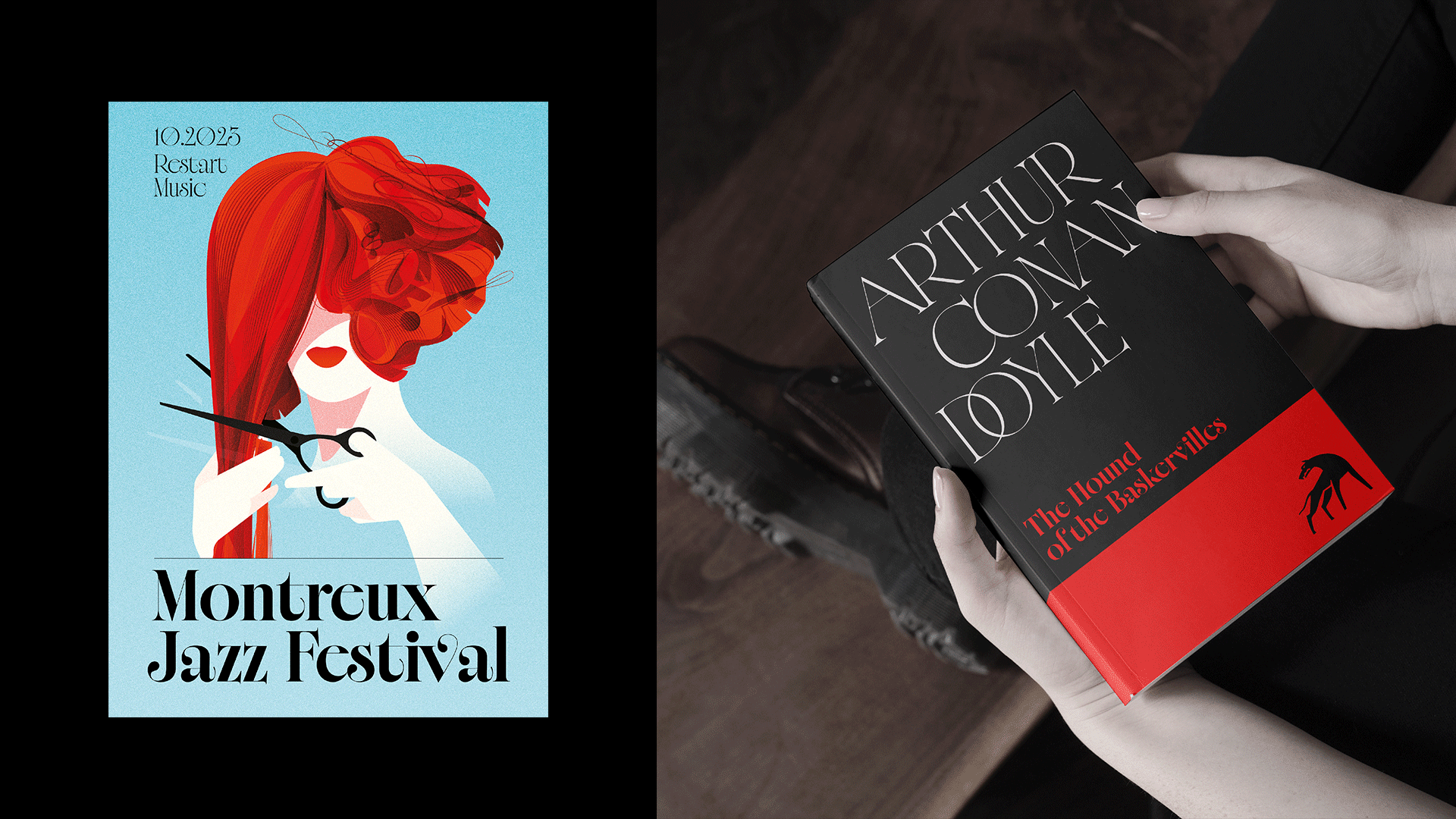
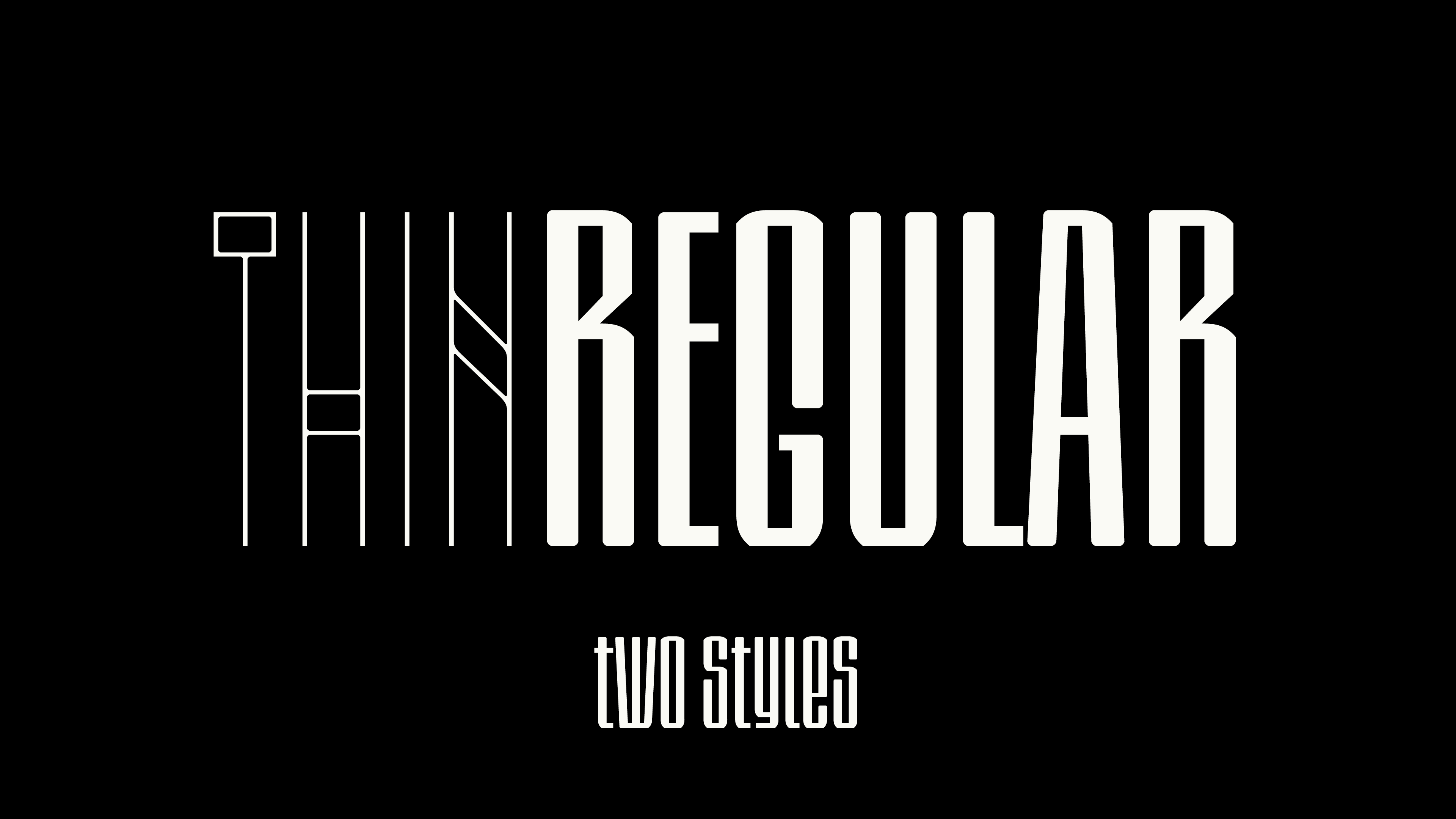
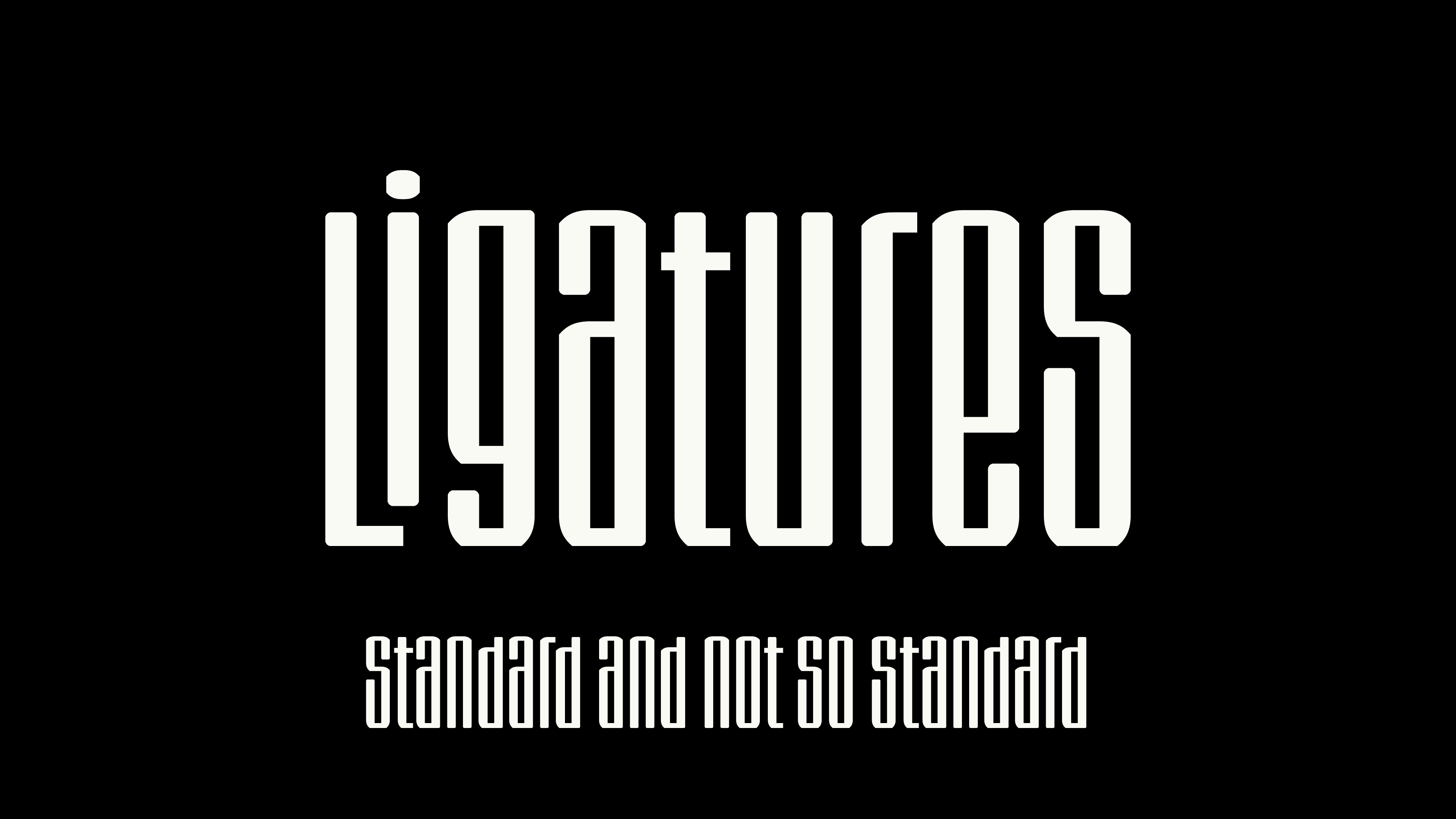
Suspense began as an exploration of non-obvious proportions in lowercase, inspired by the titles of the classic Western film “Wagon Tracks” (1919). Serifs, descenders, ascenders, and ligatures evoke a polyphony of associations—elegance, mystique, and the atmosphere of gothic stories and classic mystery novels. I see Suspense as an expressive display serif with a distinct character suitable for a variety of tasks.
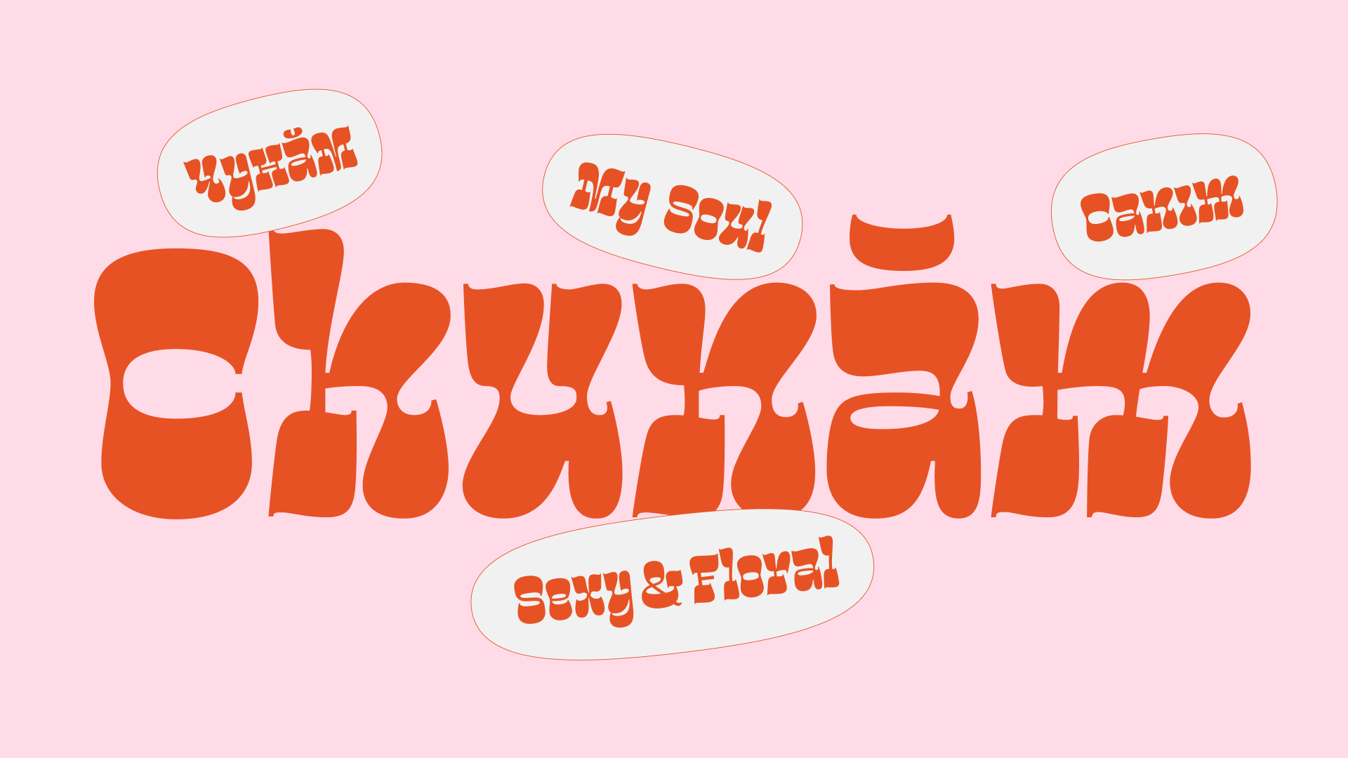
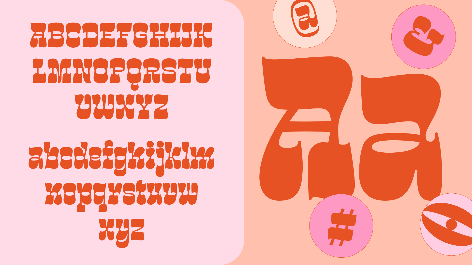
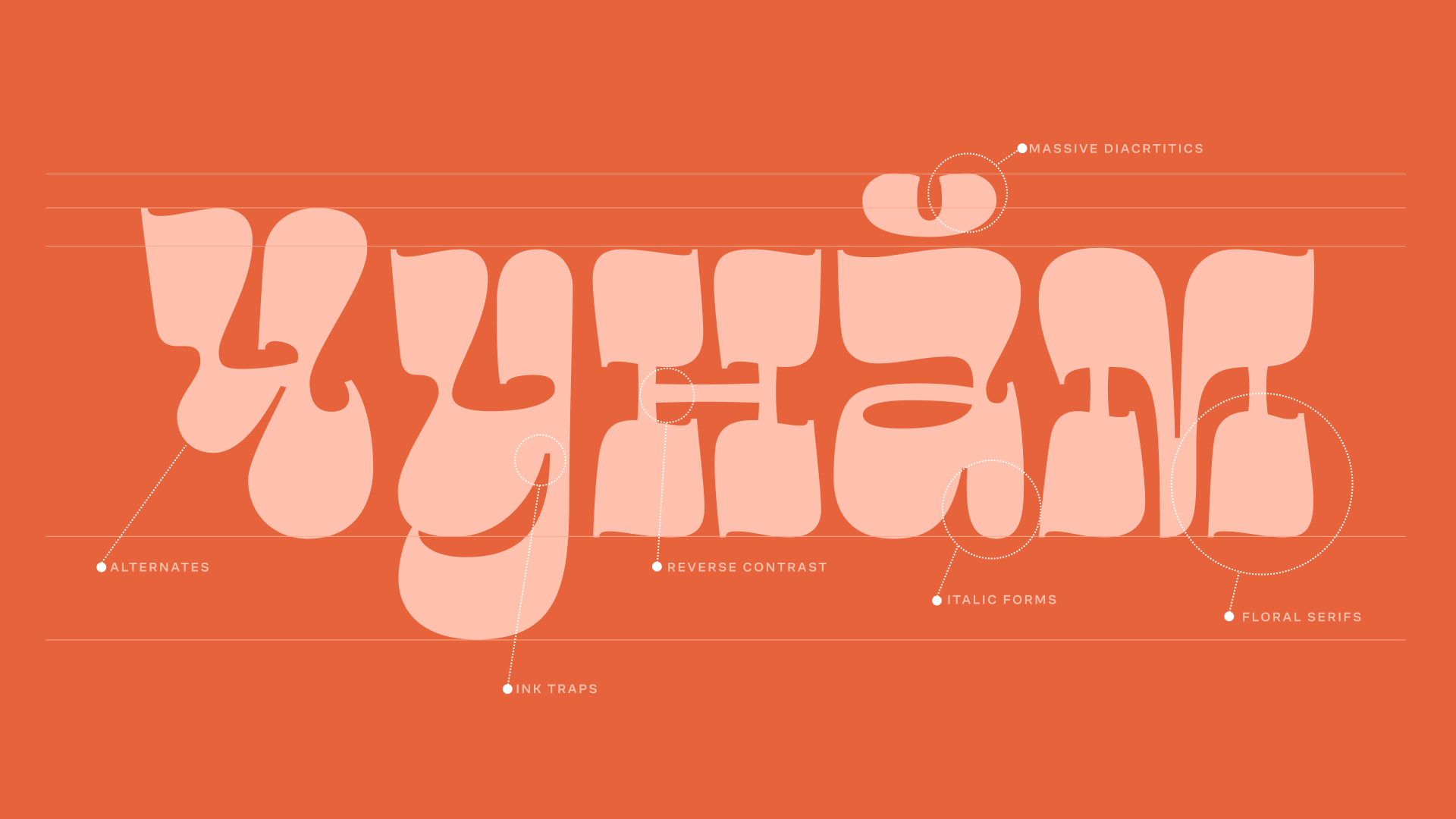
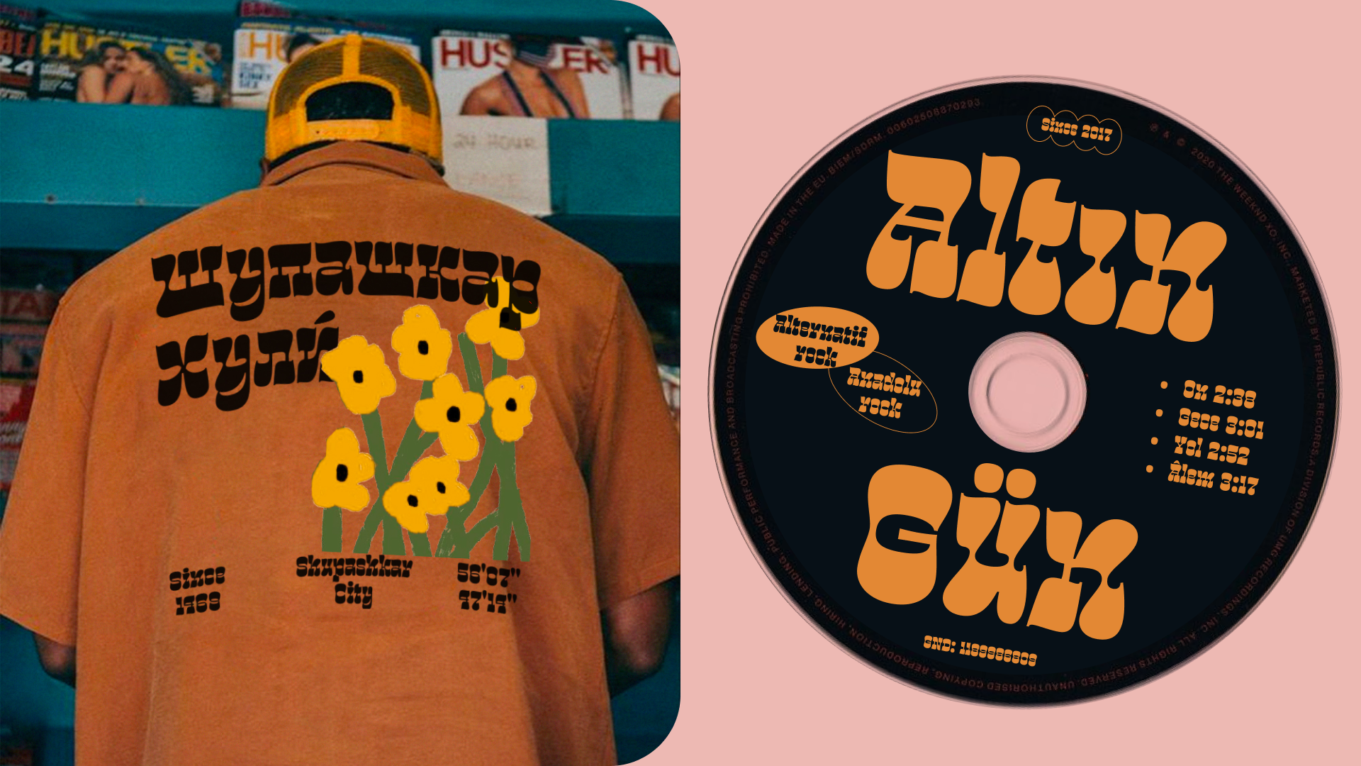
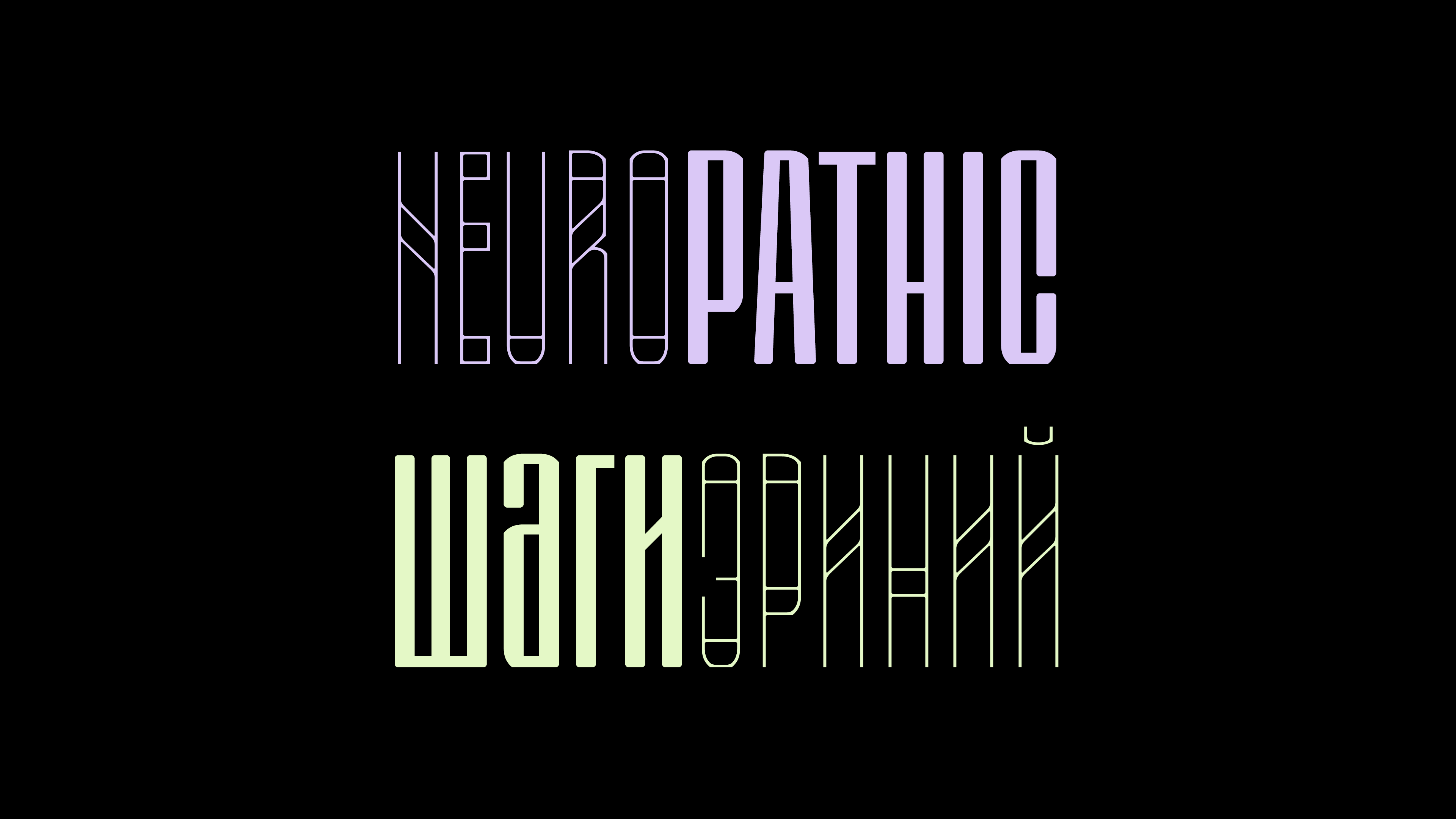
Chunăm is a display typeface inspired by lettering created for a Chuvash language camp. It features a reverse contrast and Italic elements and aims to explore the role of diacritics in defining the image of Turkic languages. I encountered many challenges in creating this typeface, particularly in working with the widths and contrast to achieve the desired rhythm and feel. The meditative process of working with black and white in the letterforms was both fascinating and challenging, but the result is a typeface that captures the essence of Turkic languages and their unique diacritic marks.
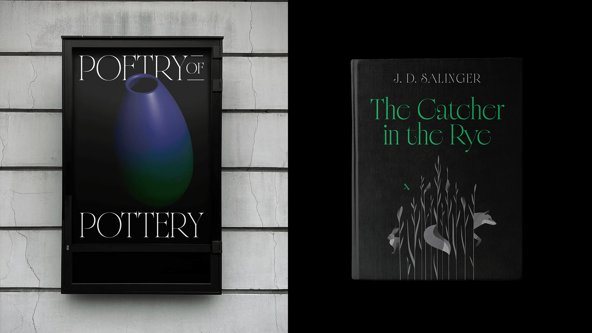
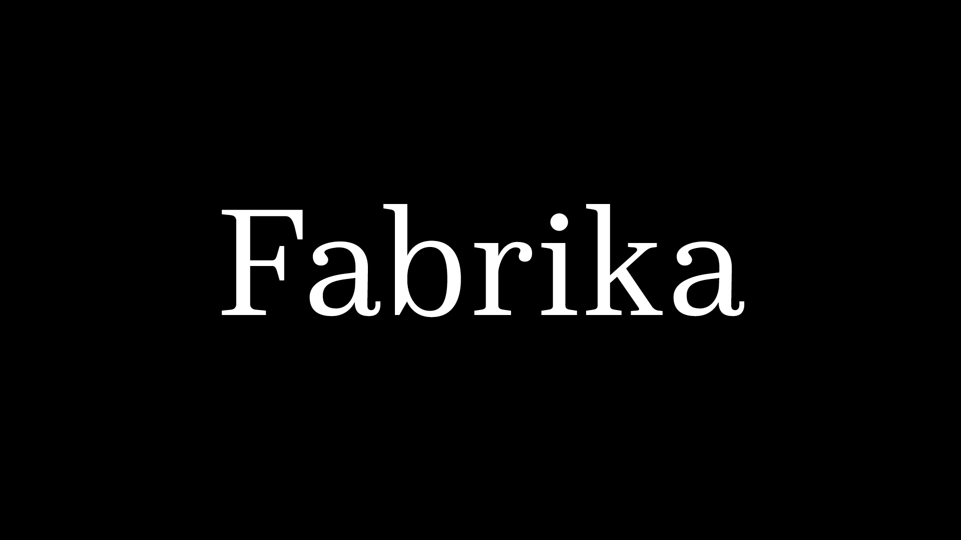
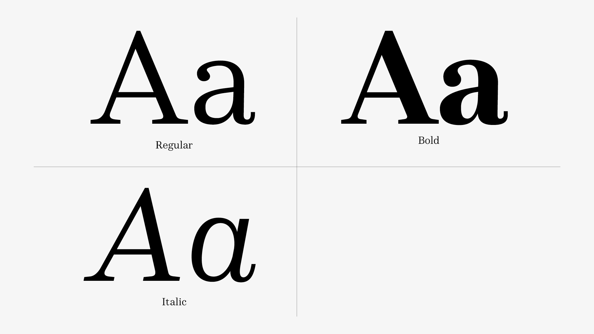
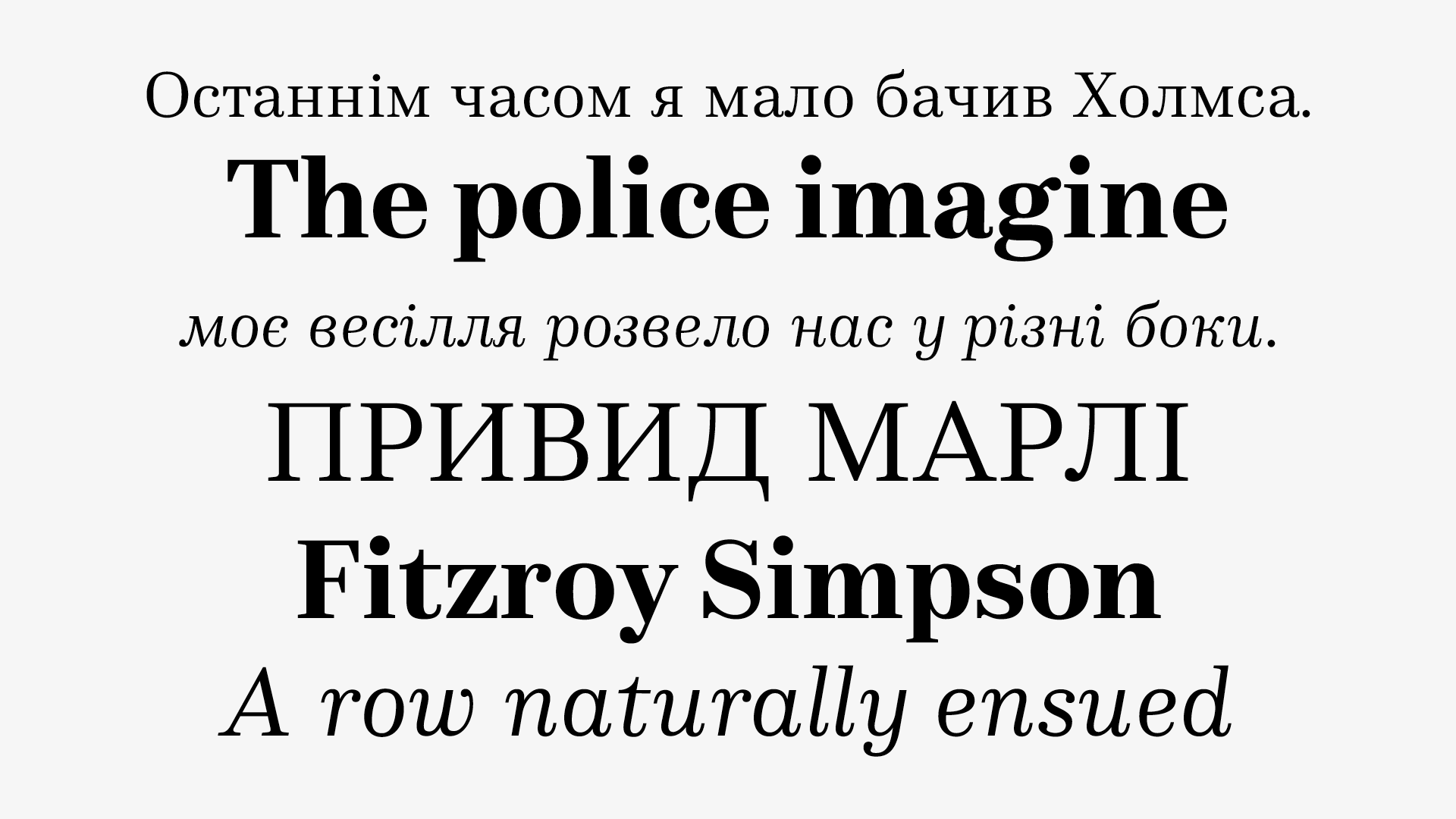
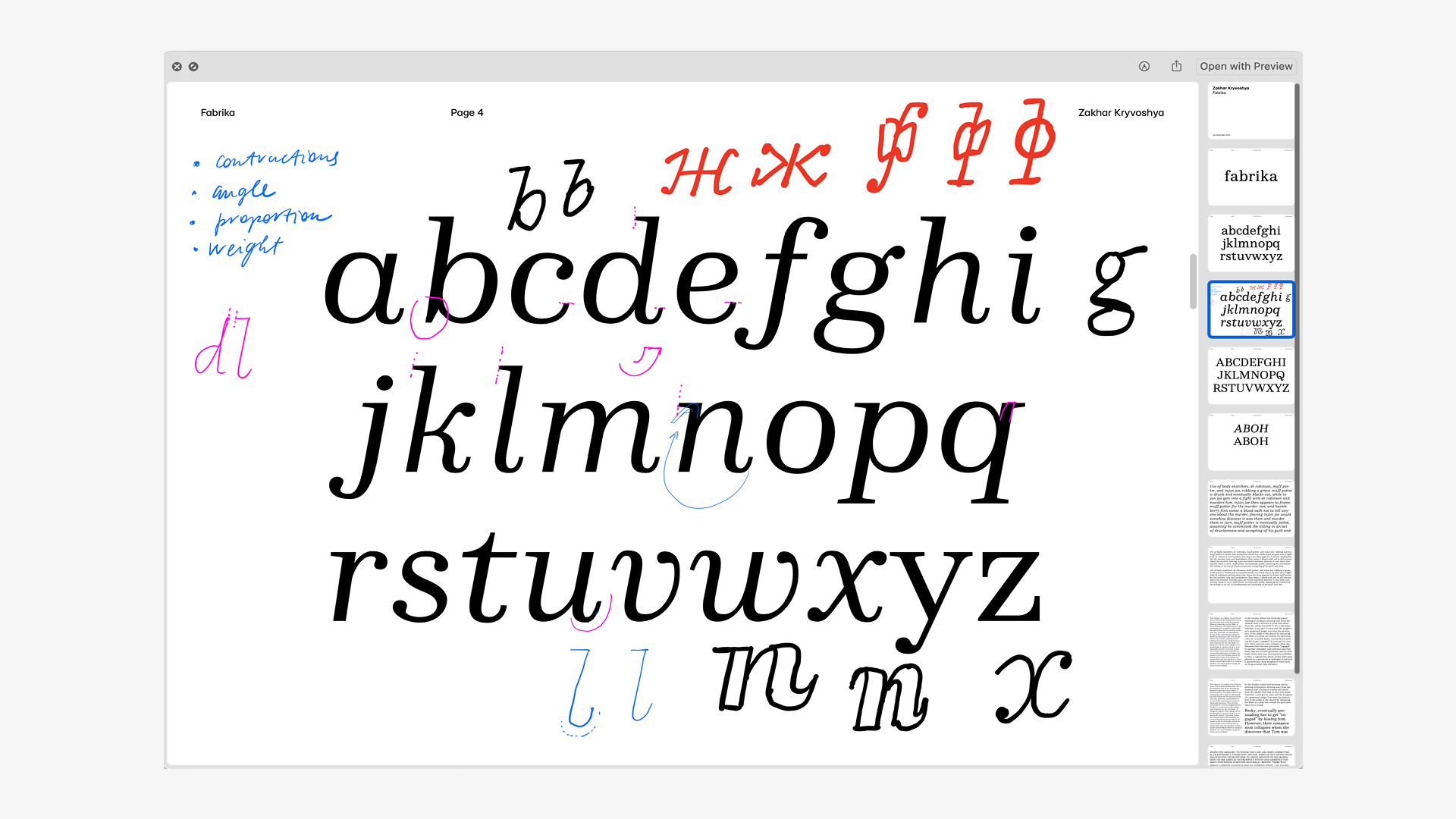
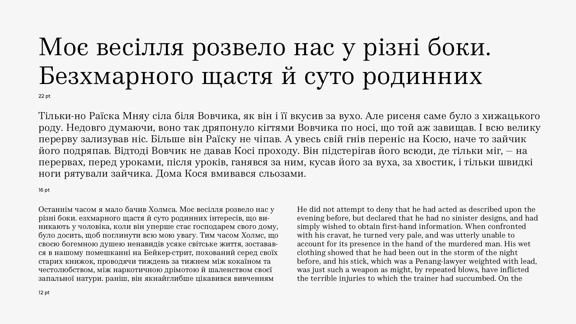
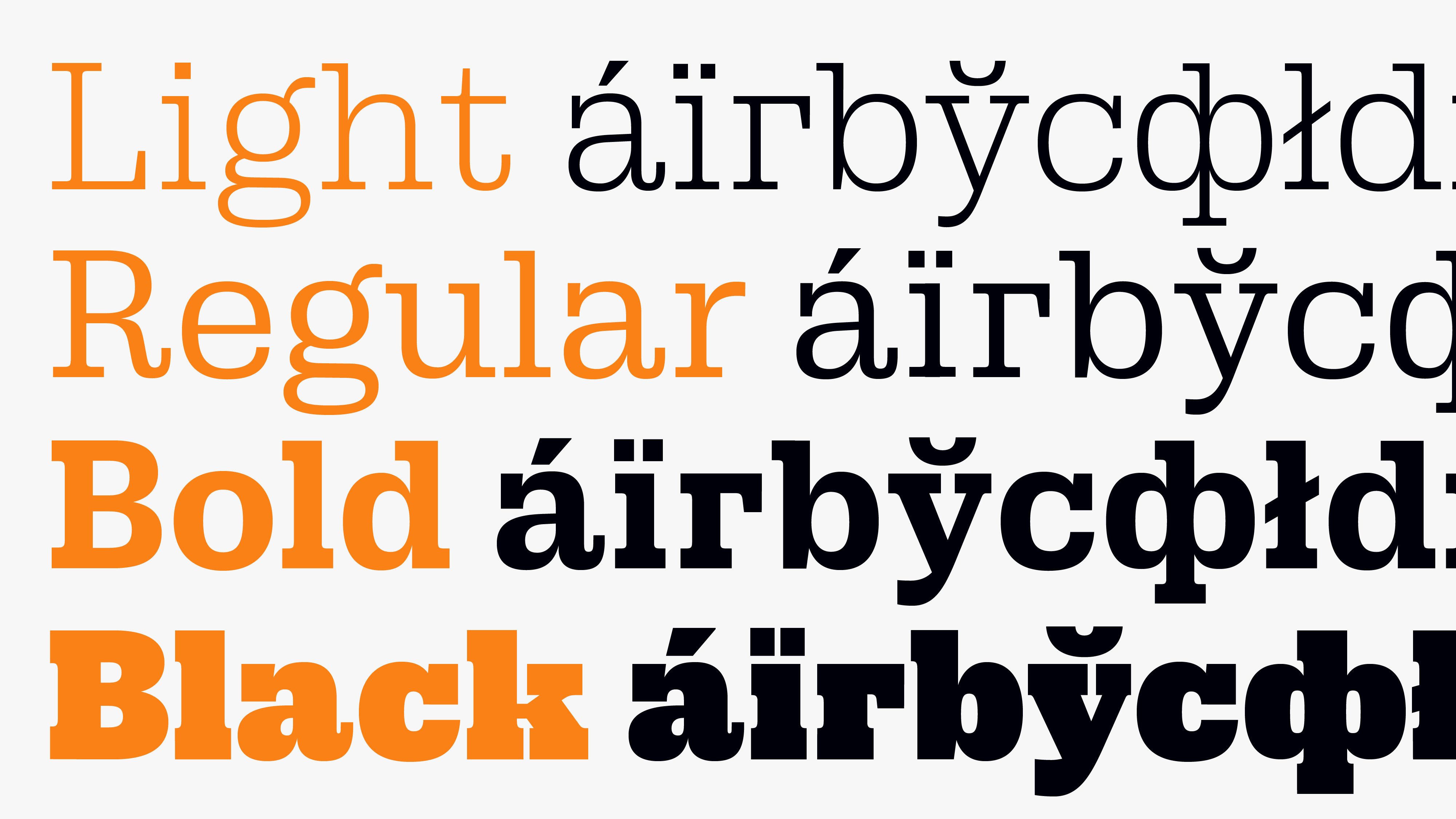
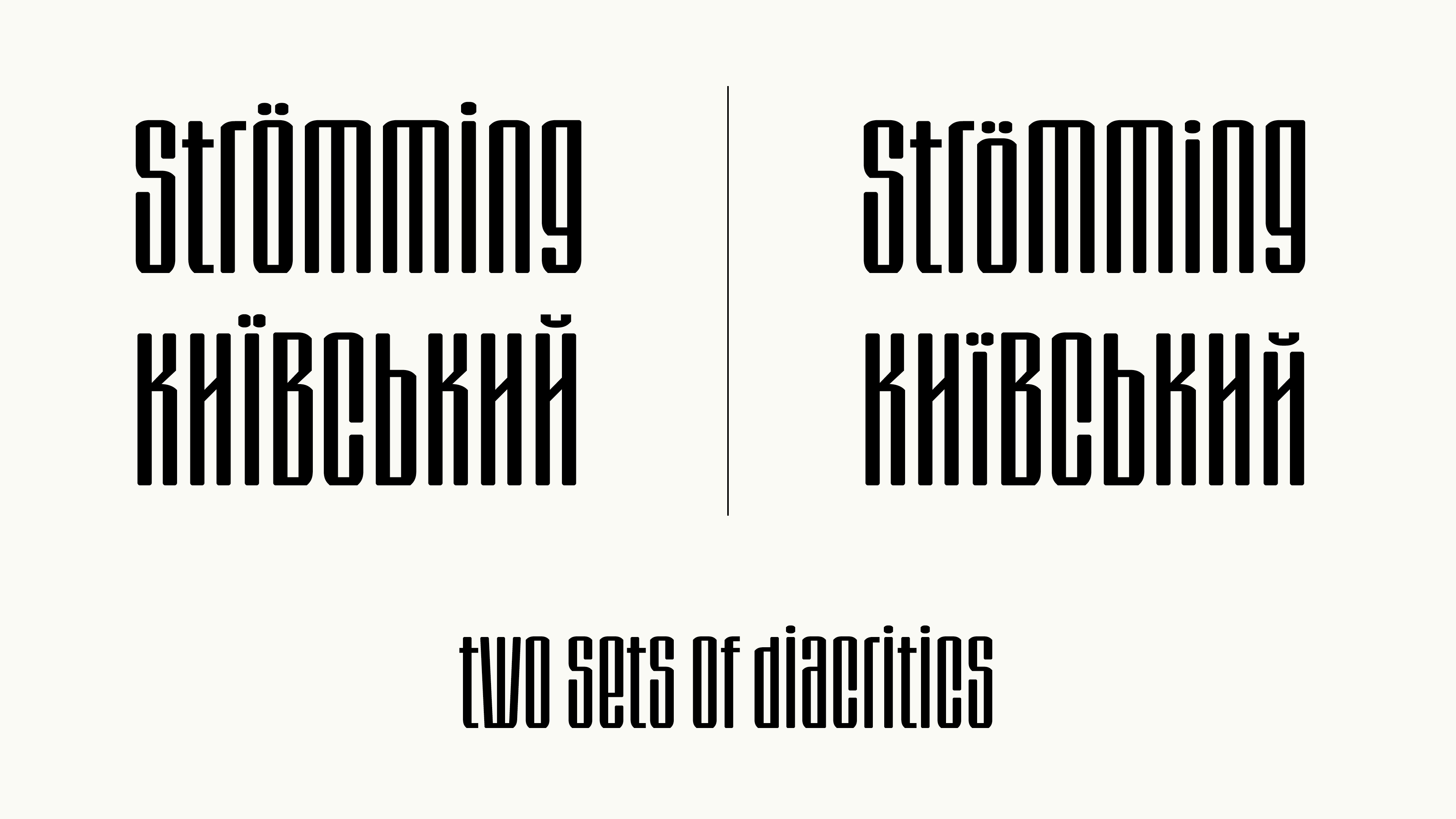
Fabrika is a serif typeface project that started about 4 years ago inspired by Bodoni and Didot. The current version is more towards the Clarendon and Scottish antiqua style for a more universal and less attention-grabbing typeface. It has a strict vertical contrast, soft ball terminals, and strict 90-degree stroke endings. The typeface also features more rounded outer ovals and more squared inner ovals. It comes in Regular, Bold, and Italic and supports basic Cyrillic and extended Latin characters.
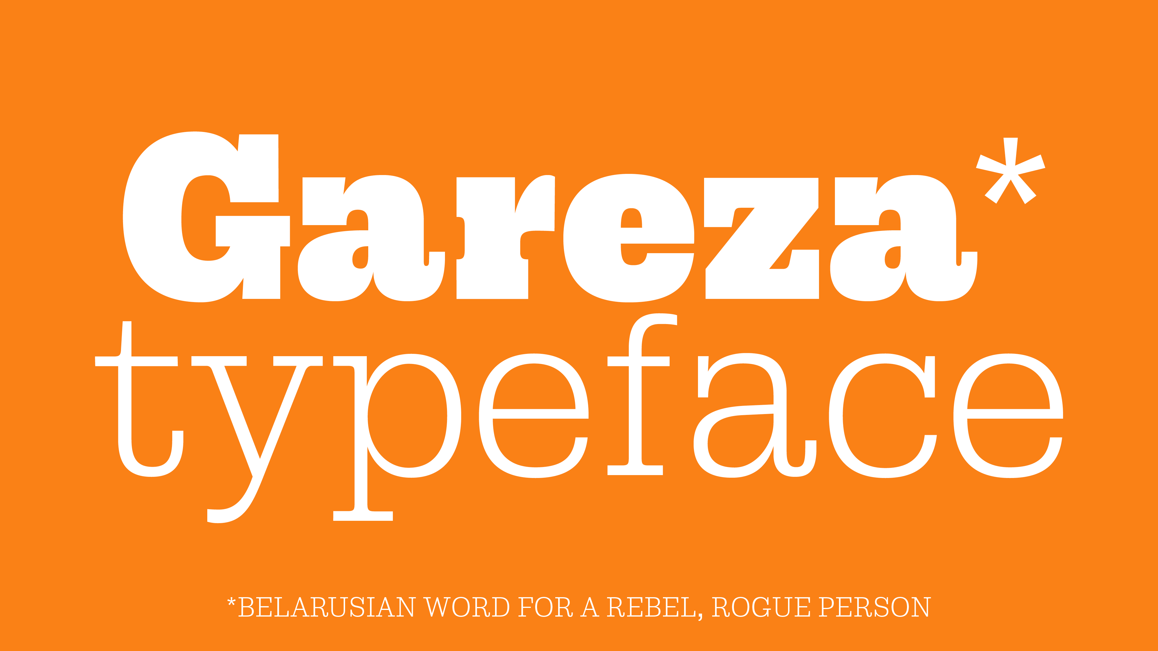
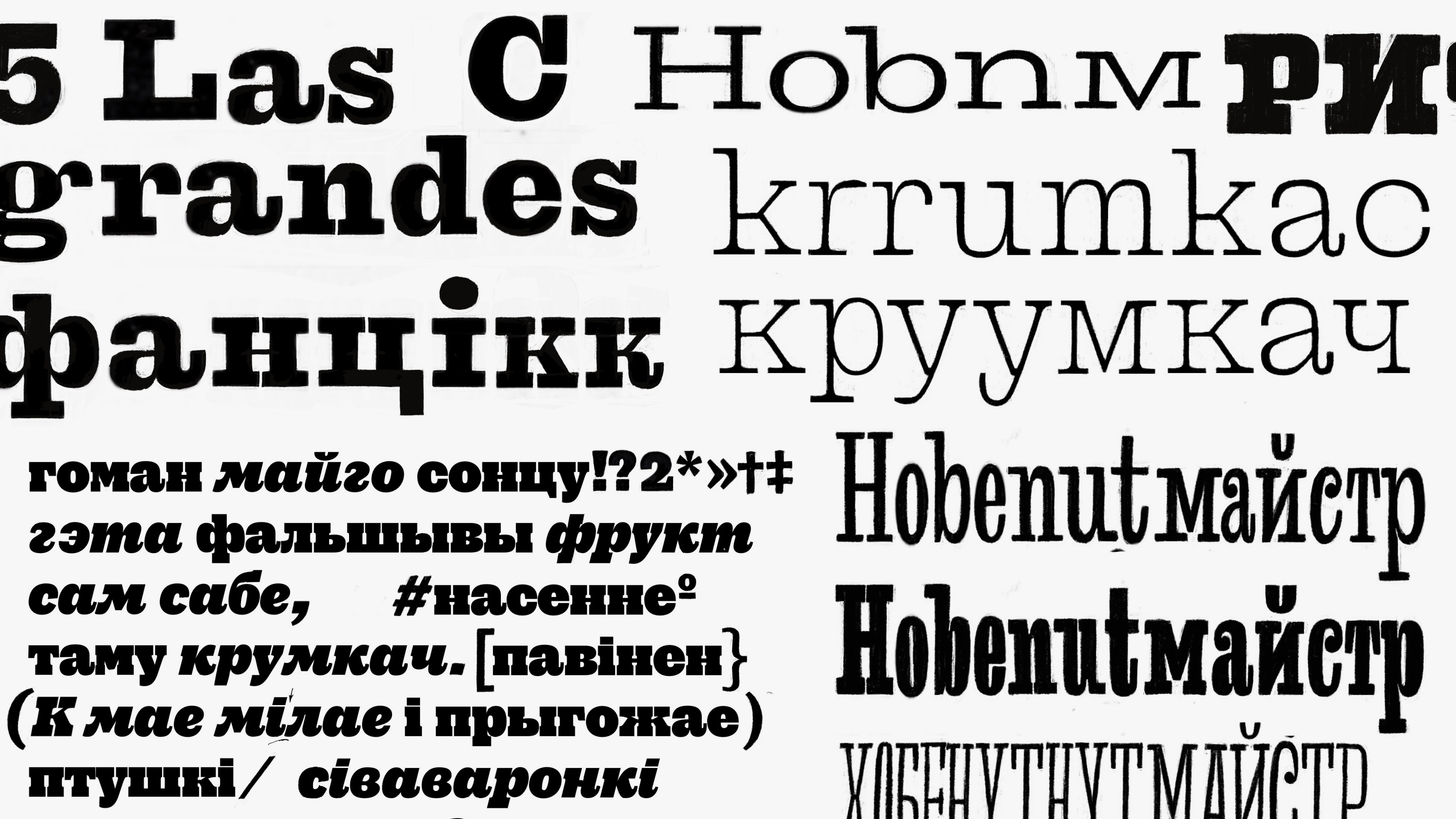
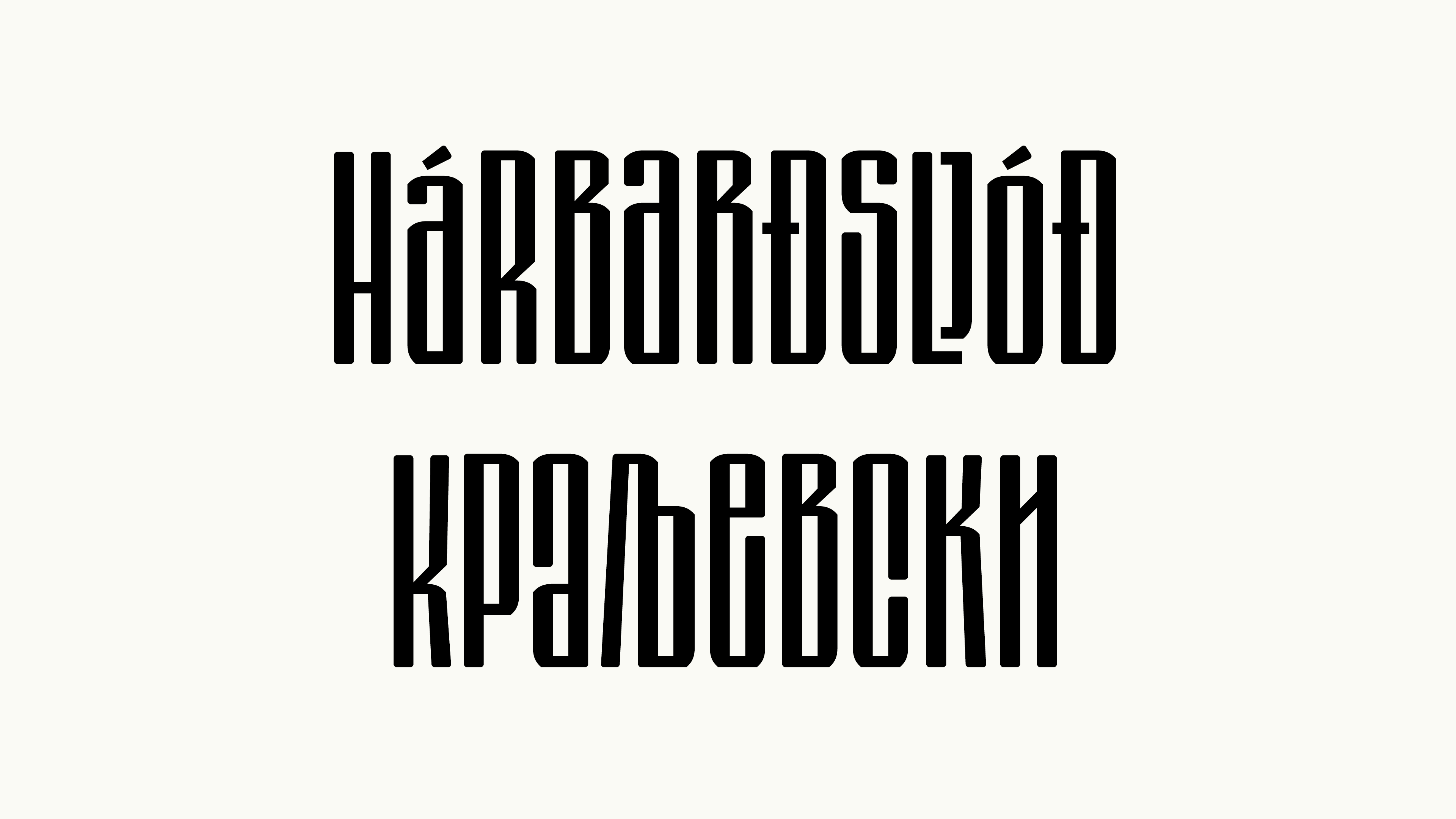
The Gareza type family explores 19th century Egyptian typefaces, especially Shelter and Giesecke’s Breitte Fette Egyptienne, which has wide, dark and rough letters with chunky serifs, natural round and abrupt mechanical shapes. Gareza’s design preserves historical letter forms, avoiding extreme contrast or ink drops. Both the Latin and Cyrillic script influence each other in Gareza’s design, resulting in a unique look. It has four styles: Light, Regular, Bold, and Black, with big x-heights and wide symbols allowing for a lot of white space, while short ascenders and descenders allow for tight leading. Gareza works well as a display type family for headlines and titles.
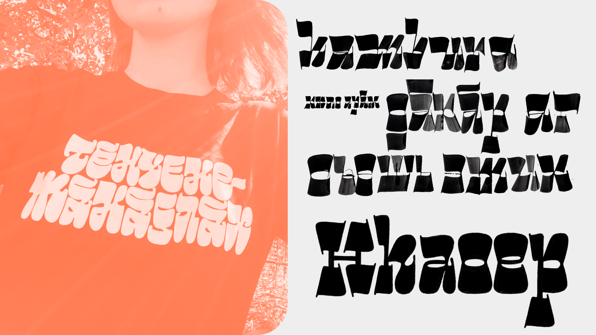
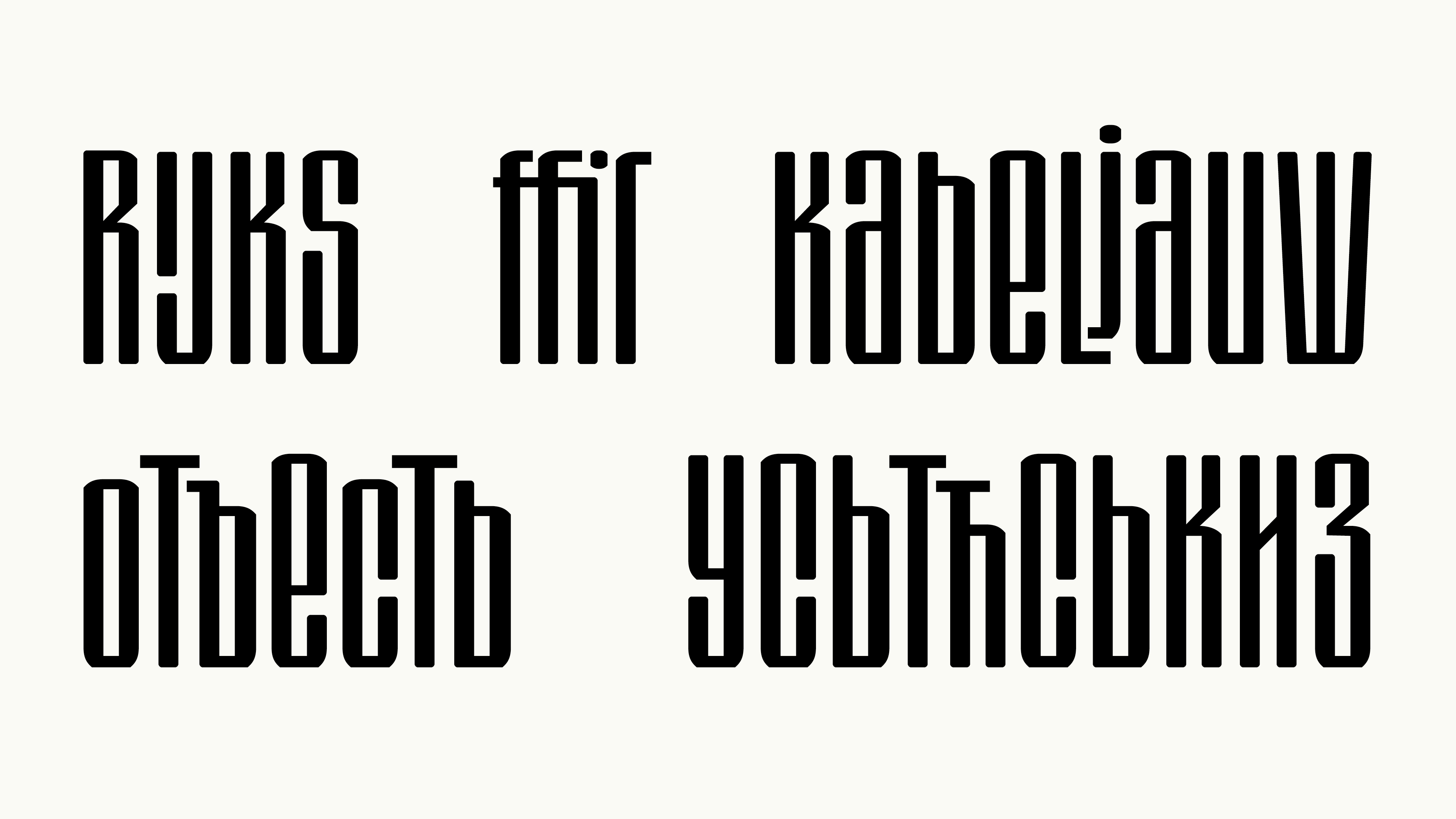
Strom typeface is inspired by Byzantine revival style, which is in turn inspired by medieval Cyrillic lettering. The idea was to make it modular, minimalistic and ornamental at the same time. I added some features in order for it to become flexible and to make working with it fun for the users:
•lowercase letters are the same height as uppercase;
•there is an additional set of compact diacritics (enabled via stylistic set feature);
•variable waist position as well as two separate stylistic sets for higher and lower waist;
•ligatures.
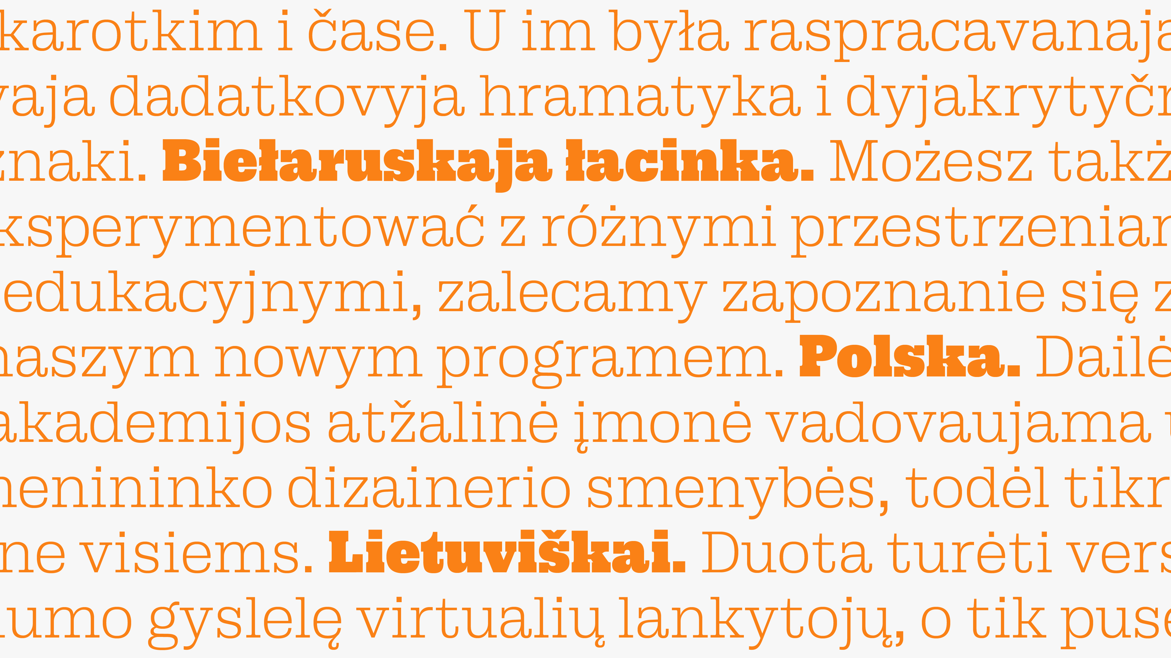
My typeface supports Belarusian, Russian, Serbian and Ukrainian languages as well as Central and Western European languages. It contains one set of numbers, fractions, special symbols and even some kerning 🙂 More features and supported languages are in progress.
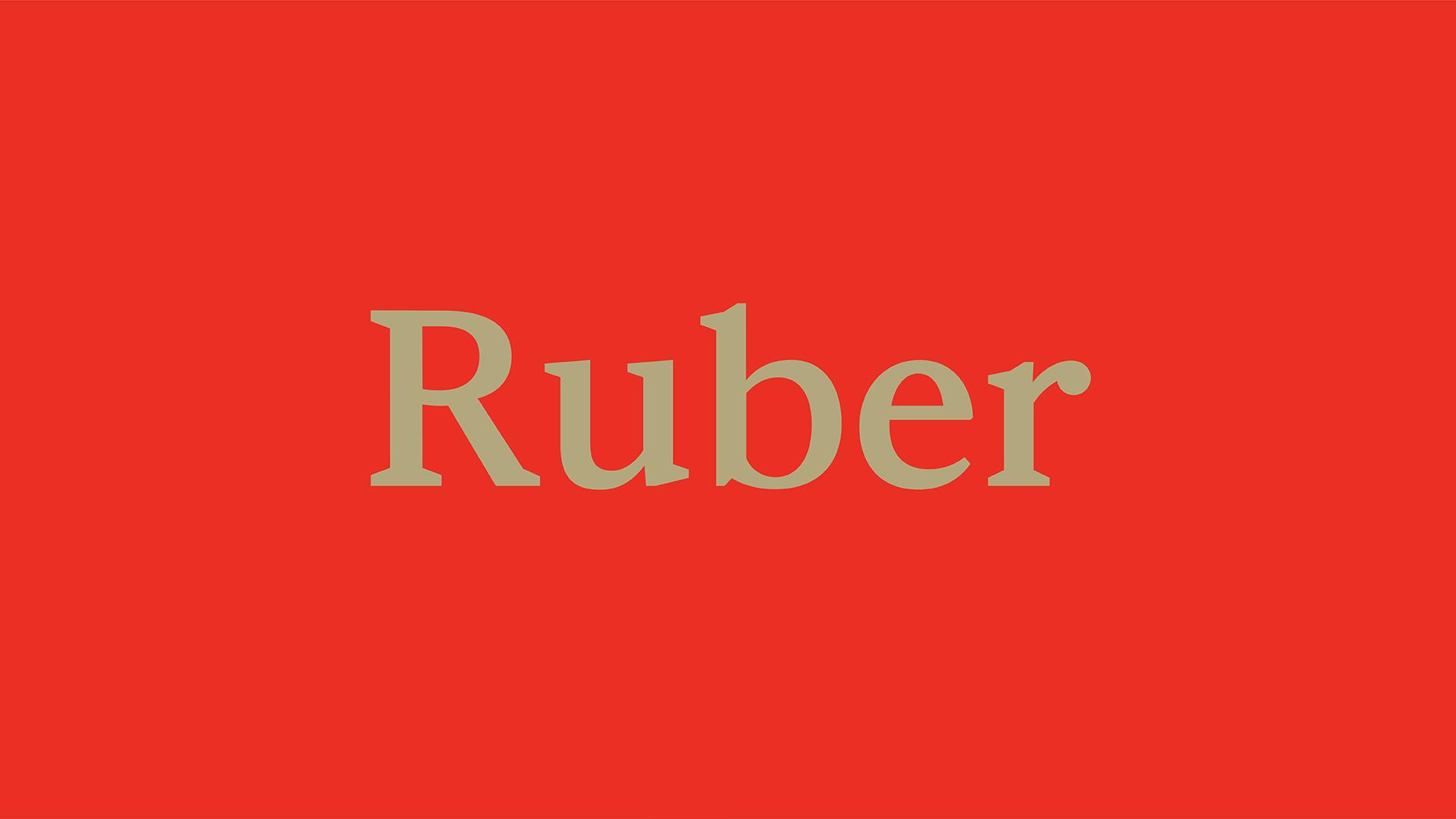
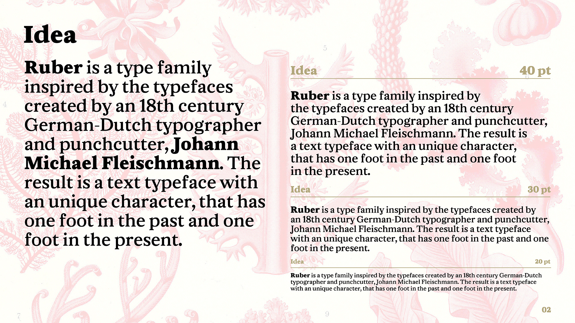
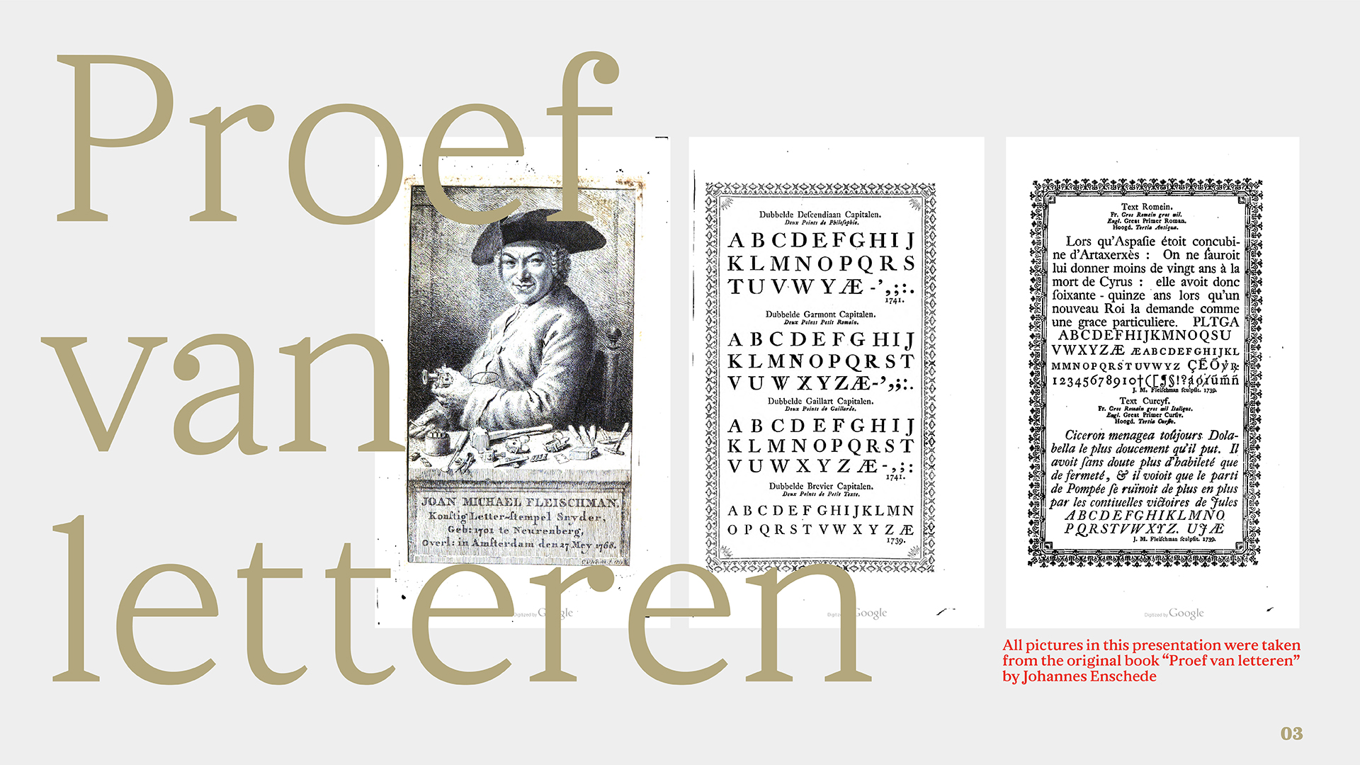
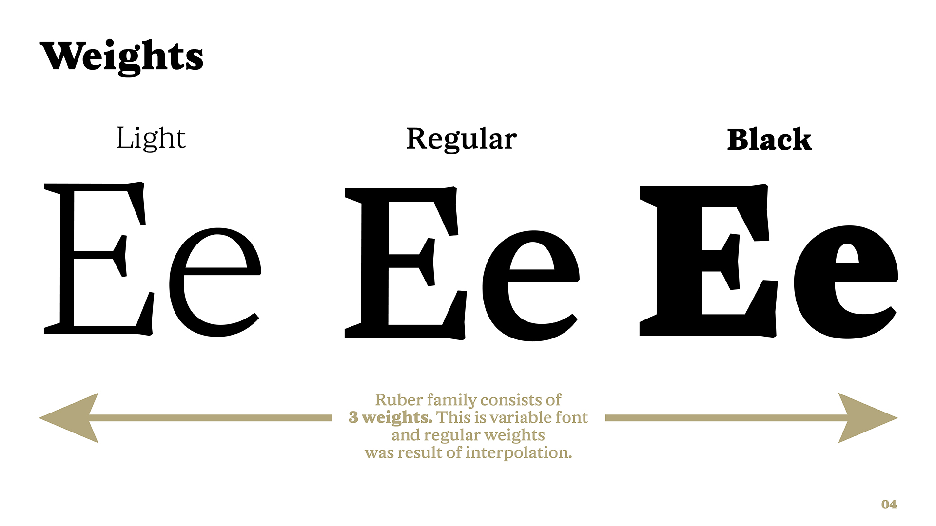
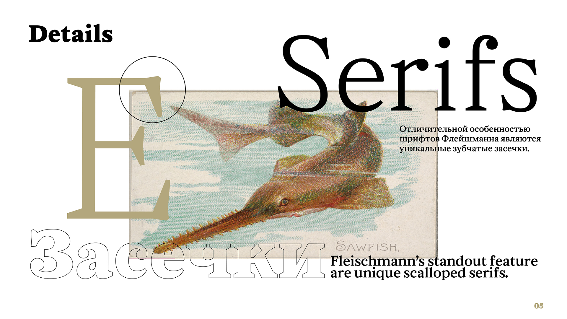
I came to the Intermediate TDW course with a text typeface, which later got the name Ruber. The project was inspired by the typeface created in the 18th century by the Dutch-German type designer Johann Michael Fleischmann. At the beginning of the course, I had a roughly made Regular design and a desire to add a weight axis to the typeface, which was done during the course. I was eager to understand the nuances of creating bold and thin strokes, to figure out what to pay attention to when drawing a text typeface and what is important for the typefaces used in large sizes.
All of this and more was learned during these four months. The project is still under development, but I hope to finish it soon and release it. If you’re interested, you can check out my email, Instagram, and Behance profiles.
Snark is a calligraphic typeface based on the author’s interpretation of Russian unique script from the 16th–17th centuries which is called Skoropis’. Its name comes from Lewis Carroll’s poem “The Hunting of the Snark” and, like the poem itself, symbolizes the pursuit of happiness. The idea for the typeface was born during the study of historical scripts and calligraphic experiments with them. Skoropis’ is one of my favorite writing styles—bright, distinctive, and polyphonic, with wonderful graphic techniques that can work in modern design. Despite the typeface being a modern interpretation, it still retains the main features of Skoropis’. Snark works well in both large sizes and texts, and is particularly suited to poetry.