Type Design Workshop / 2022
The main Type Design Workshop theme this year were the extended Cyrillic languages: Abkhazian, Aleutian, Bashkir, Dolgan, Kildin, Mansi, Serbian, Tatar, Tuvan, Ukrainian, Khanty, Chukchi, and Yakut. The languages for the research aspect of the project were randomly assigned to students.
How does one grasp the multitude of Cyrillic-based languages? How does the make-up of the alphabet affect the project in development and its main elements? Should type design rely on some of the cultural aspects of the people who use it? These are just a few questions we brought to the table for an open-ended discussion during our workshop this year.
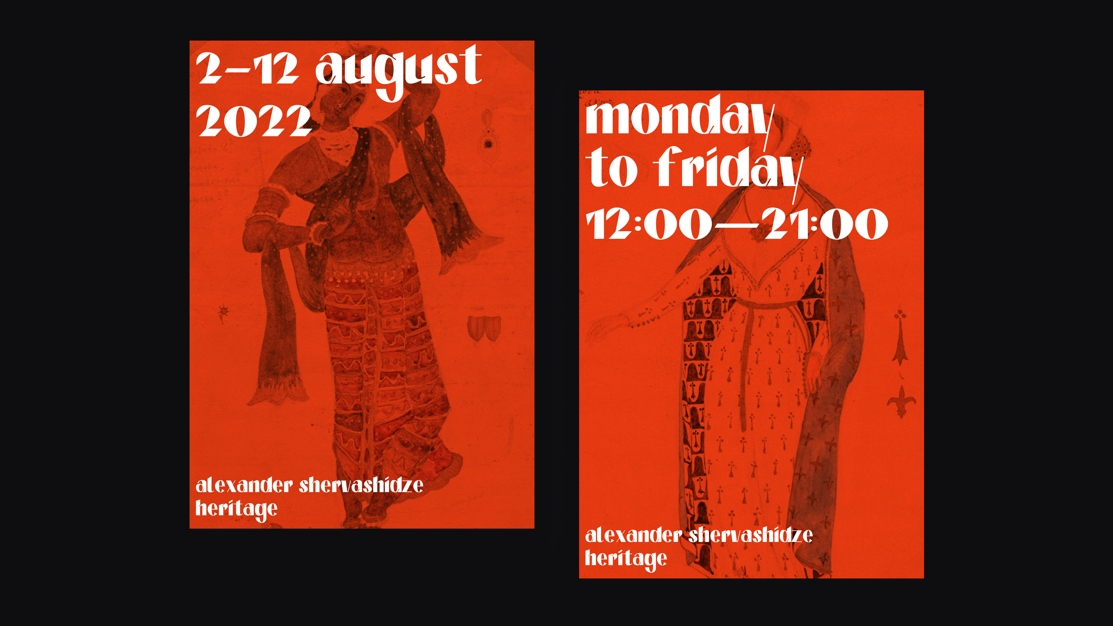
Invited speaker: Daria Petrova
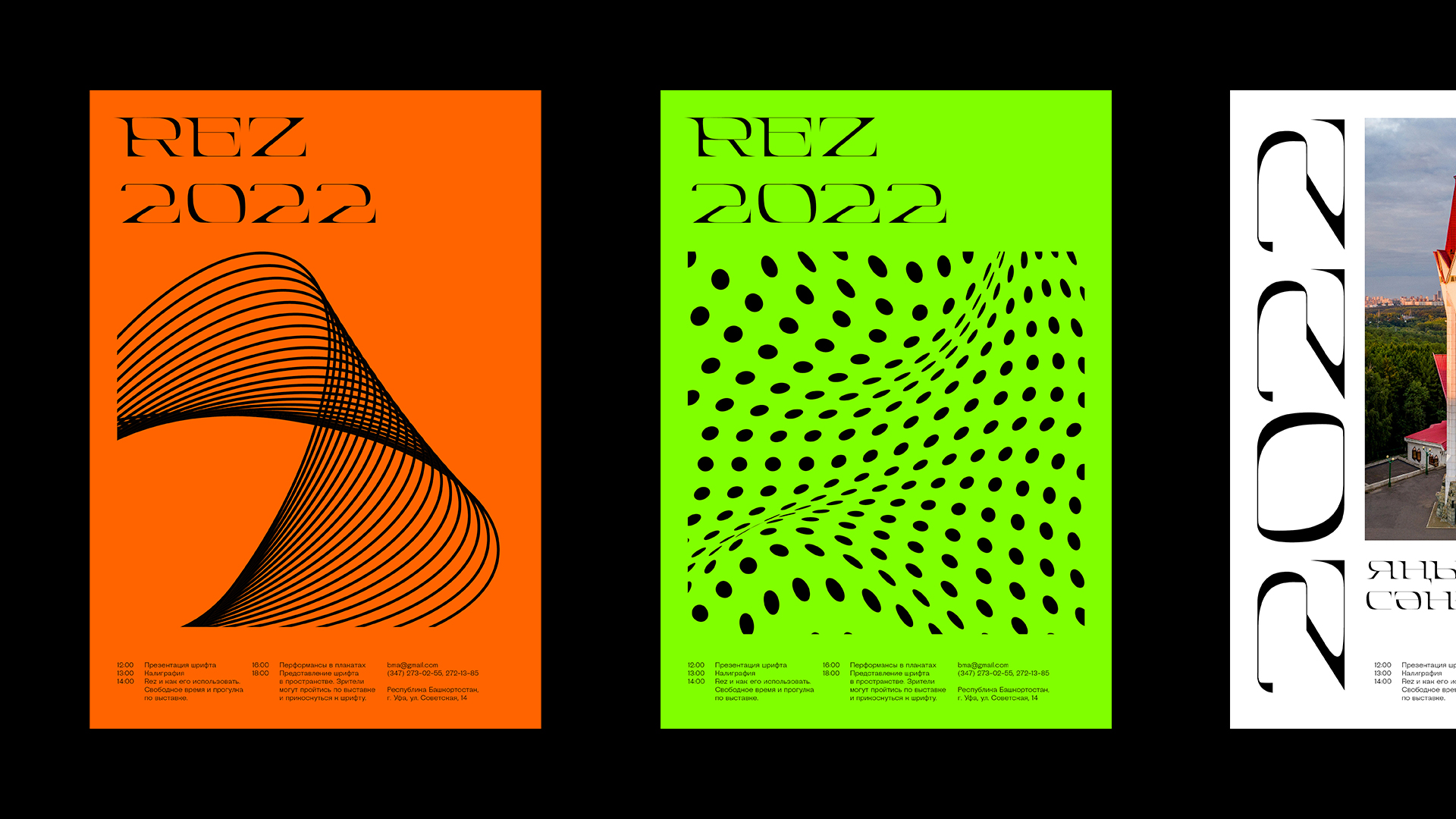
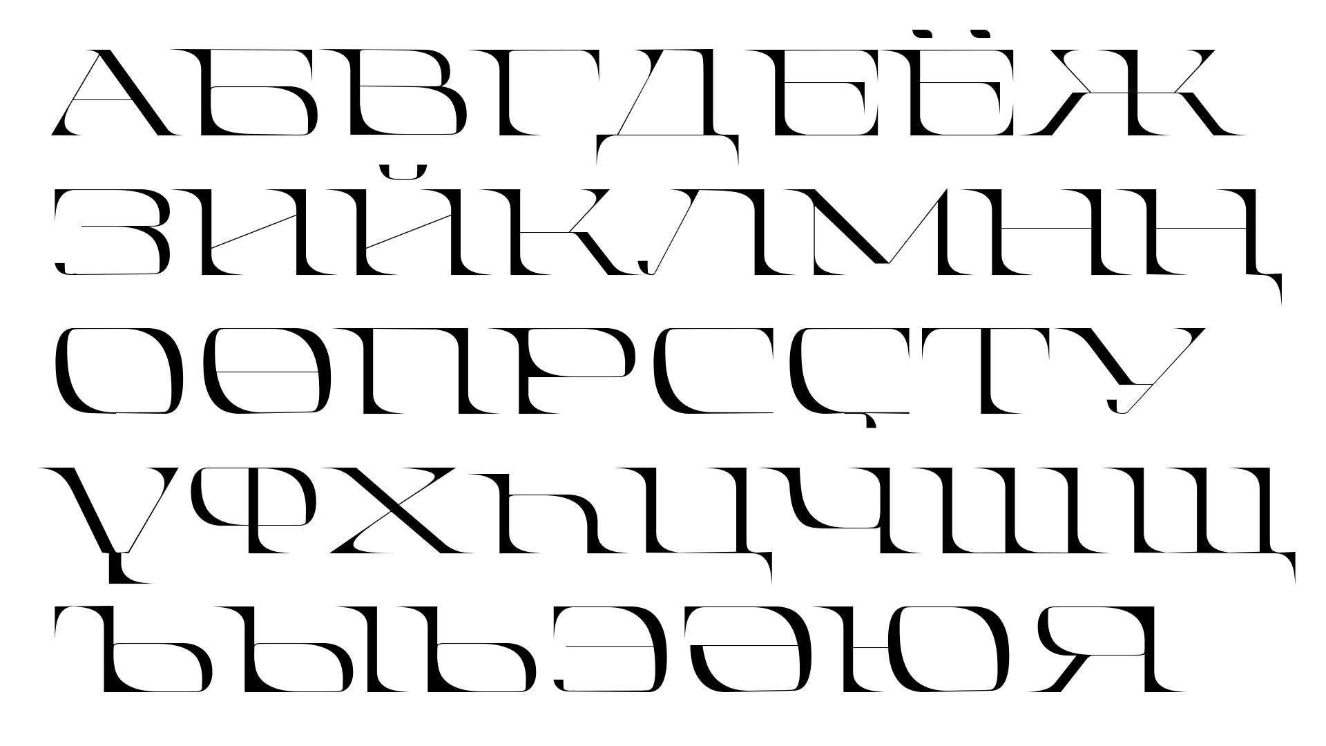
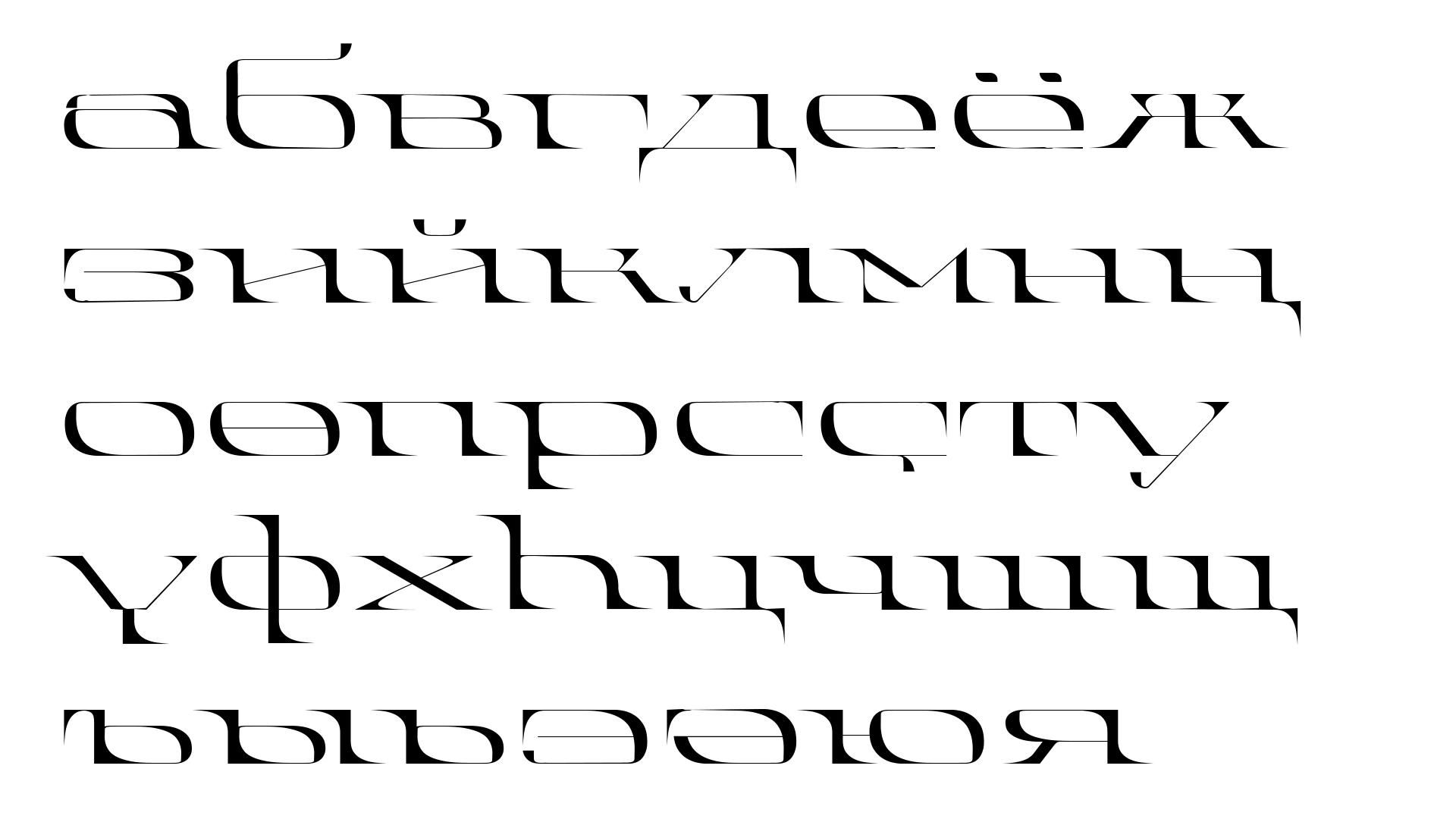
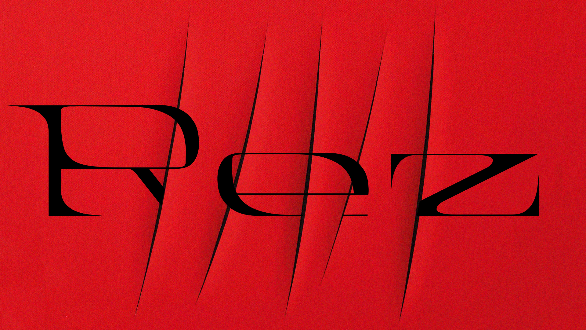
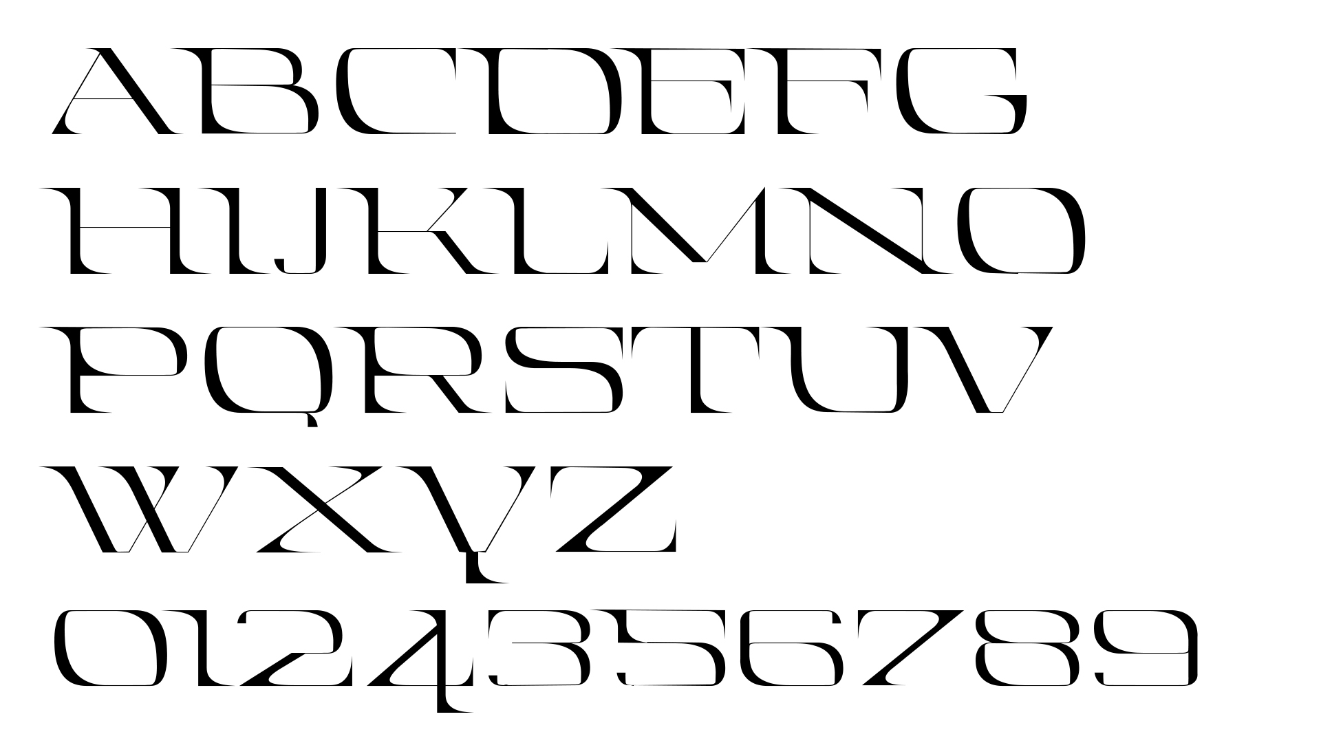
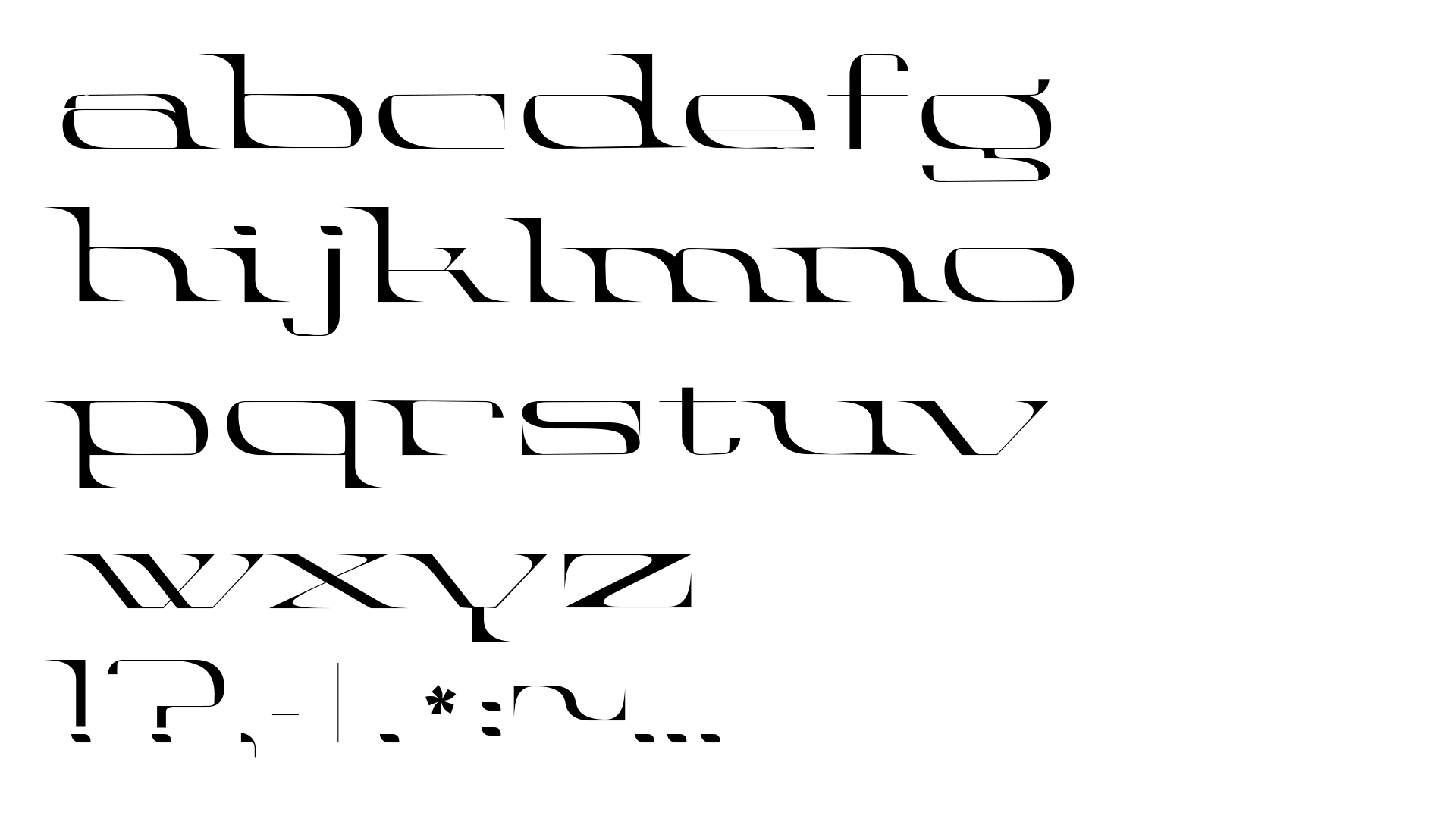
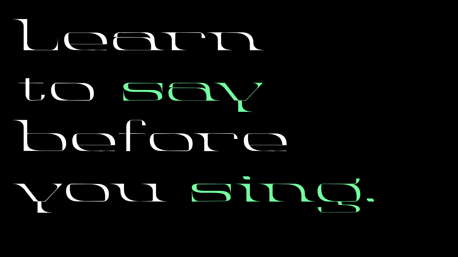
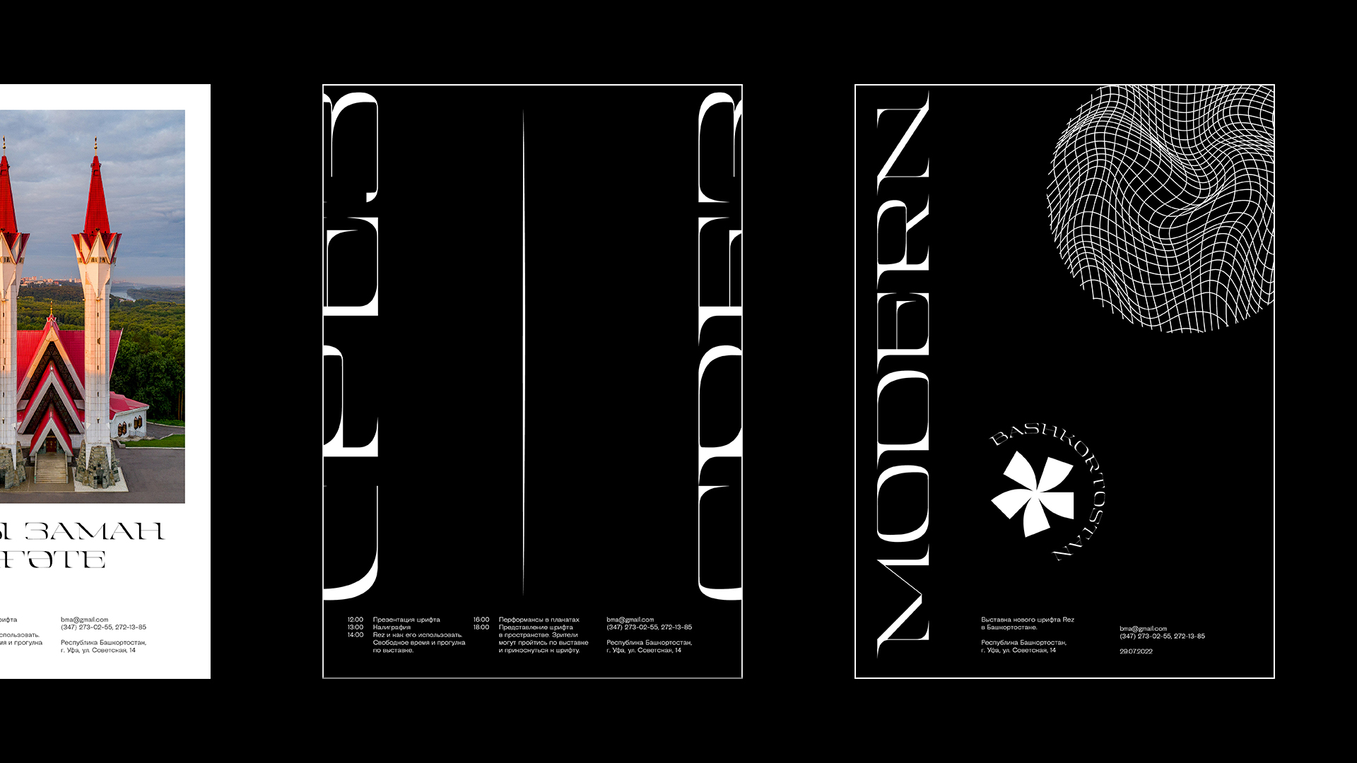
Inspired by the uneven and willful landscapes of Bashkortostan, Rez is a free-spirited typeface full of contrasts that was born from calligraphy experiments. Expanded and made to stand out on the large scale of posters, covers, and logos, she captivates attention with its shape. Rez includes uppercase and lowercase Latin and Cyryllic letters, as well as Bashkir alphabet letters with punctuation and numbers set. This typeface is excellent for the larger sizes, underlining the craving for something more rebellious, sharper, and closer to contemporary art and electropop. I am planning to continue working on it and add more typeface styles, including condensed and regular, where the latter will have new and improved legibility when it comes to the smaller point sizes.

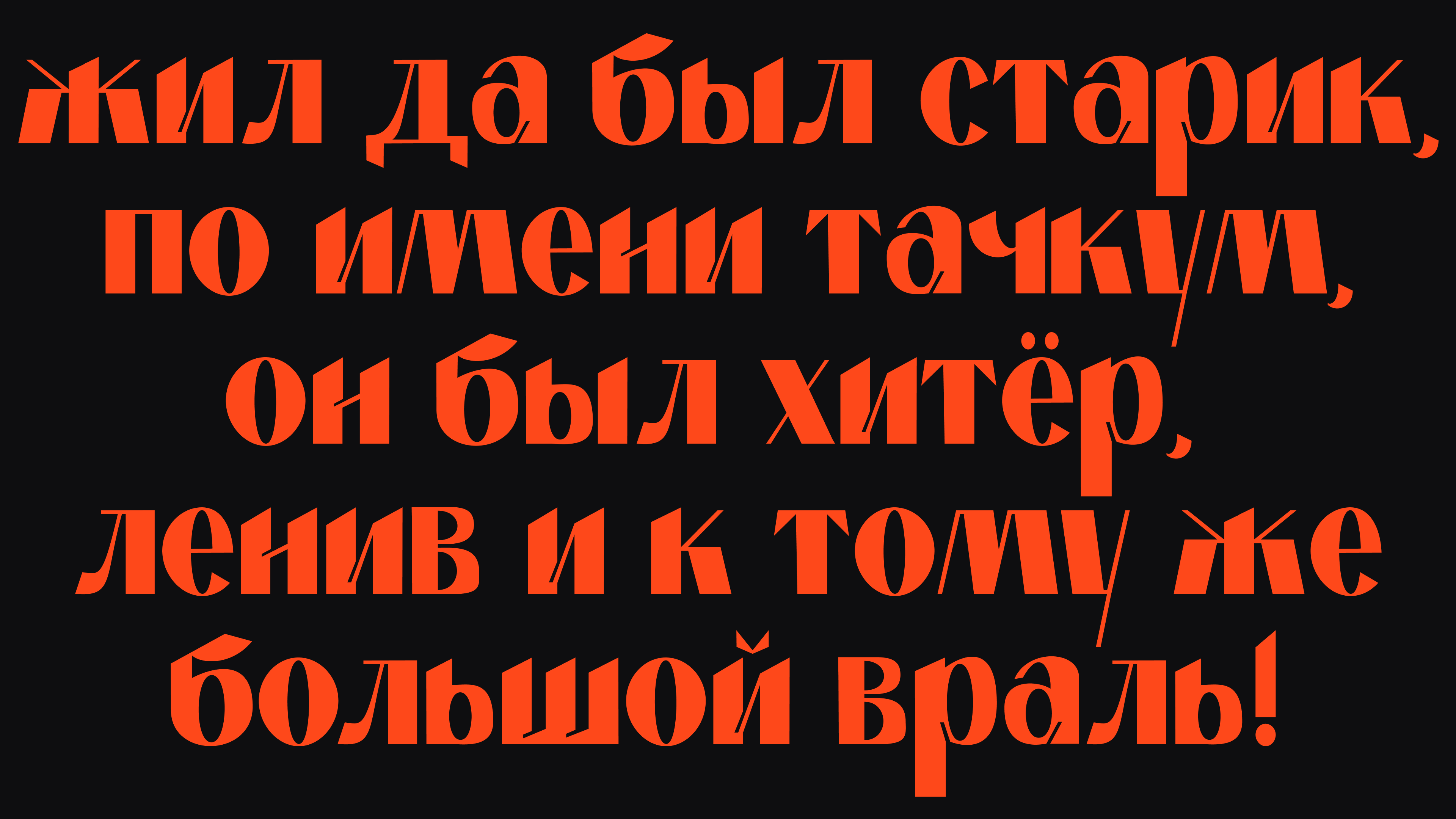
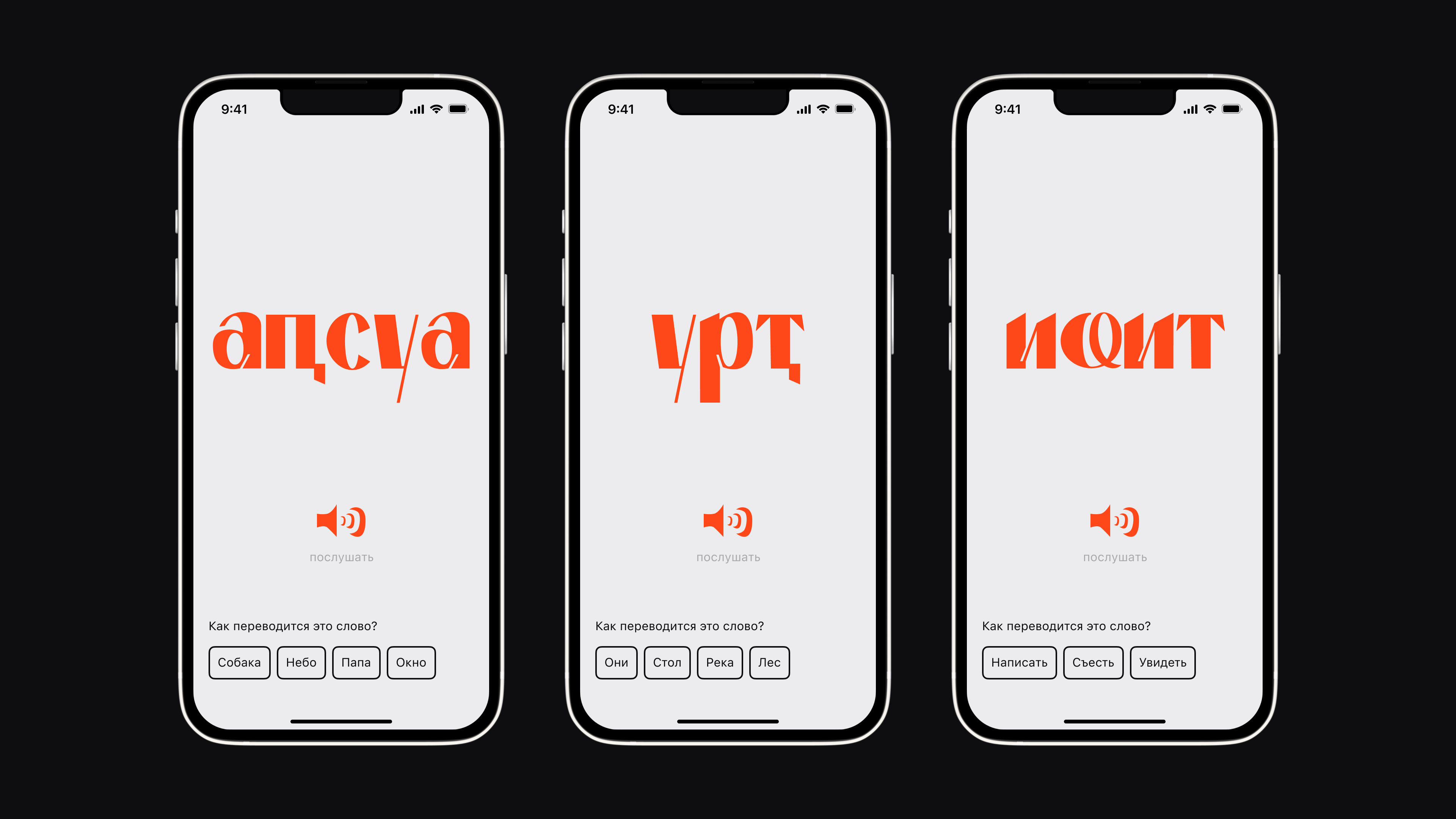
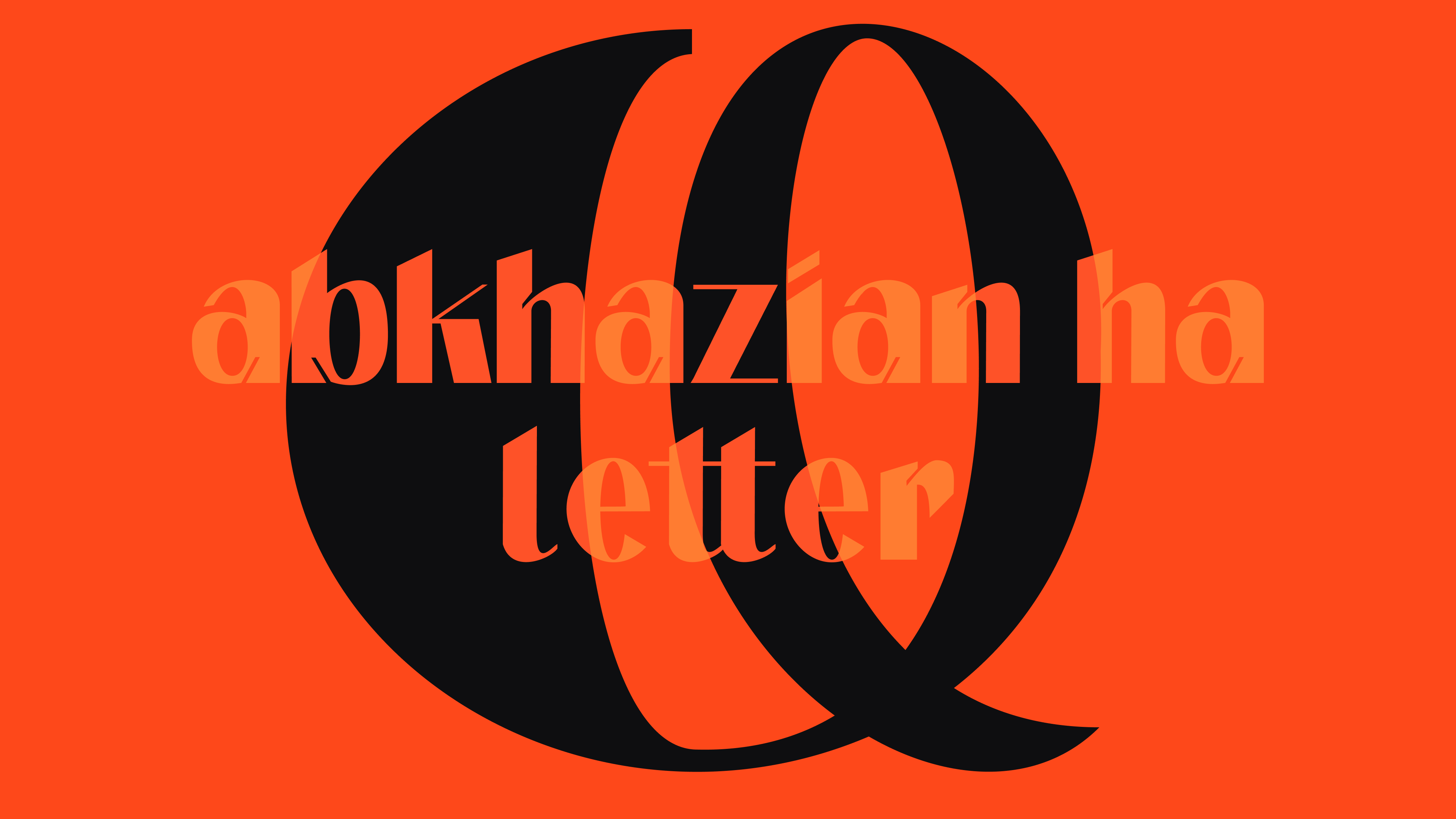
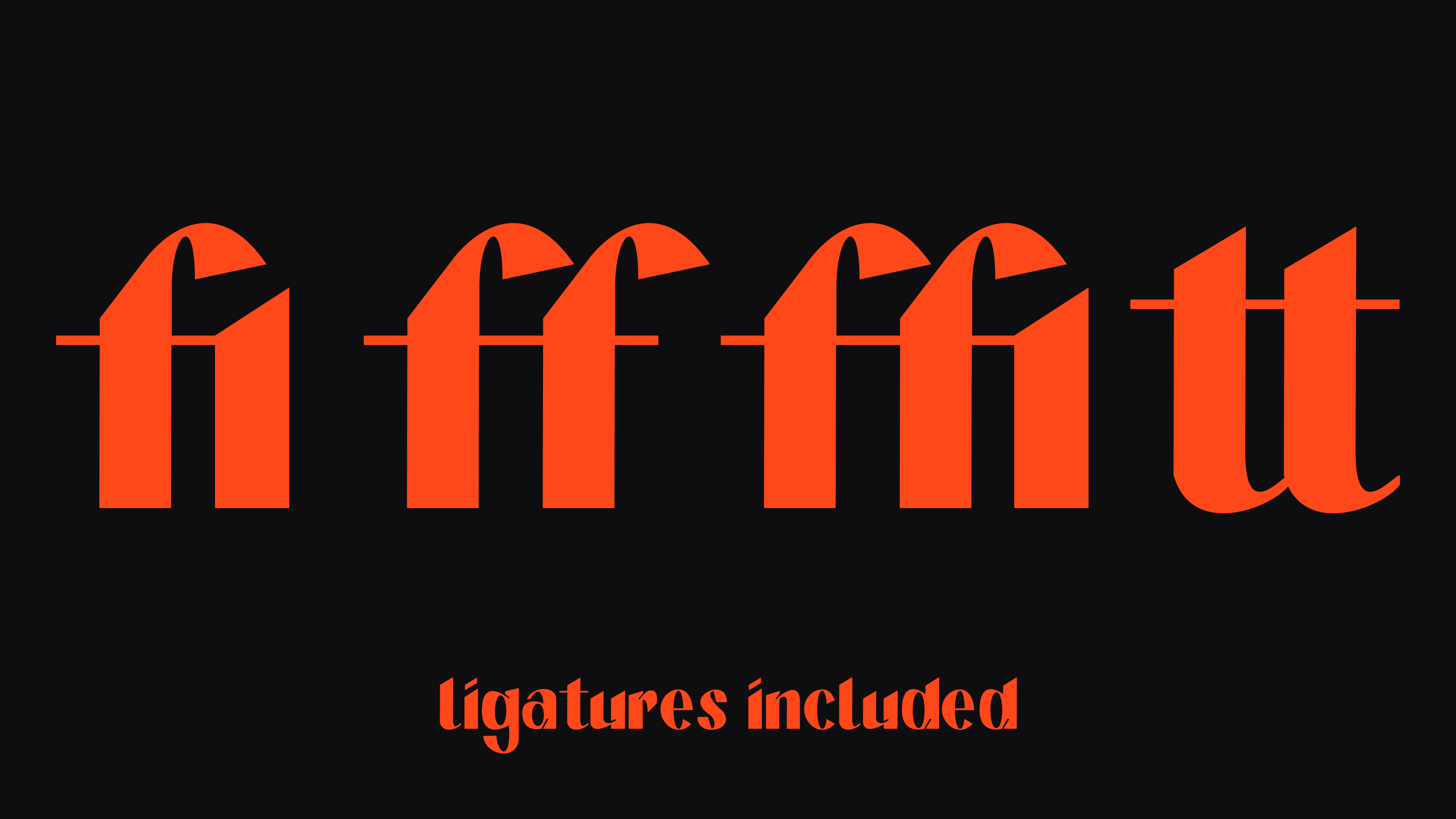
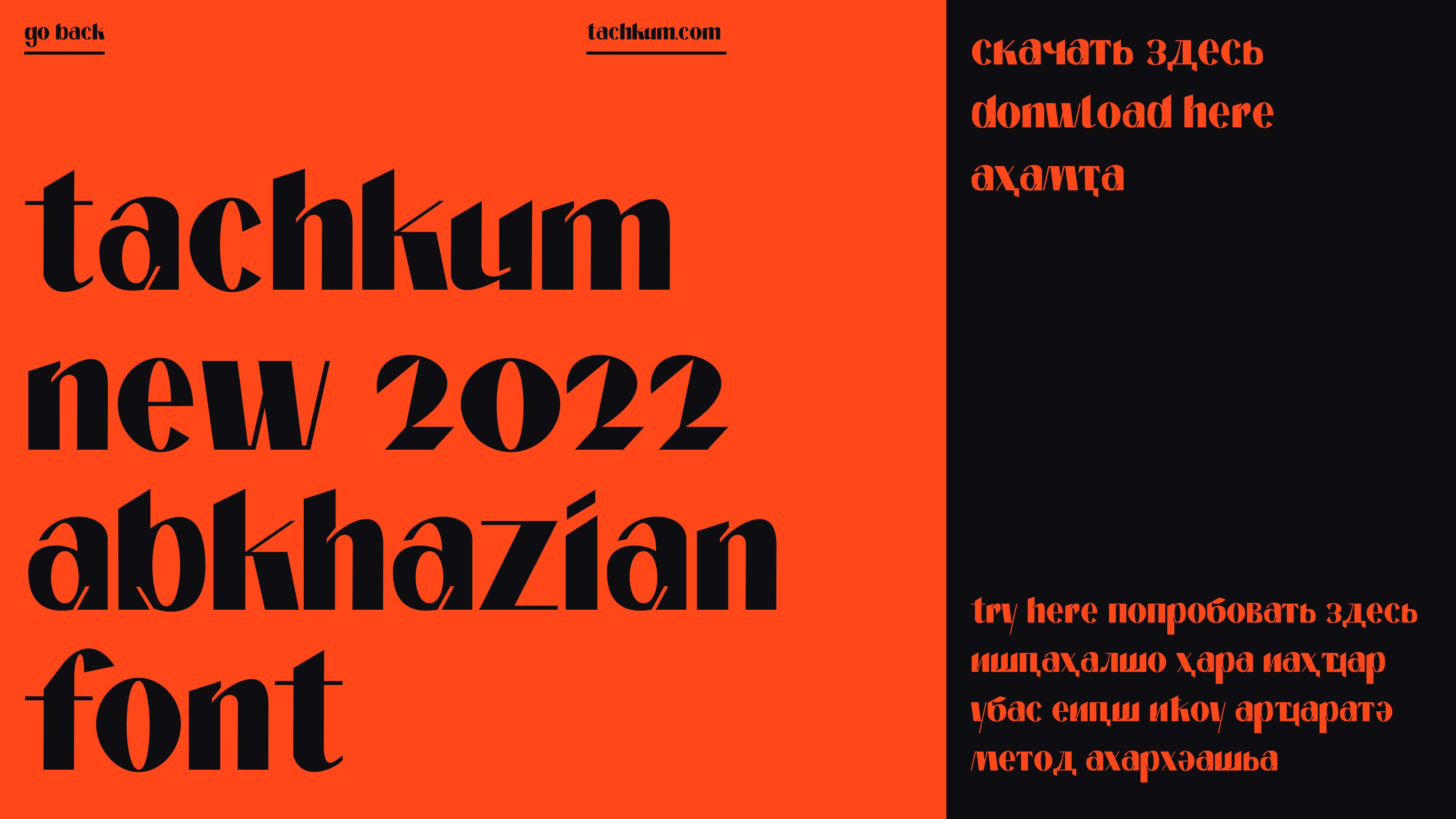
Tachkum is the cunning protagonist of the Abkhazian folk tales, impersonated in this display typeface. High in contrast and sans serif, it allows you to create unique statement texts in Russian, English, and Abkhazian. The typeface is inspired by the Carolingian minuscule and broad-nib pens, yet it gets its character through the bold ink traps.

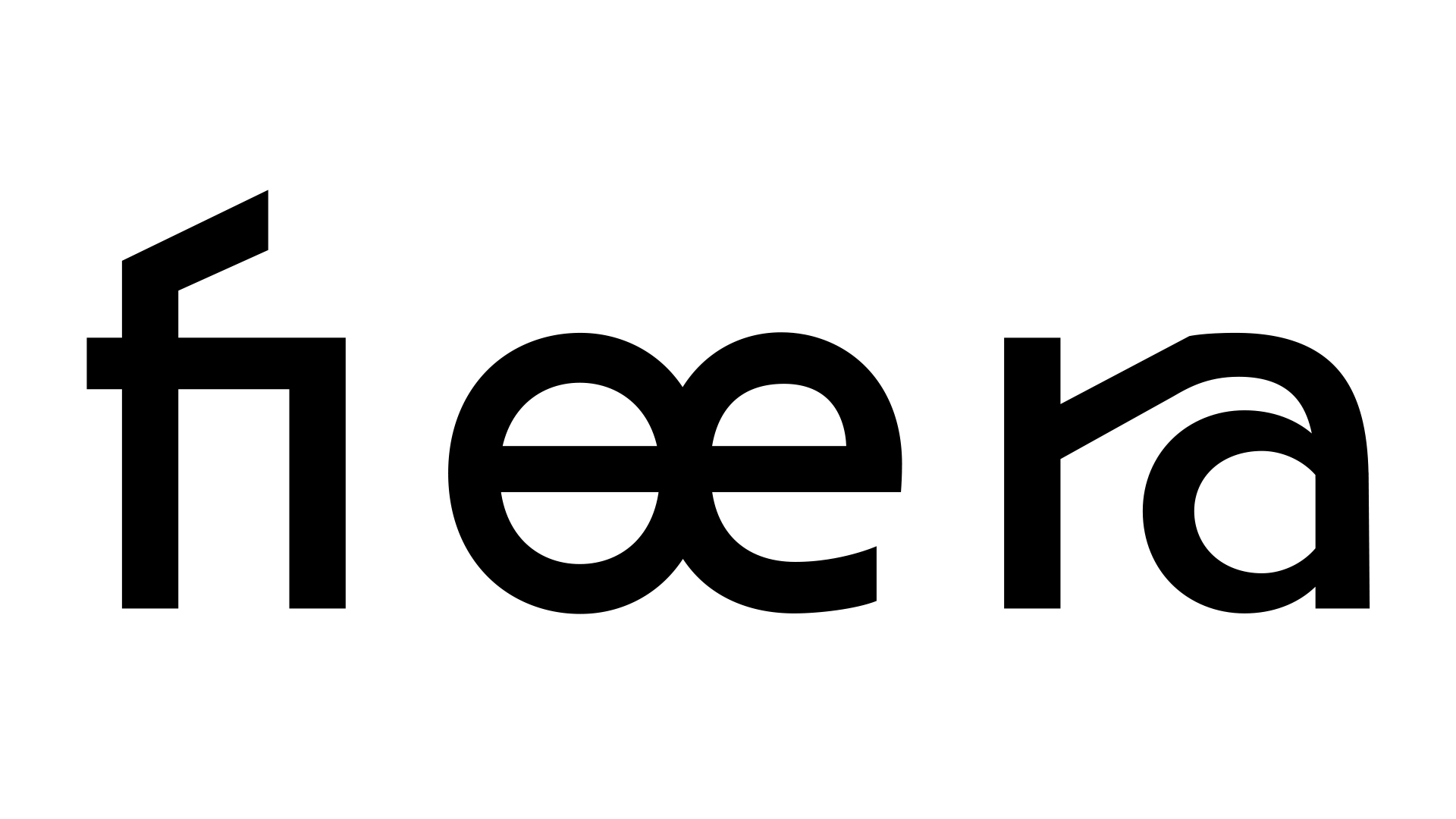
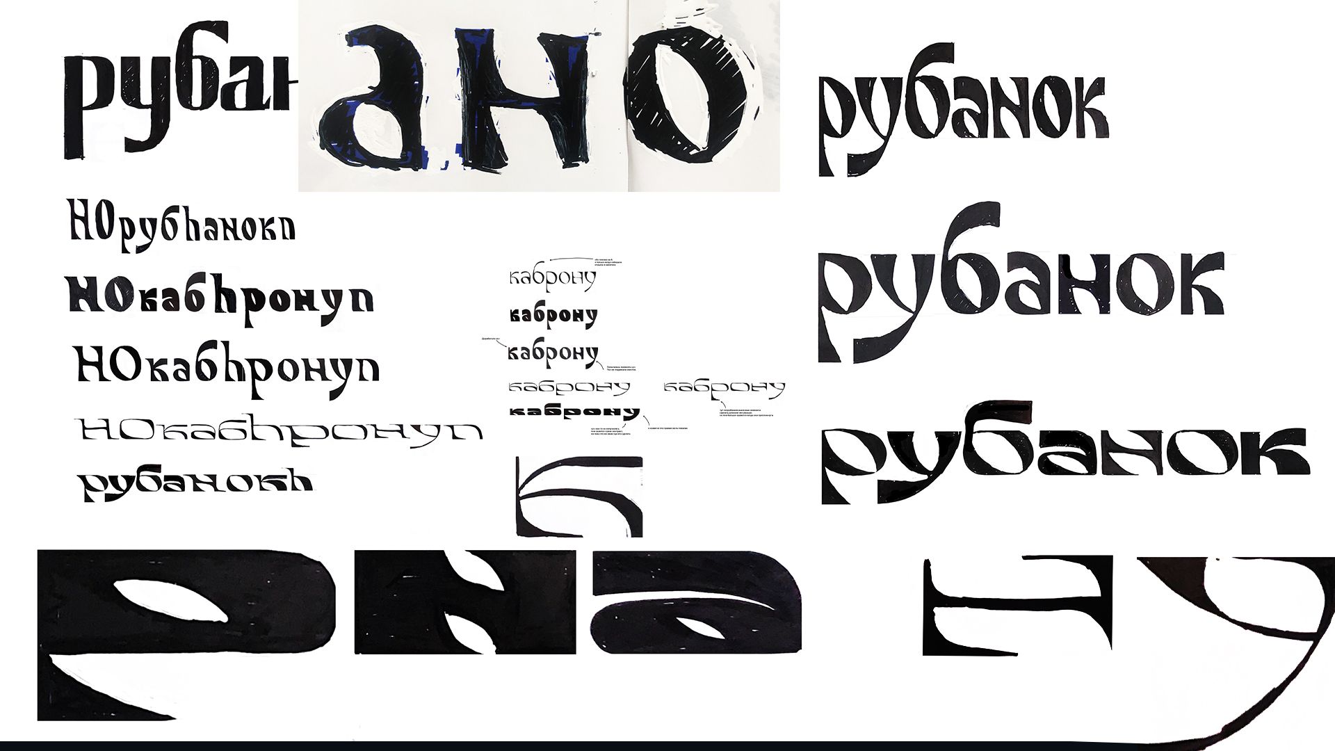
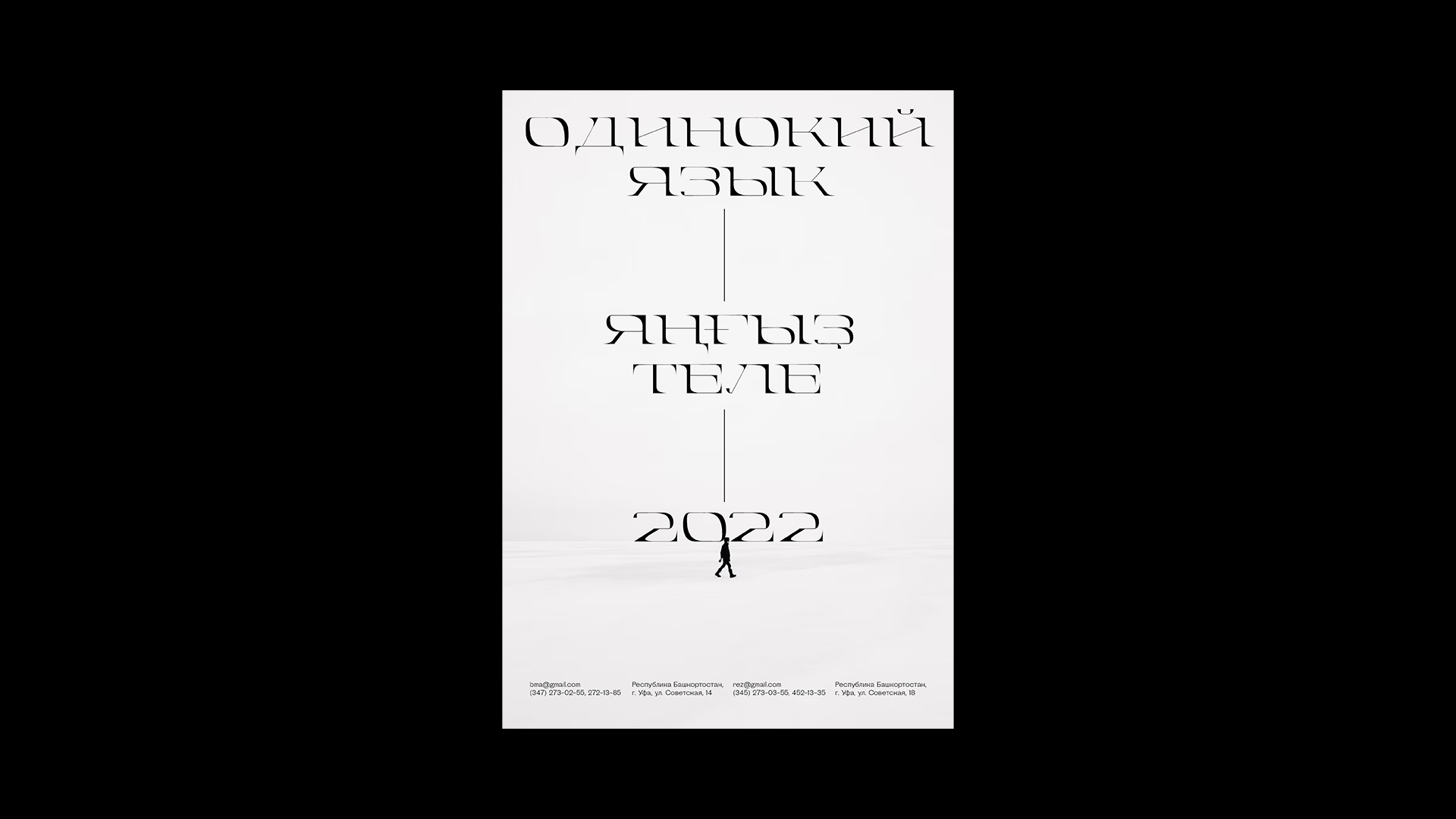
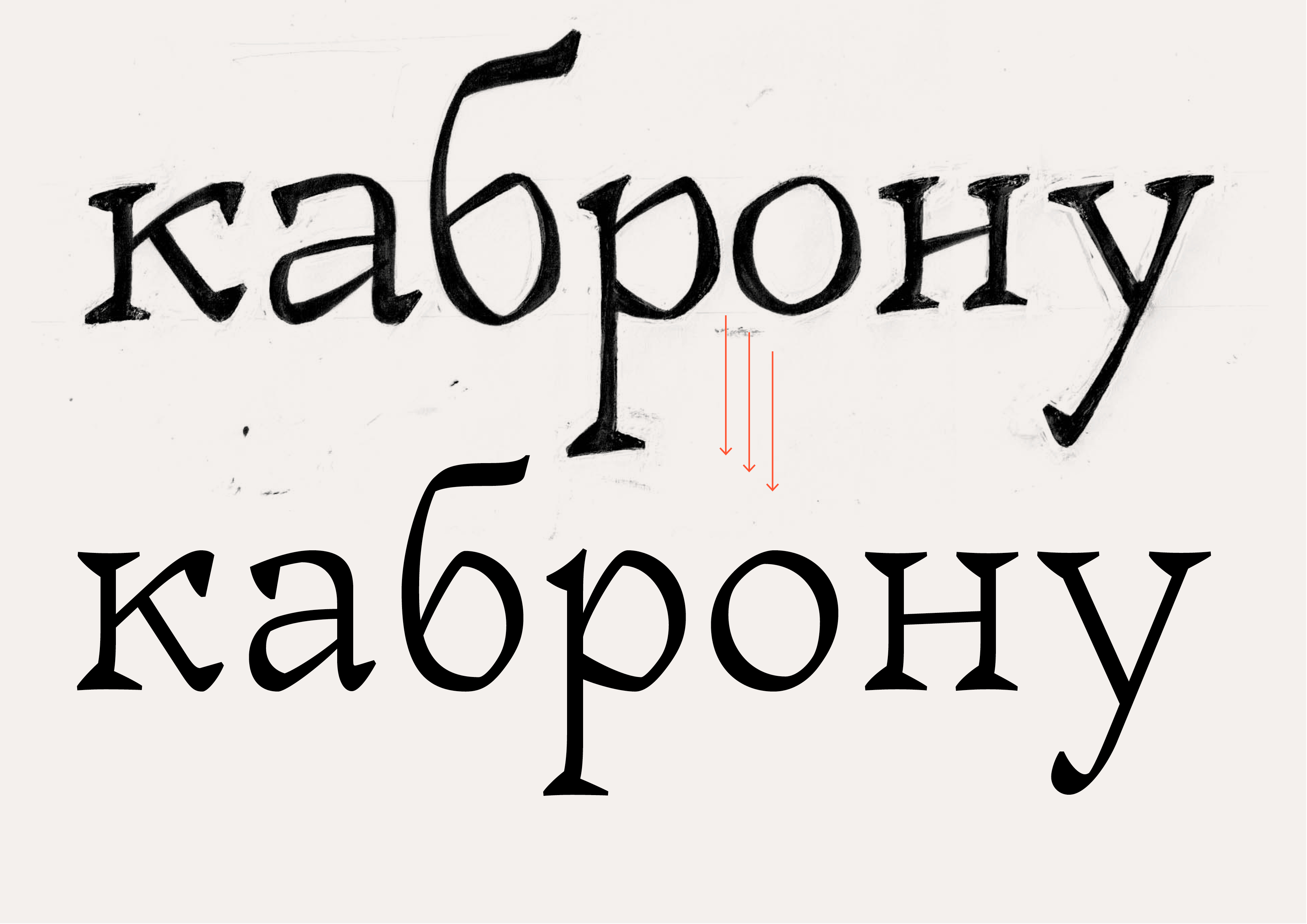
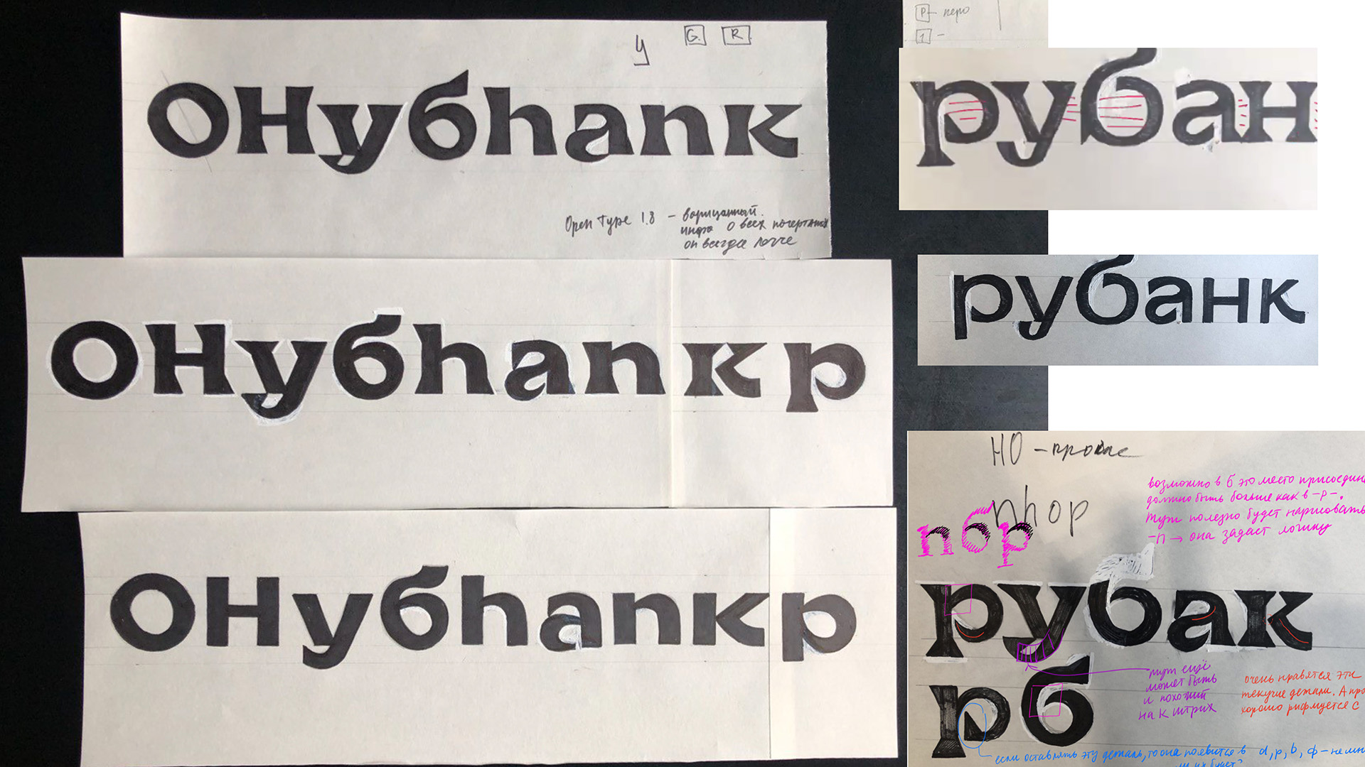
The goal of the workshop was to design a typeface for one of the Cyrillic languages. The one assigned to me was Ukrainian, having four additional characters compared to Russian.
I wanted the type to be loud, to look good on a large scale, to stand out on a poster, and to be bold and confident. It took a week of drafting on paper, using pens, paintbrushes, feather pens, and markers, for the typeface personality to start taking form. I liked the round and sharp blackletter shapes I was starting to see.
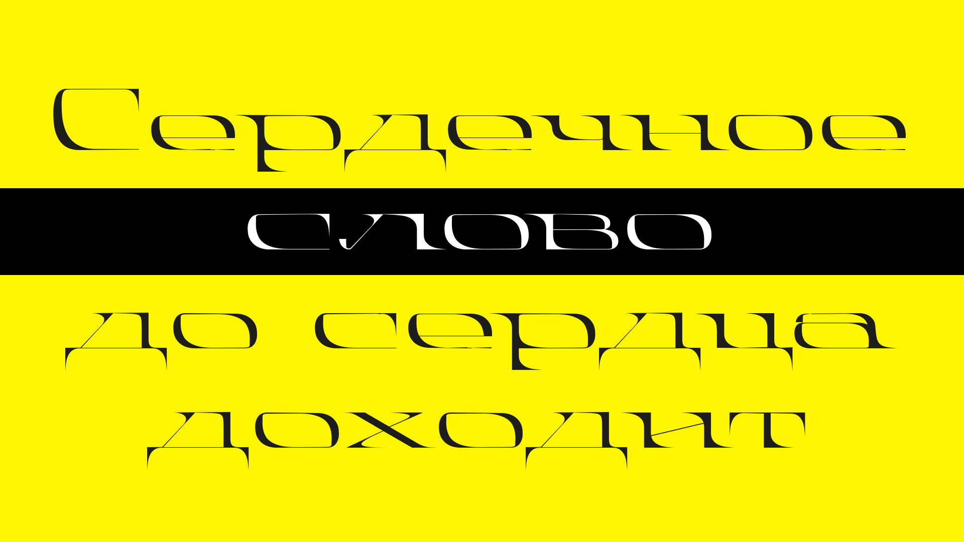
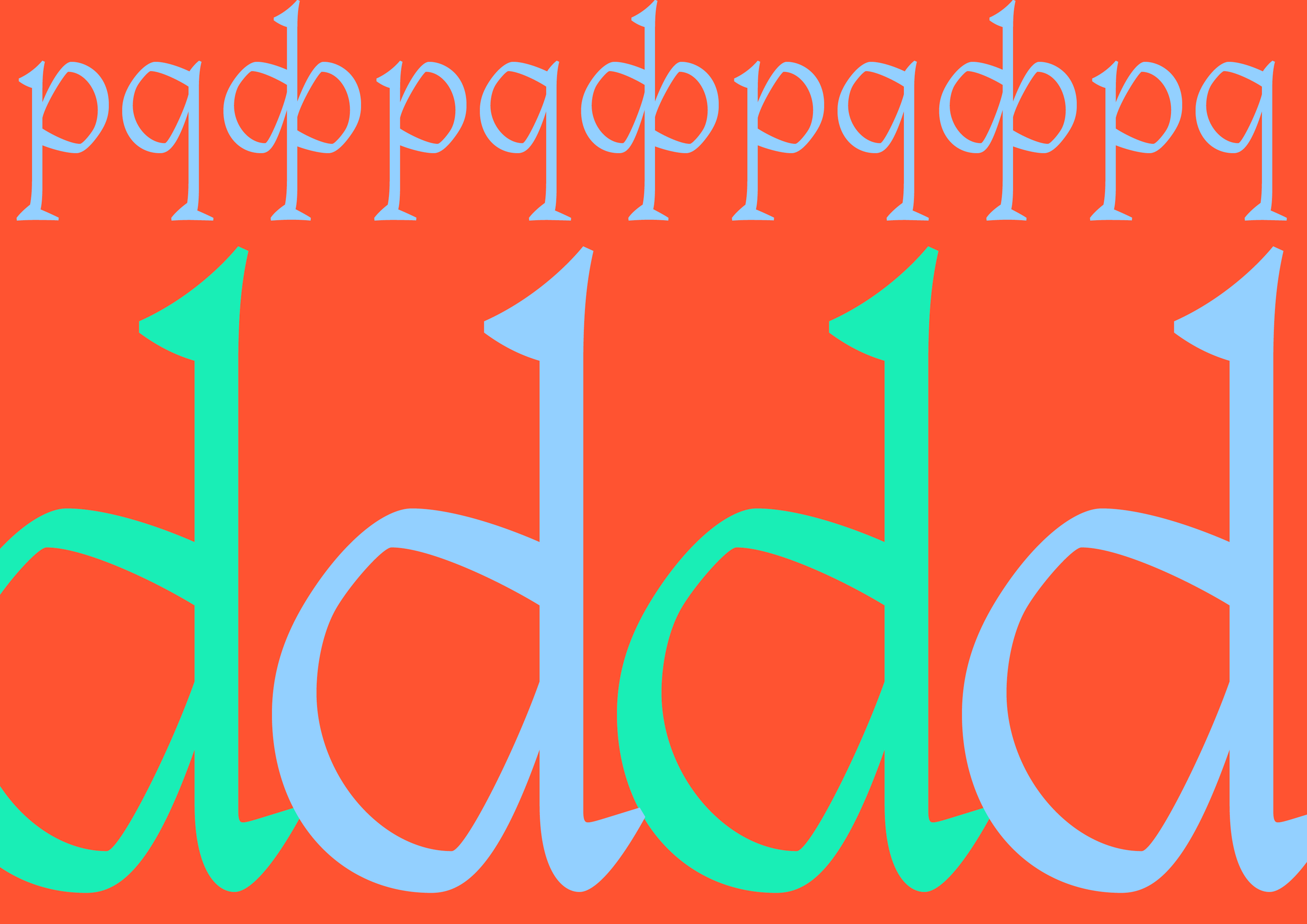
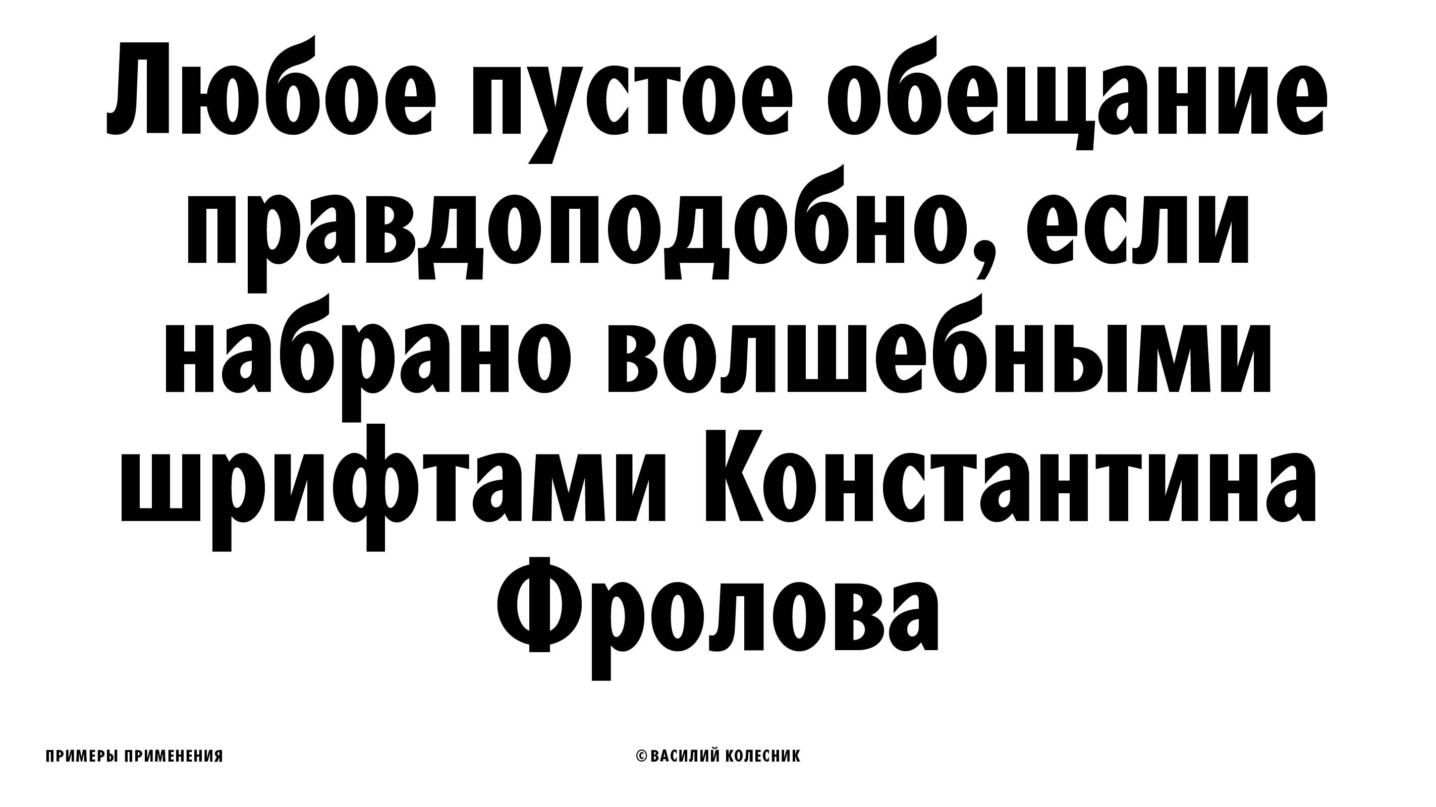
After five more days of back and forth with the corrections from the instructors, the Argus (gooseberry) typeface was born. This word is round in Russian and sharp in Ukrainian, a trait that I maintained across this typeface: on one hand it is a blackletter serif, yet on another it is a grotesque sans-serif.
The choice of color seems to be the decisive element that brings forward one or the other side of the typeface. The soft rose-gold tones will make it seem friendly and amicable, while the neon will bring out the stronger, more powerful undertones.

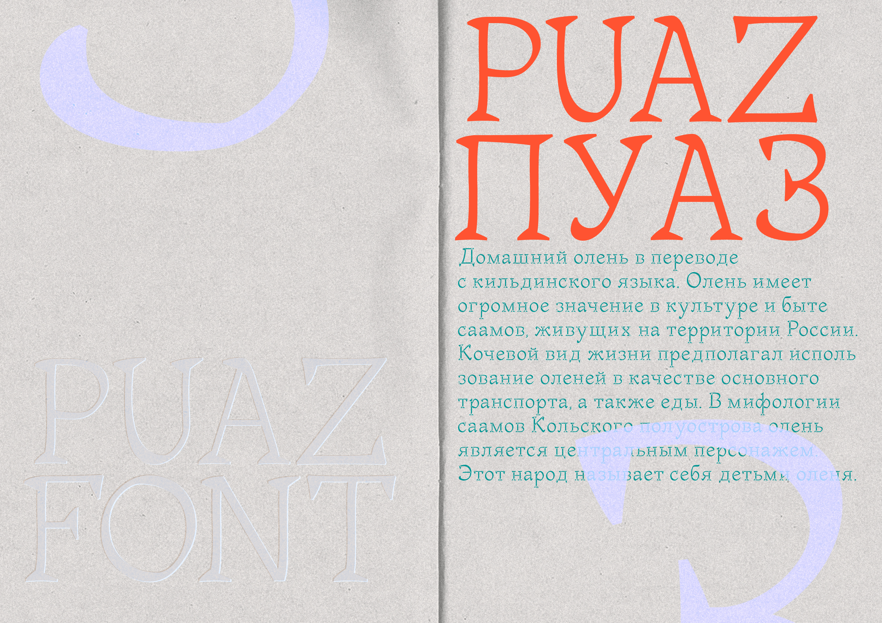
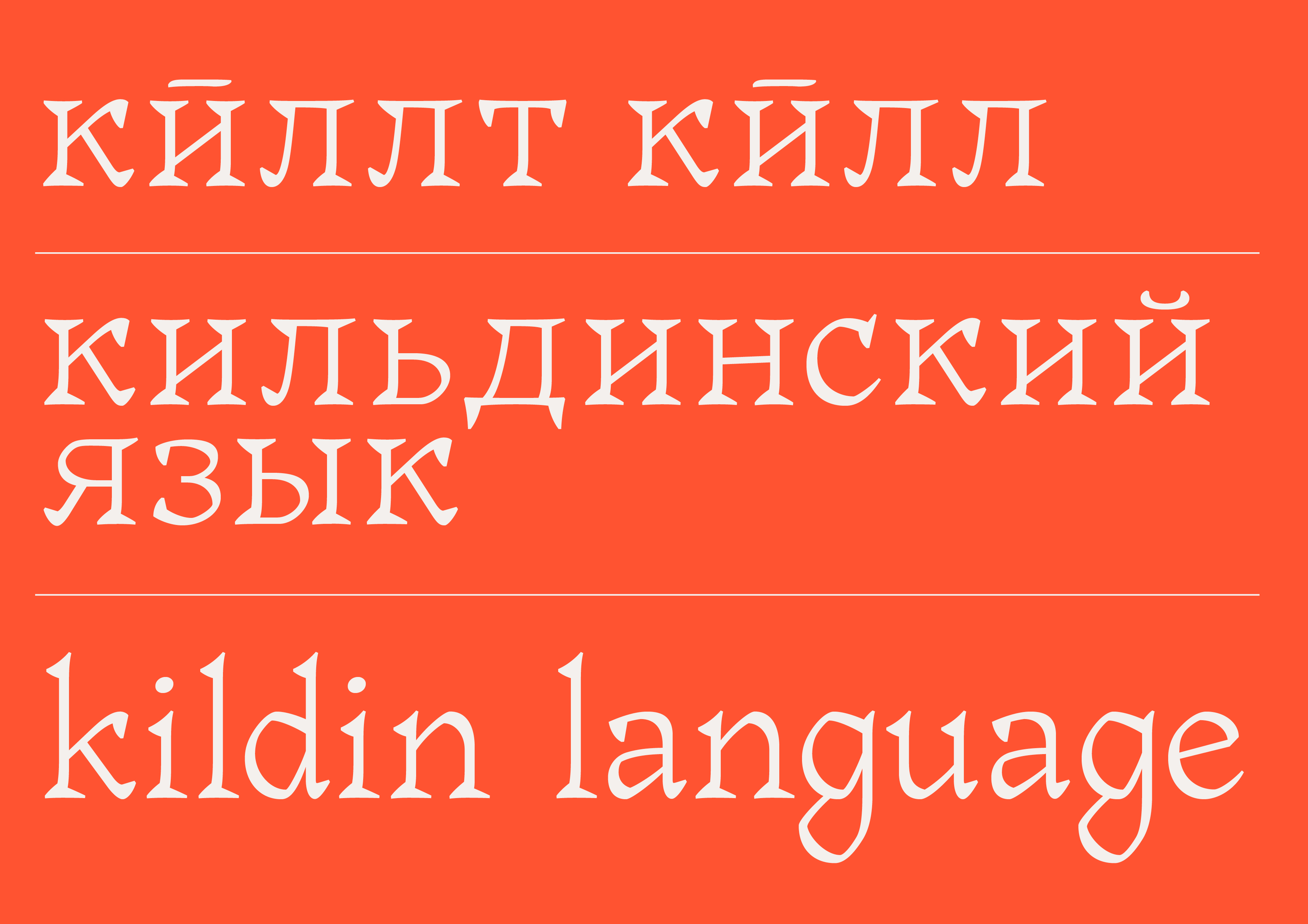
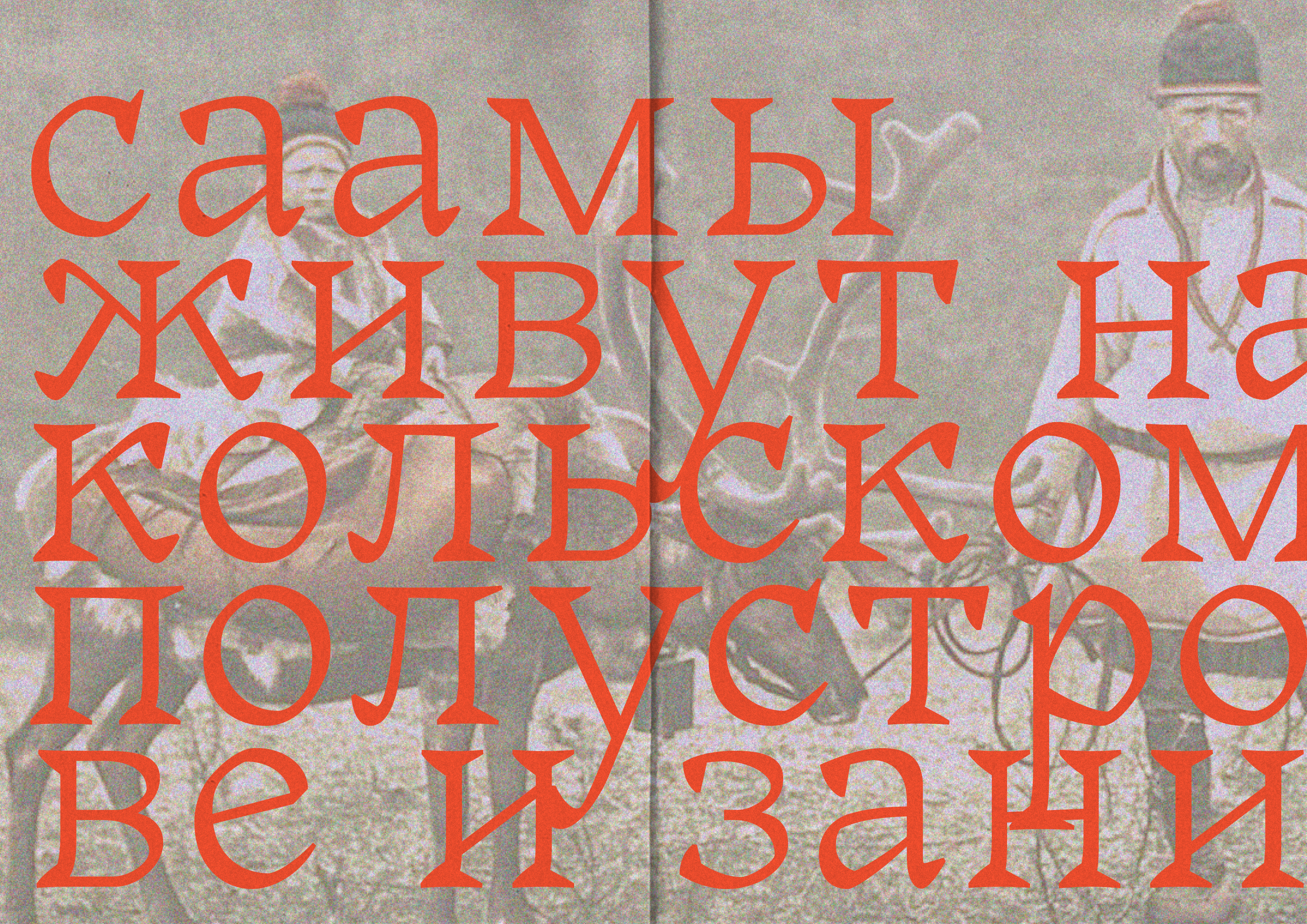
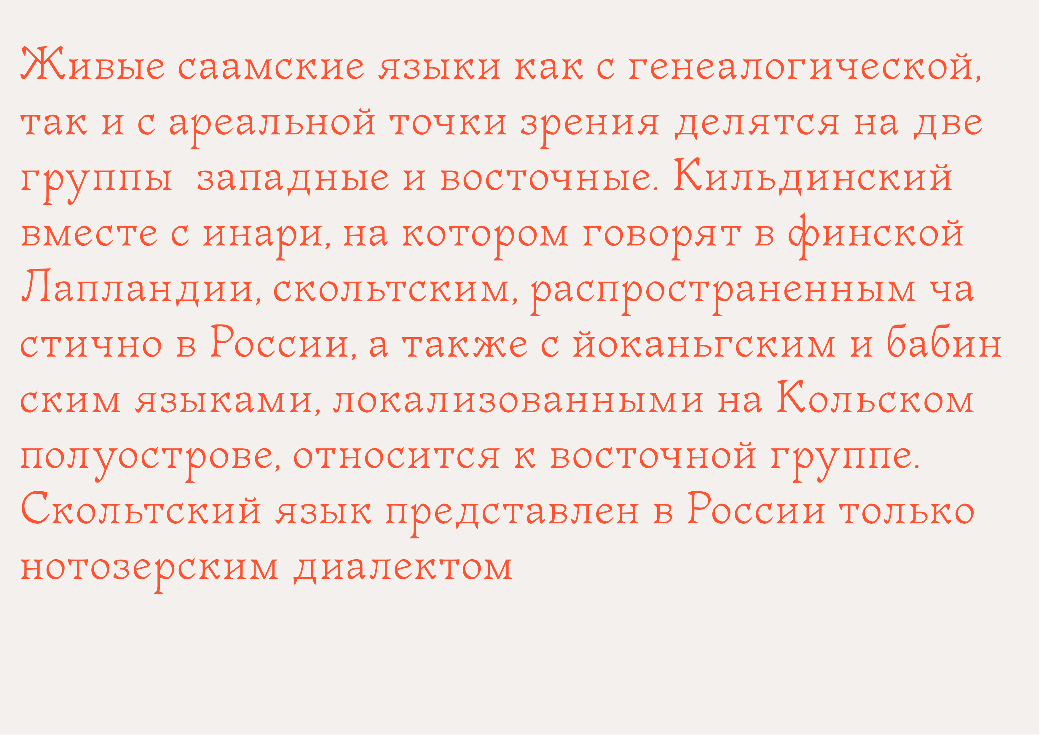
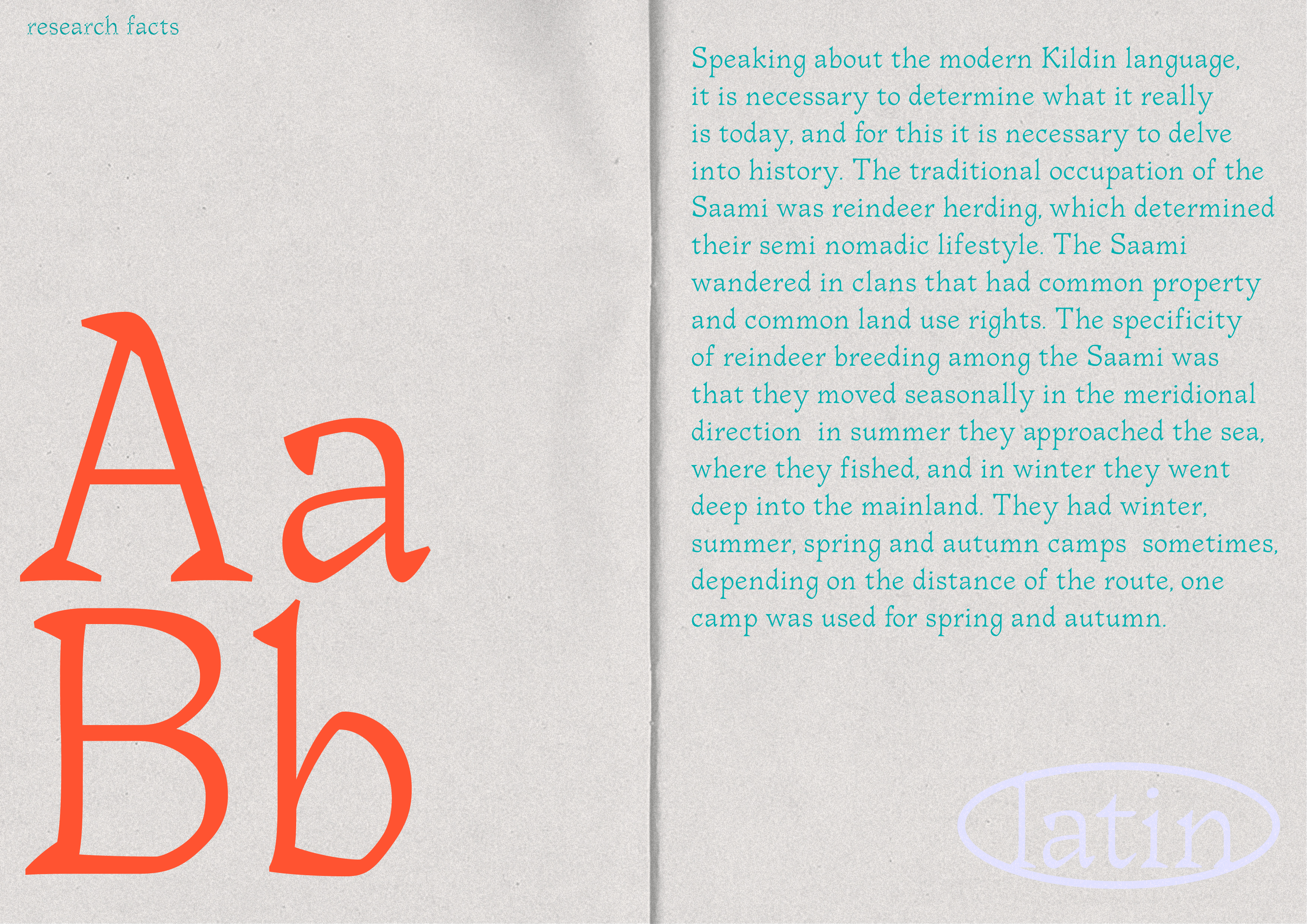
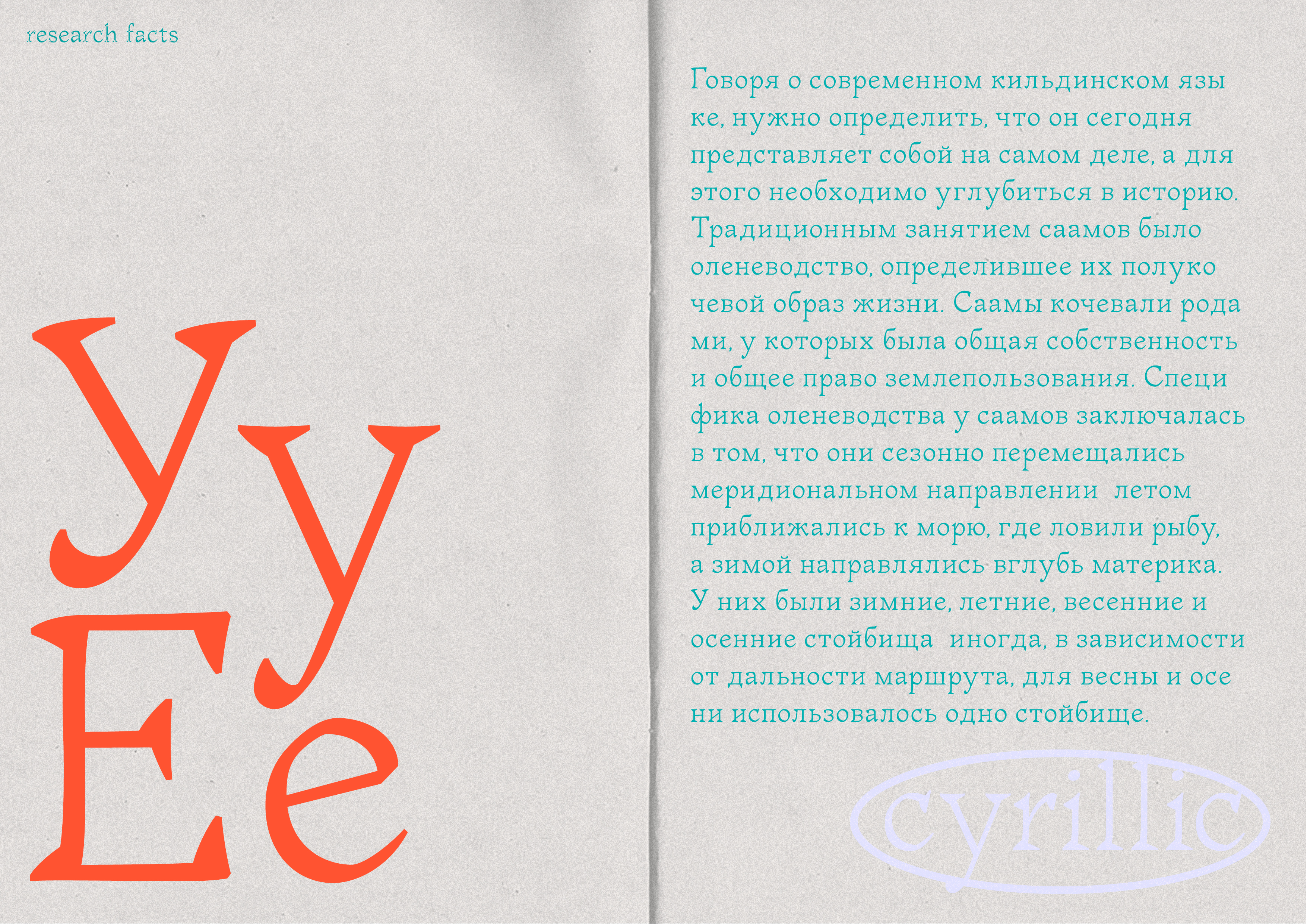
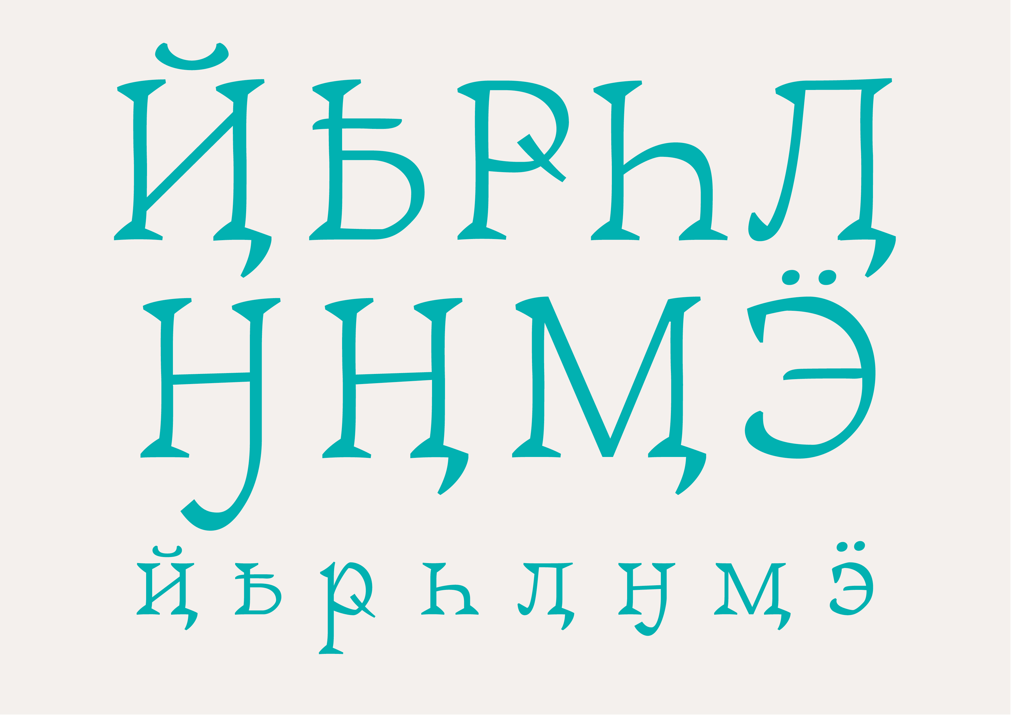
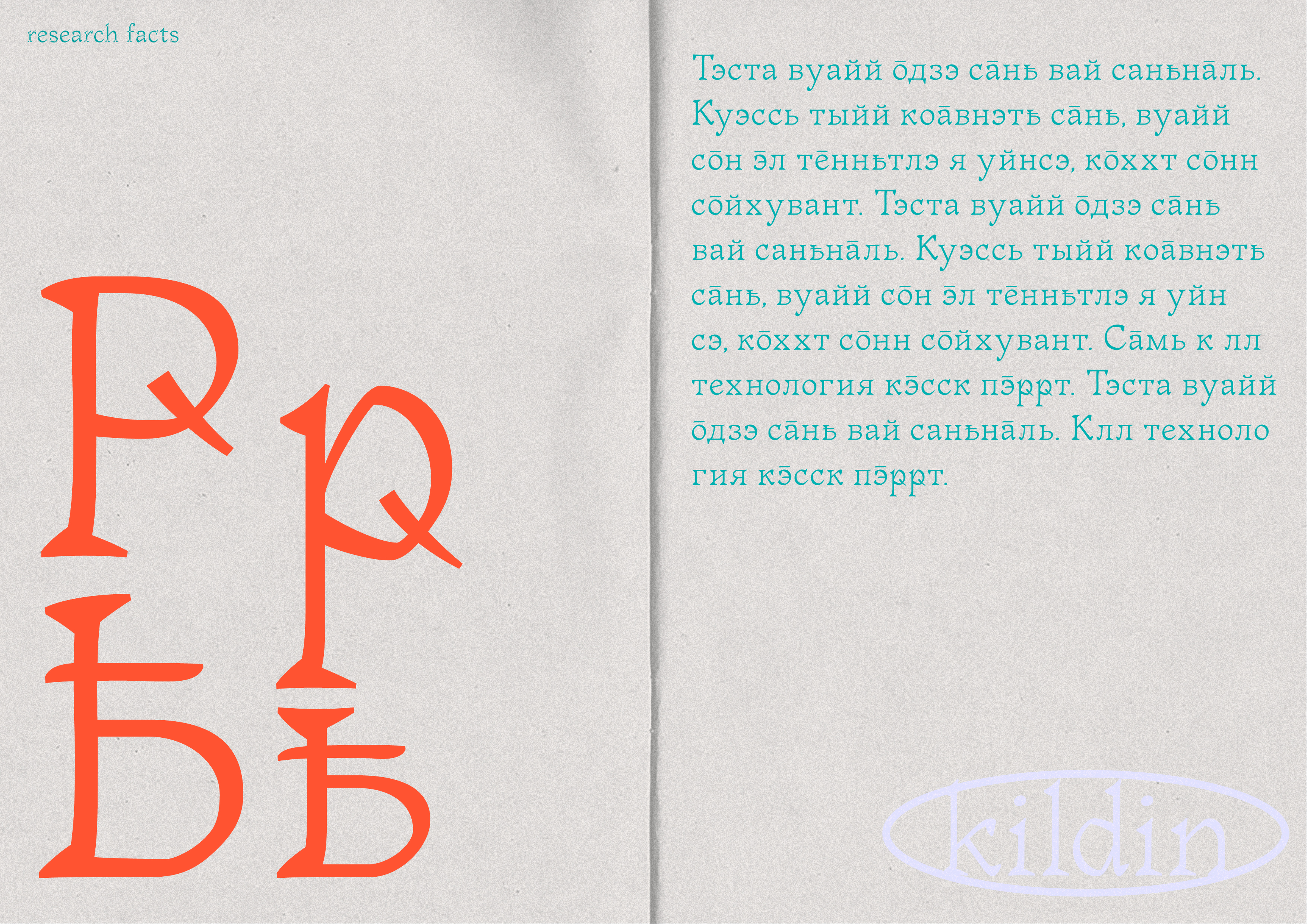
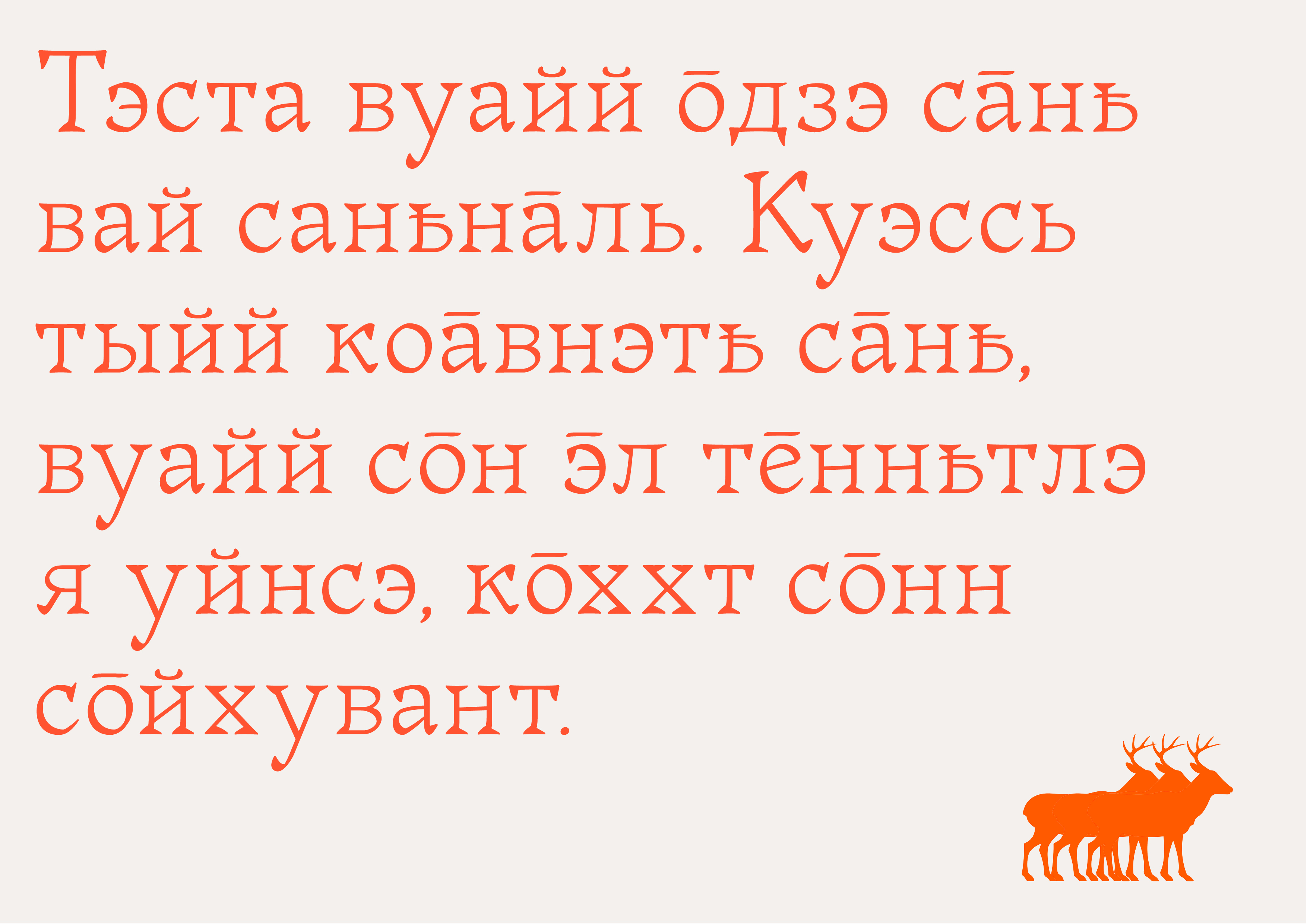
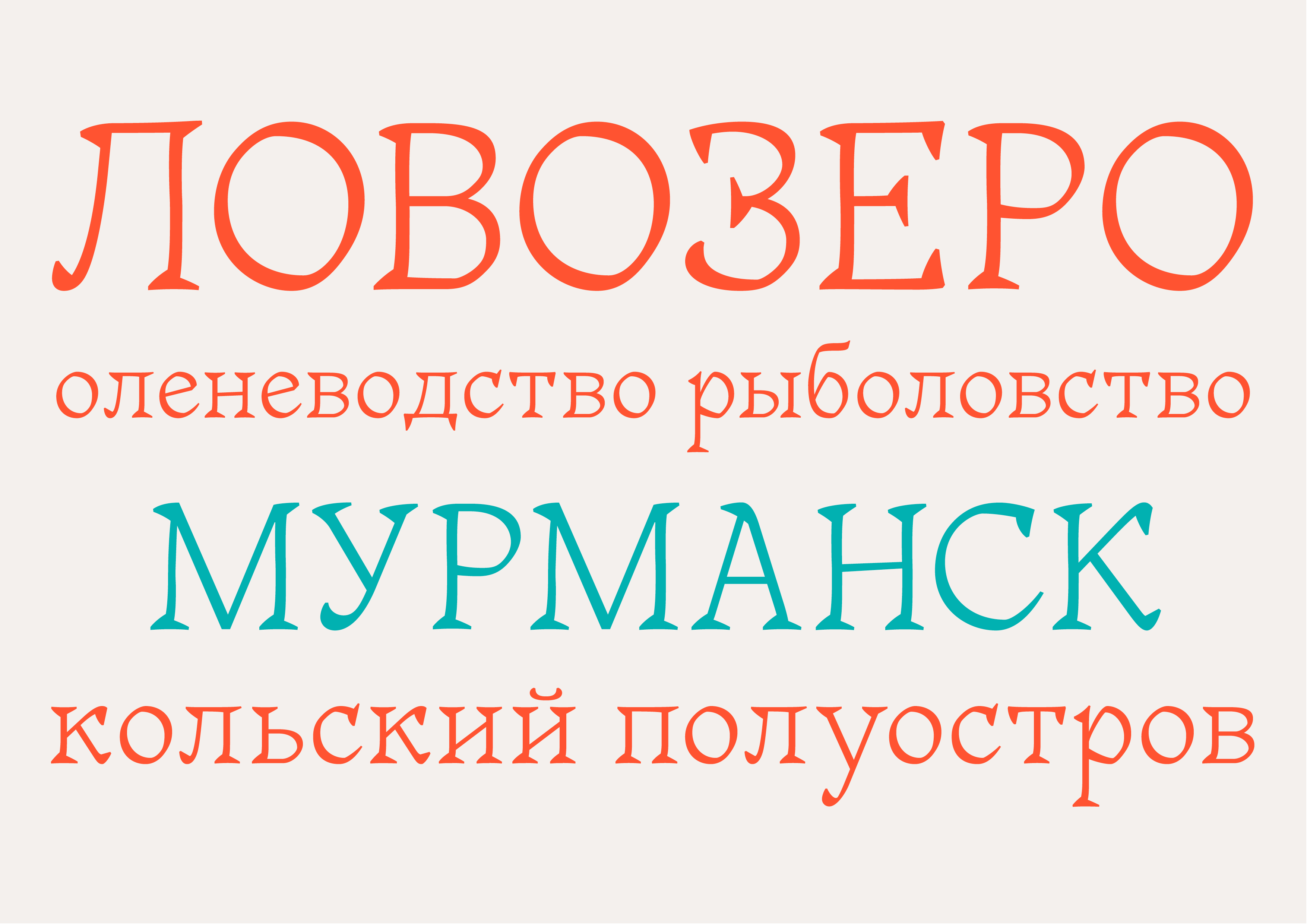
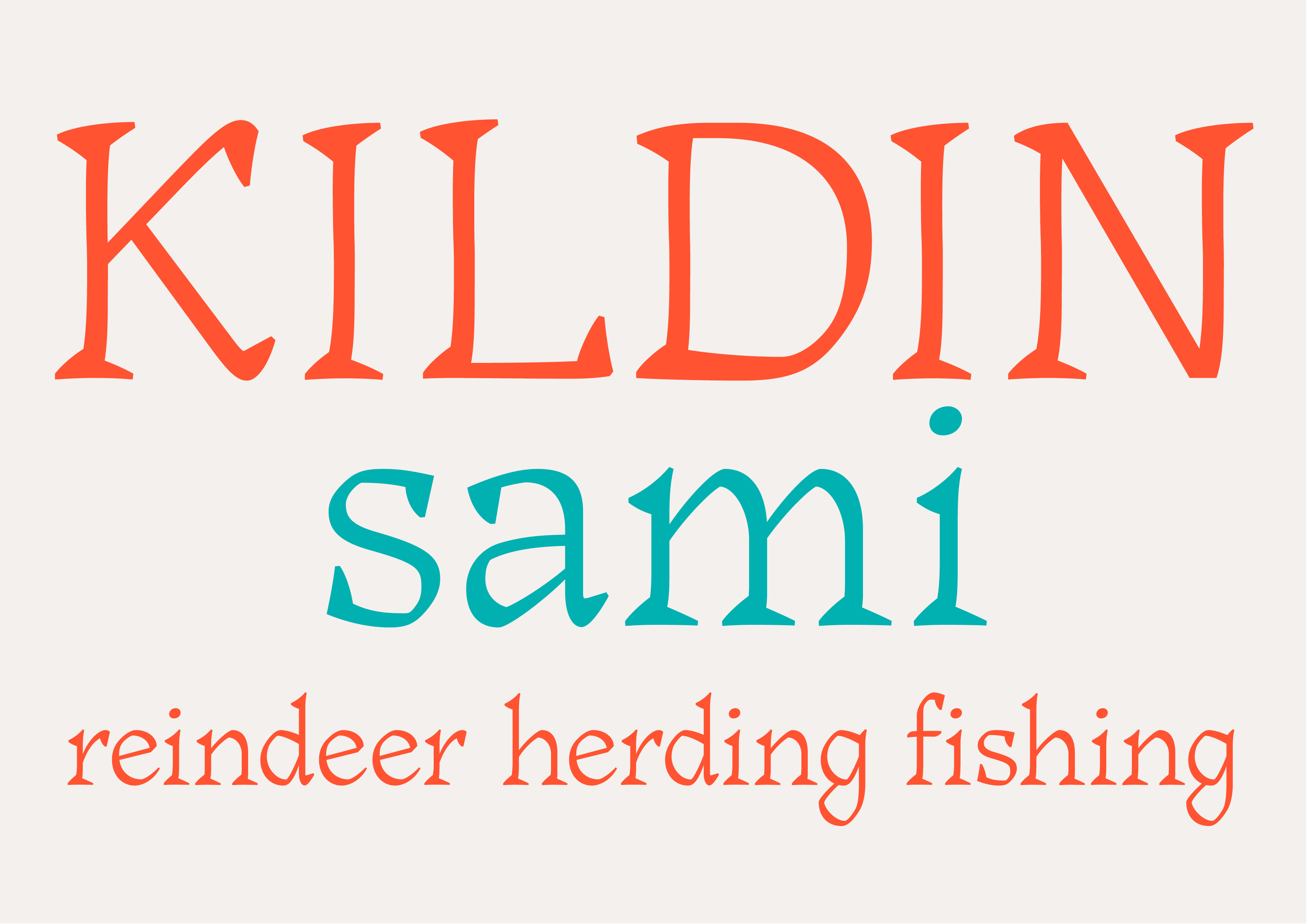
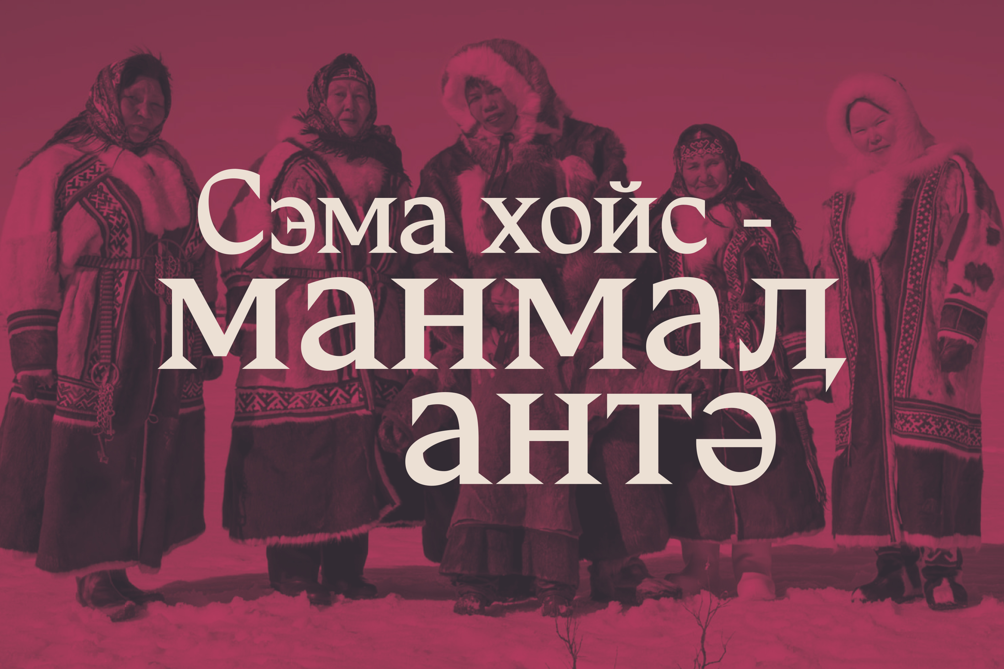
Puaz is a dynamic serif typeface, designed based on broad-nib pen strokes. The typeface was made to reflect the visual aesthetics of the Kildin Sámi people. Deer velvet antlers, shaman bubens, and the lavvu branches define the typeface’s personality, filling it with the sharp angles, adding curves and softness to the lines, and implementing dynamism and humanism to its soul. Aside from the main character set, the typeface contains the diacritics and characters of the Kildin Sámi.
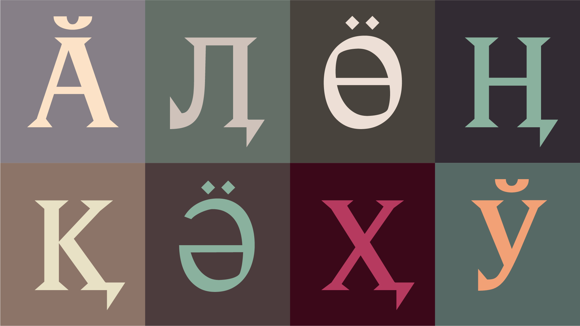
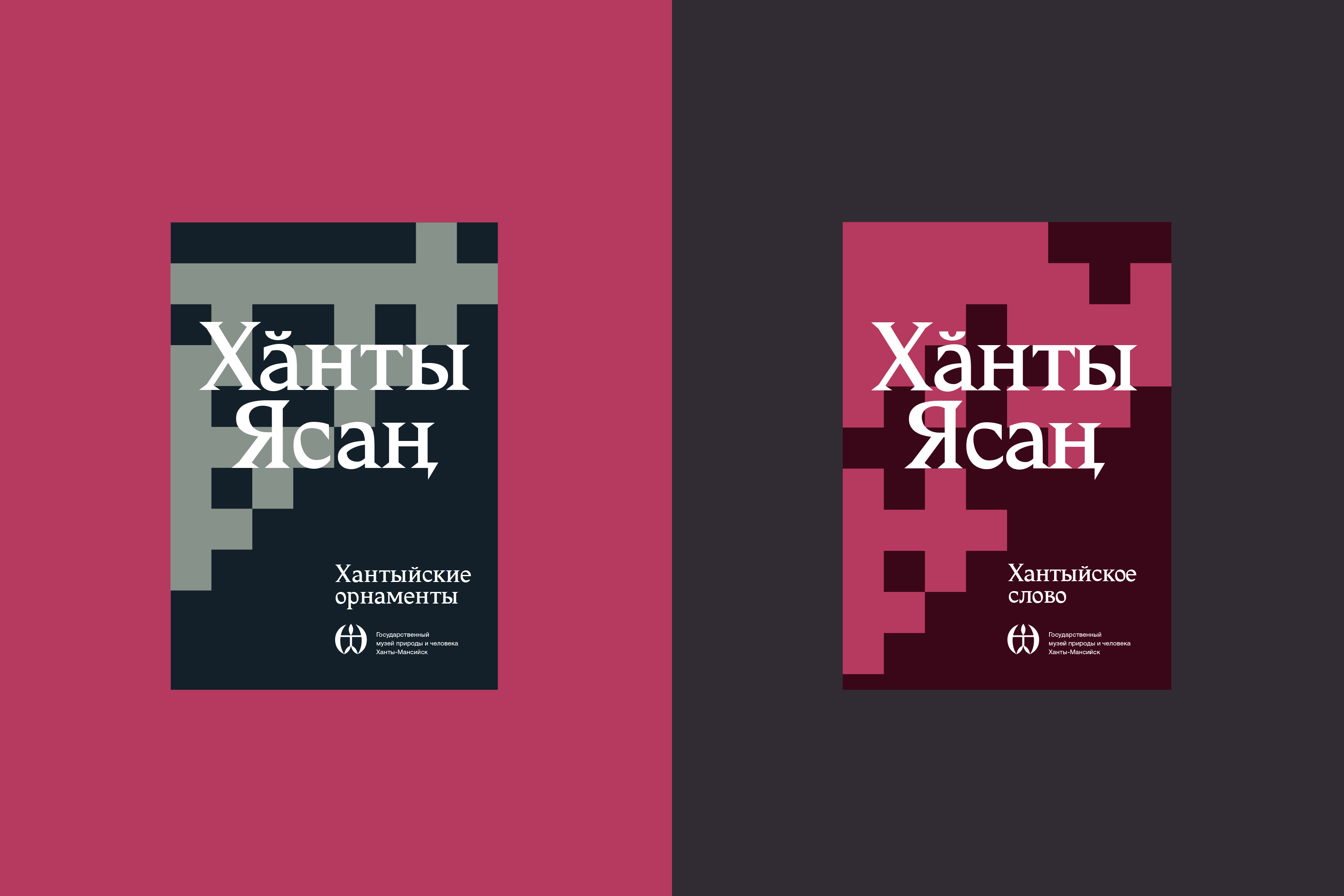
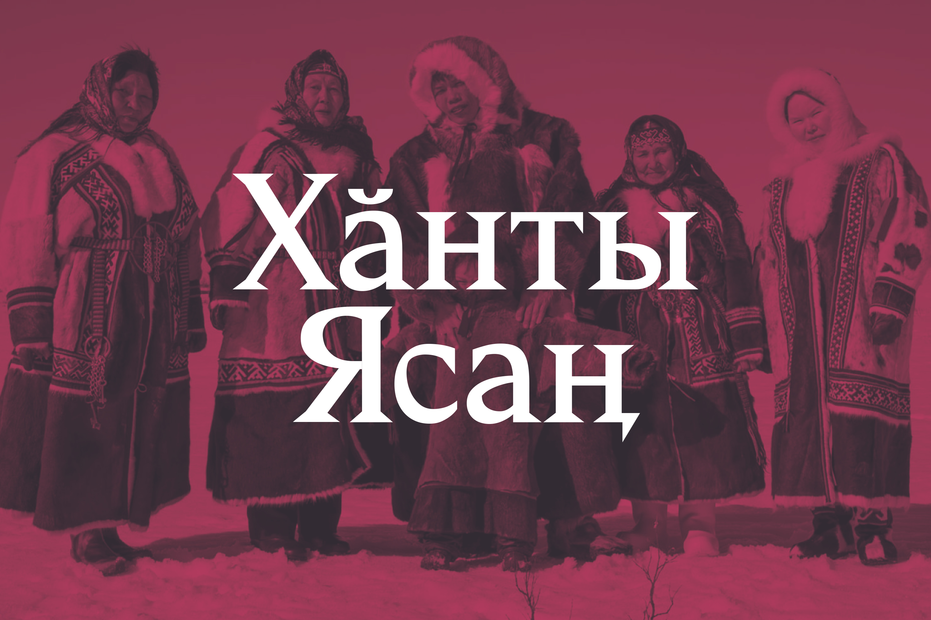
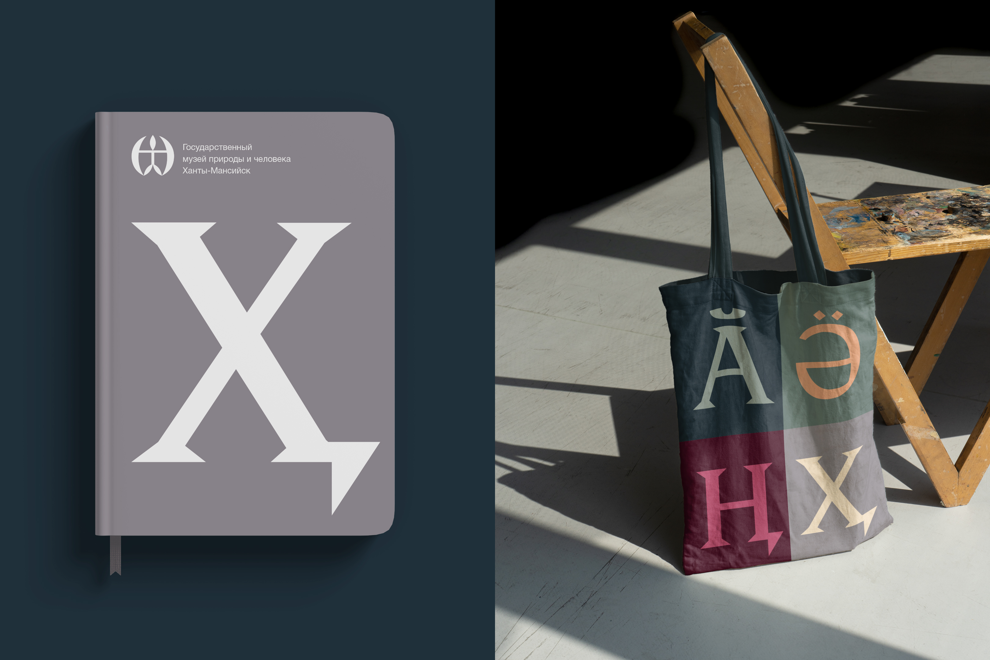
I named my typeface Hanty, for the Khanty language assigned to me for this project. I worked to make sure my typeface reflects the harsh conditions of the Khanty land and the strong character it has built in its people. It was designed to reflect the incredible richness of nature, the power of ancient traditions, and the firmness of the Khanty beliefs.
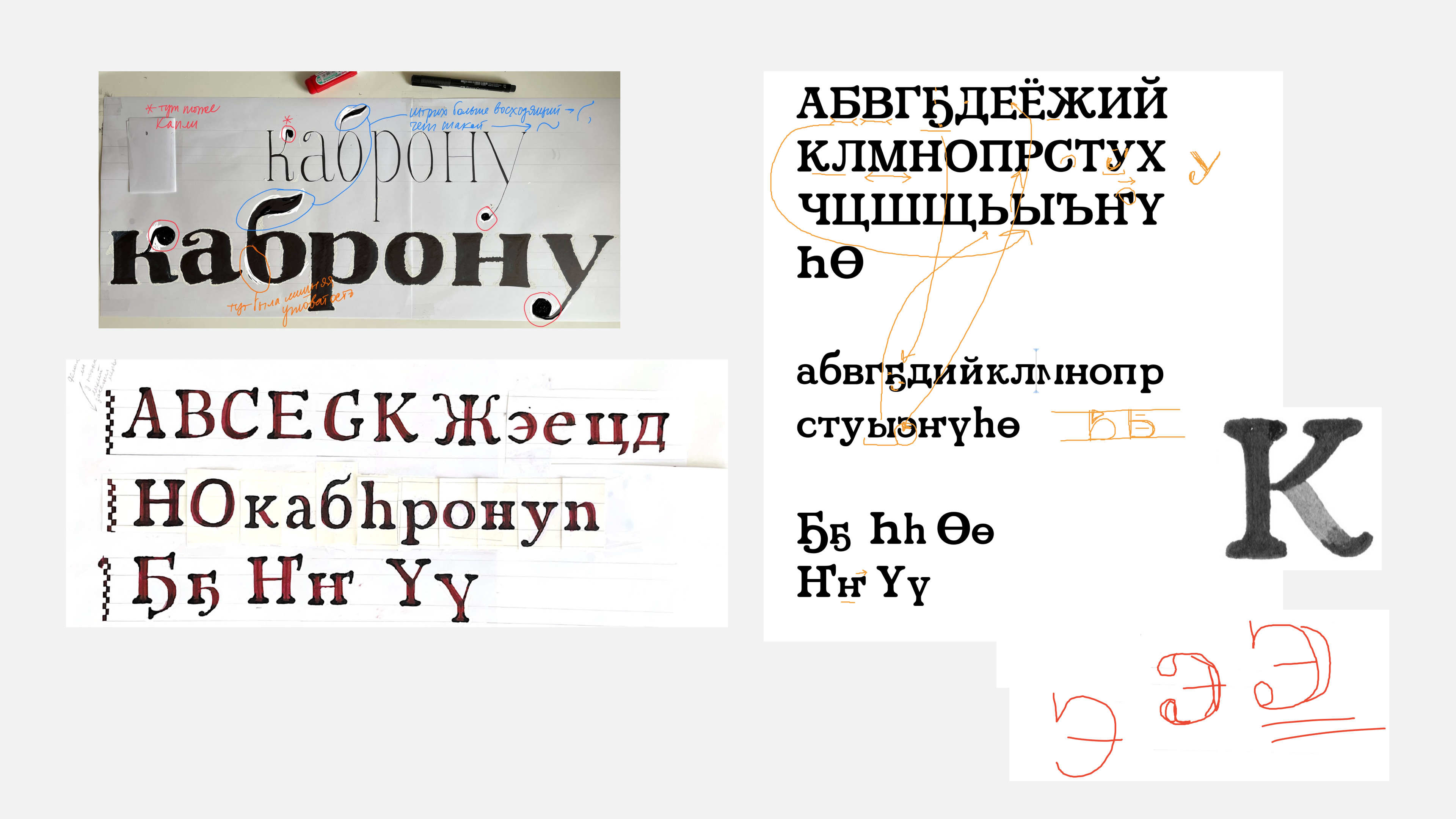
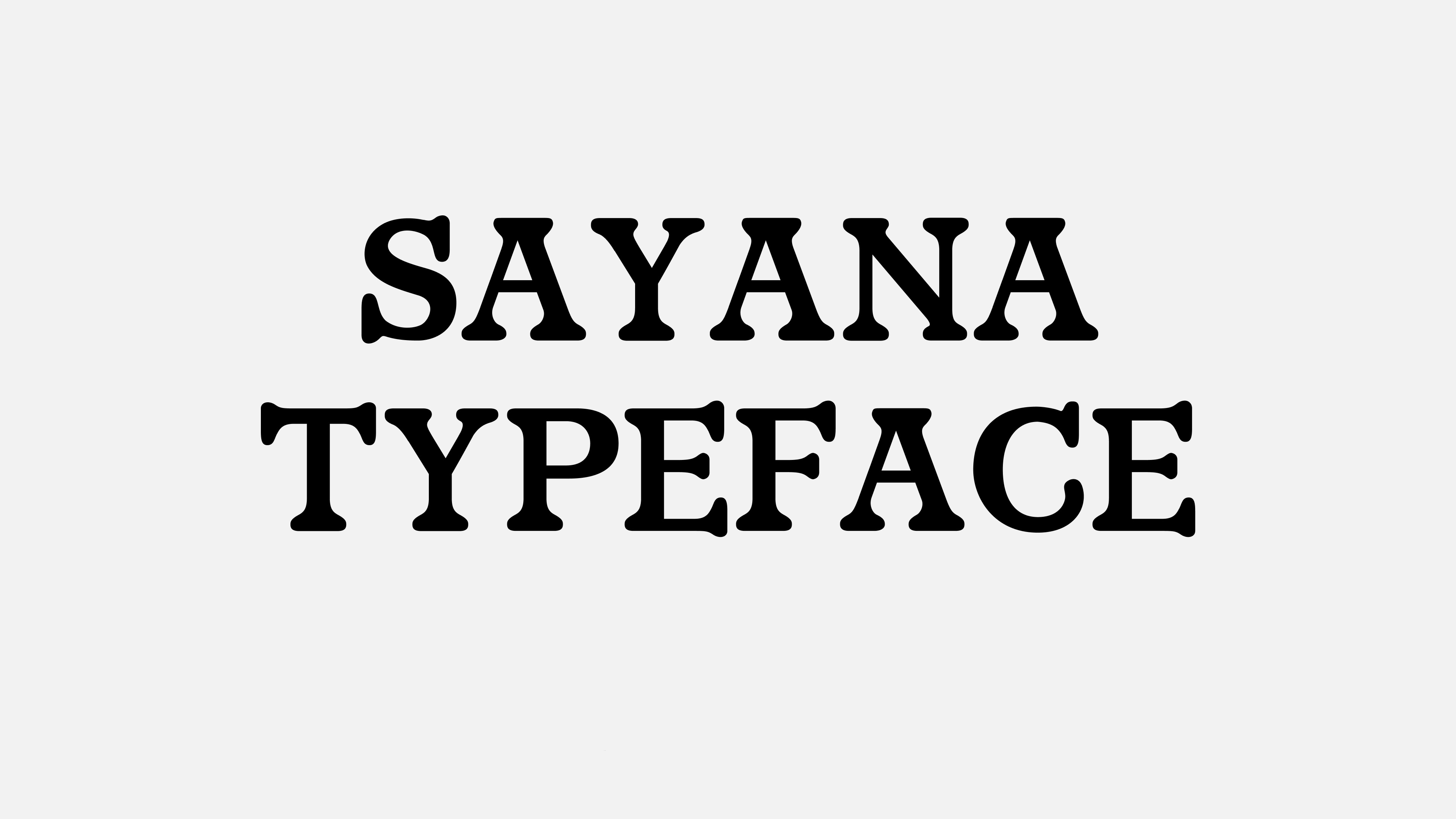
Yakut is my mother tongue and the language of the people of Yakutia, the Republic of Sakha, located in the far east of Russia. I named this typeface Sayana, and its look was inspired by the 70-90’s Yakut book illustrations. The logic and type construction were formed during the calligraphy phase, yet the typeface got its final character during the digitization process. The resulting typeface demonstrates soft and rounded serifs, and with additional effort, the serifs’ shapes seem alive and upward-inclined.
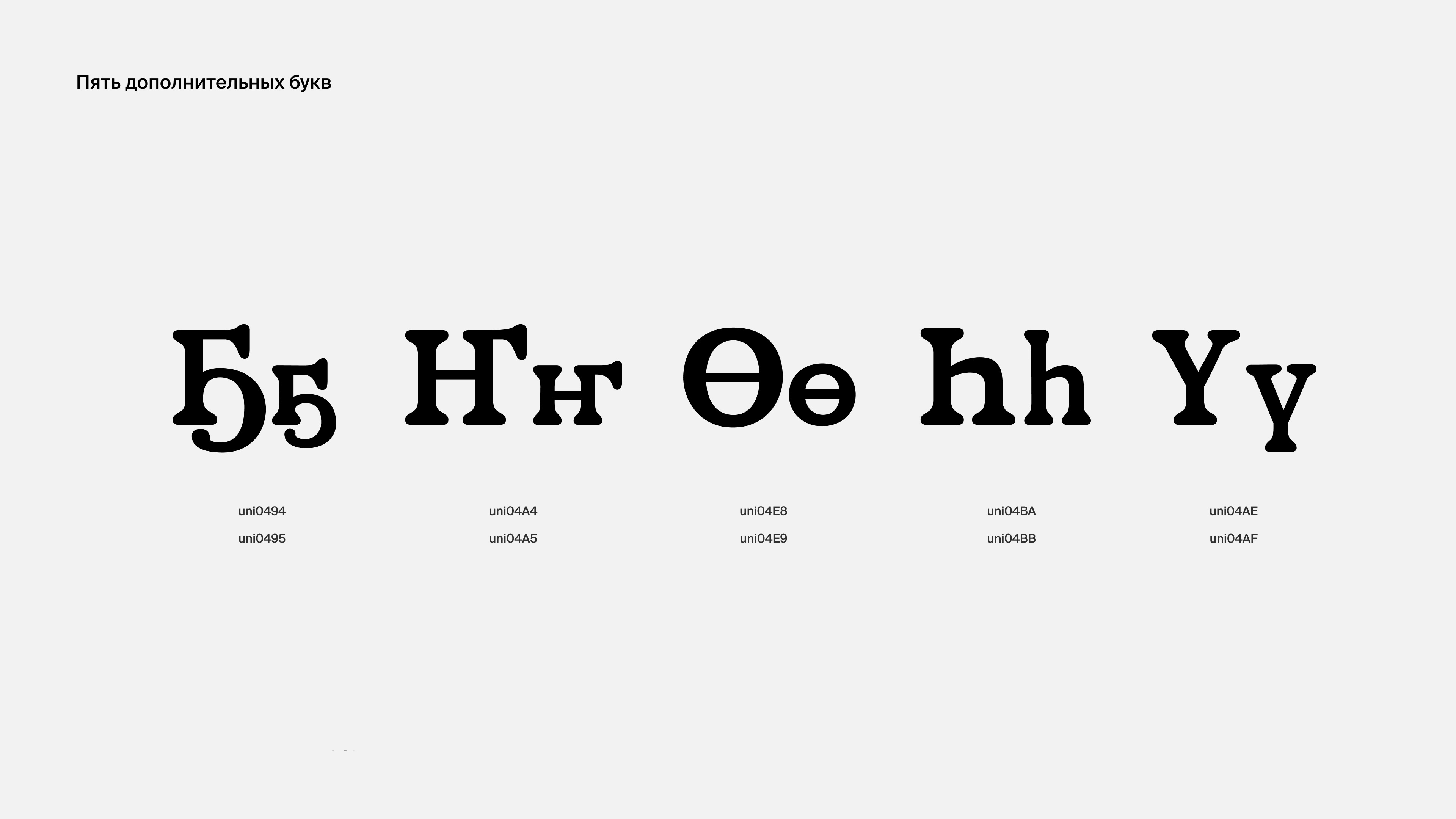
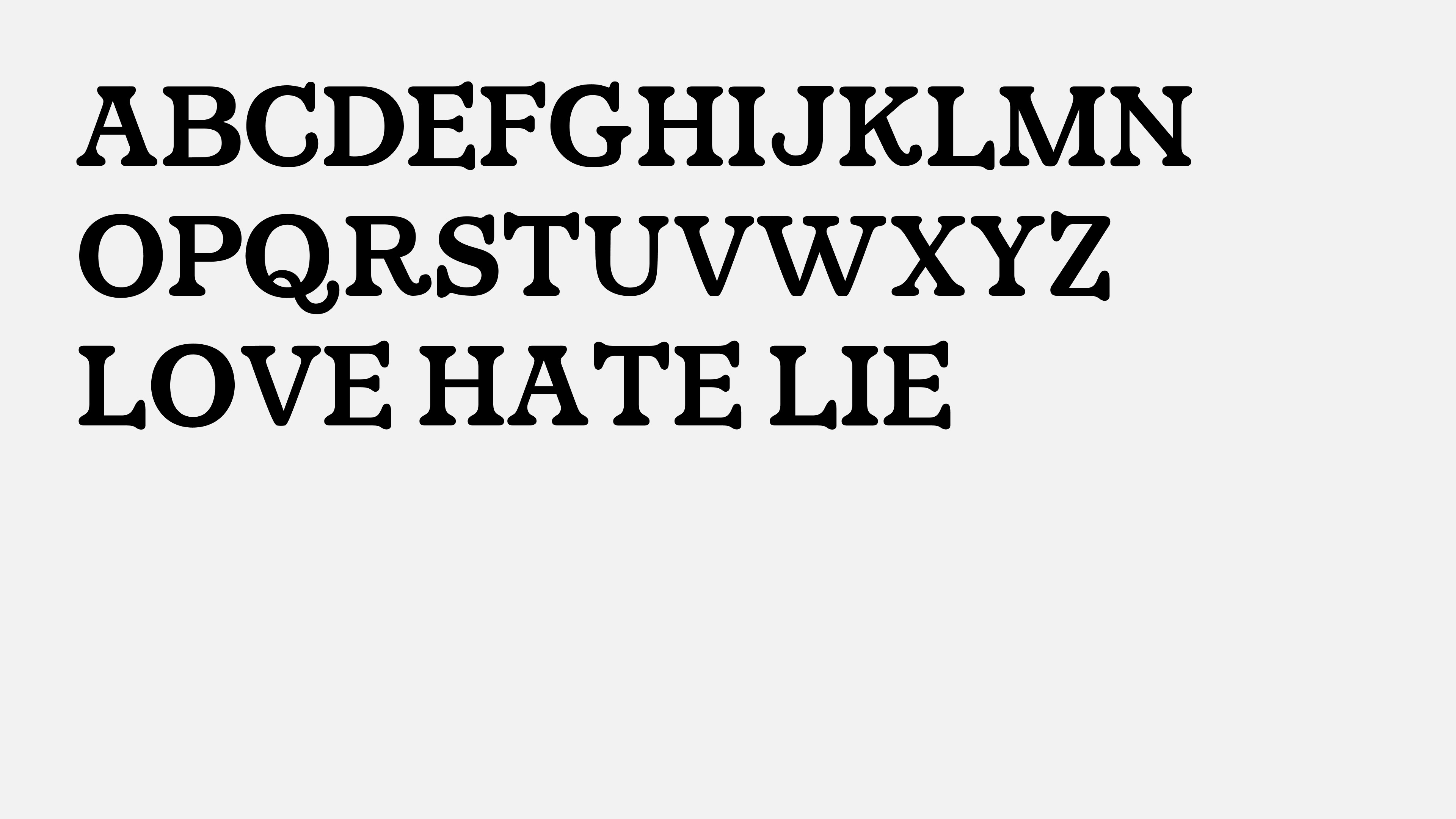
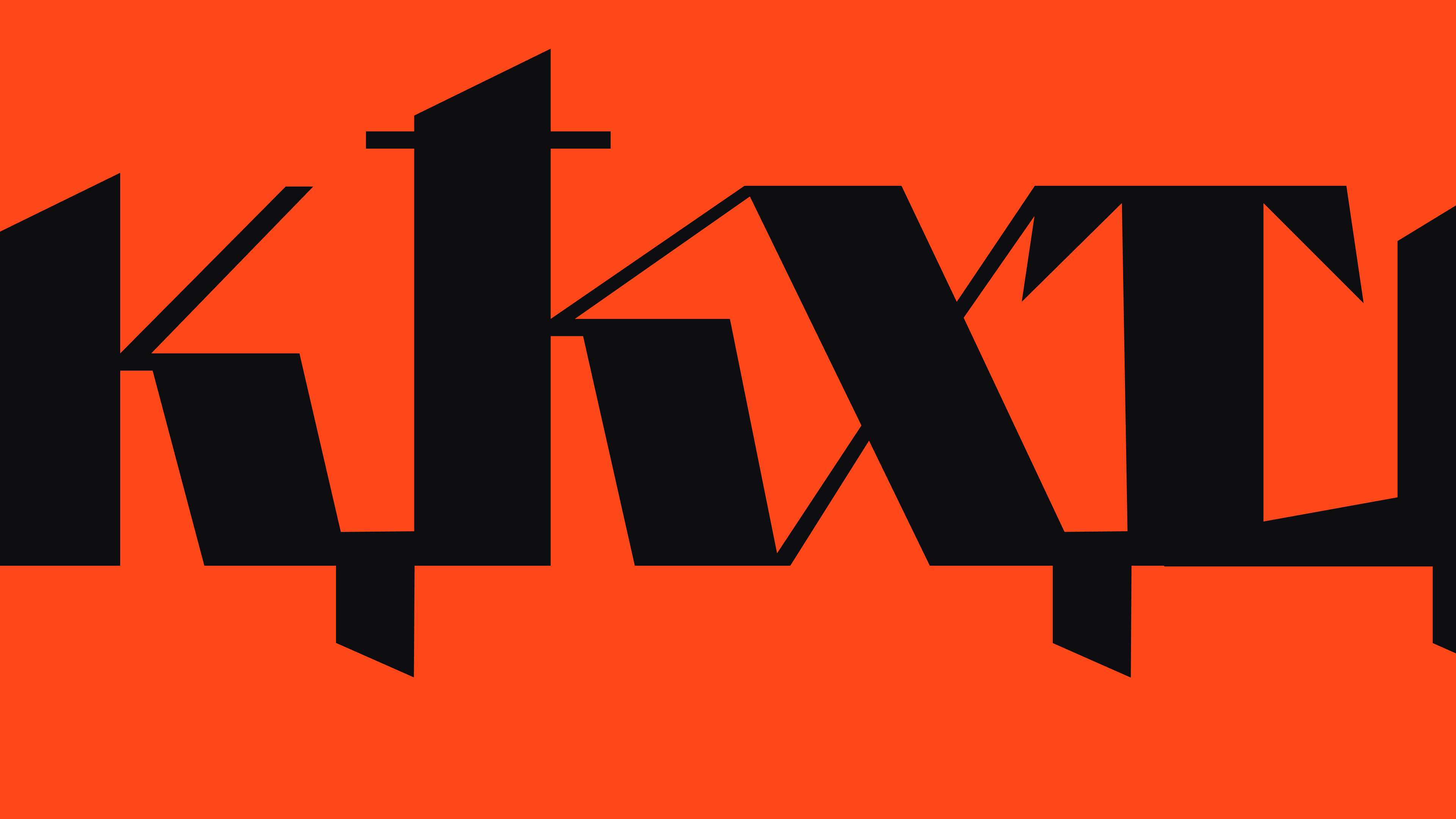
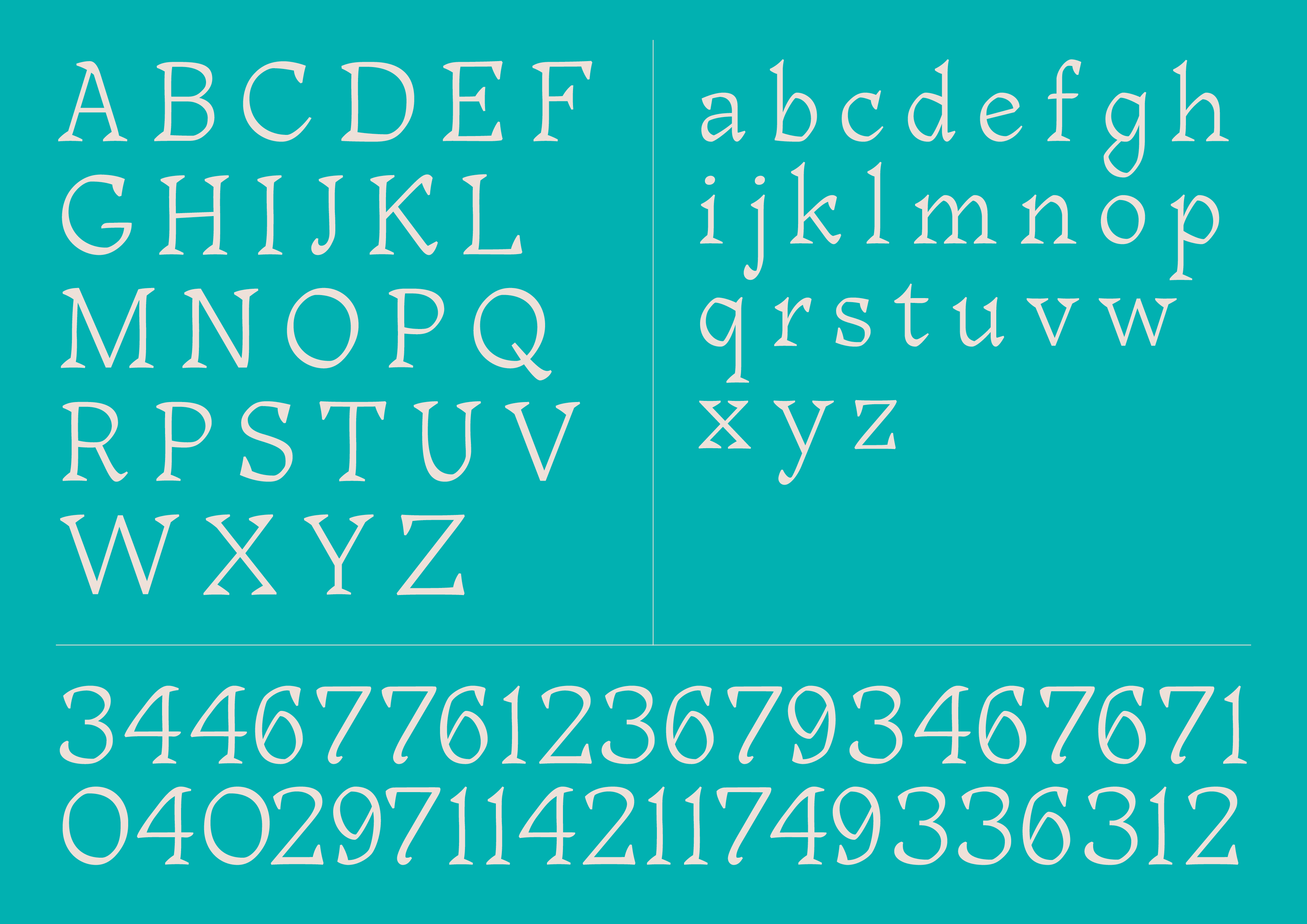
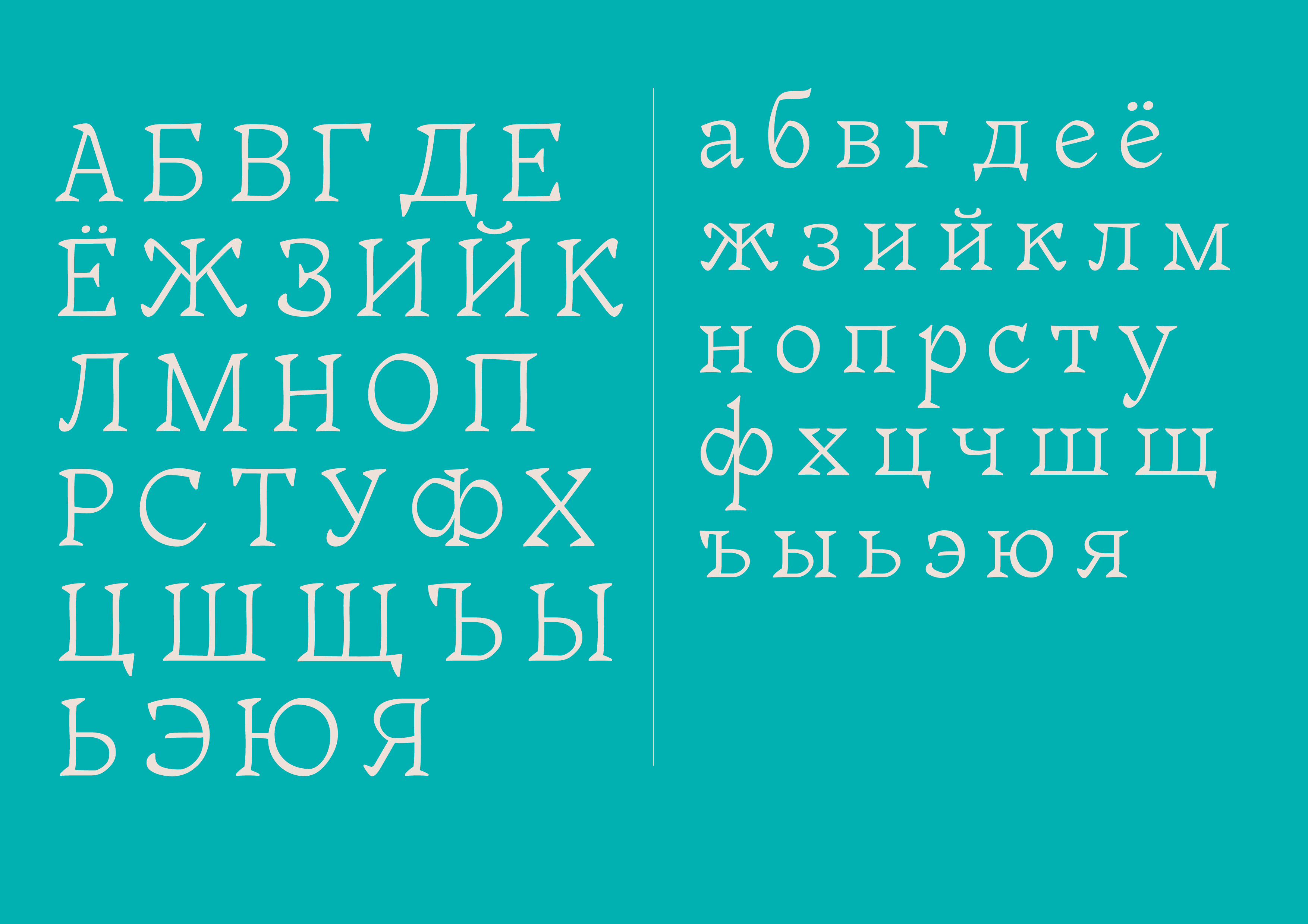
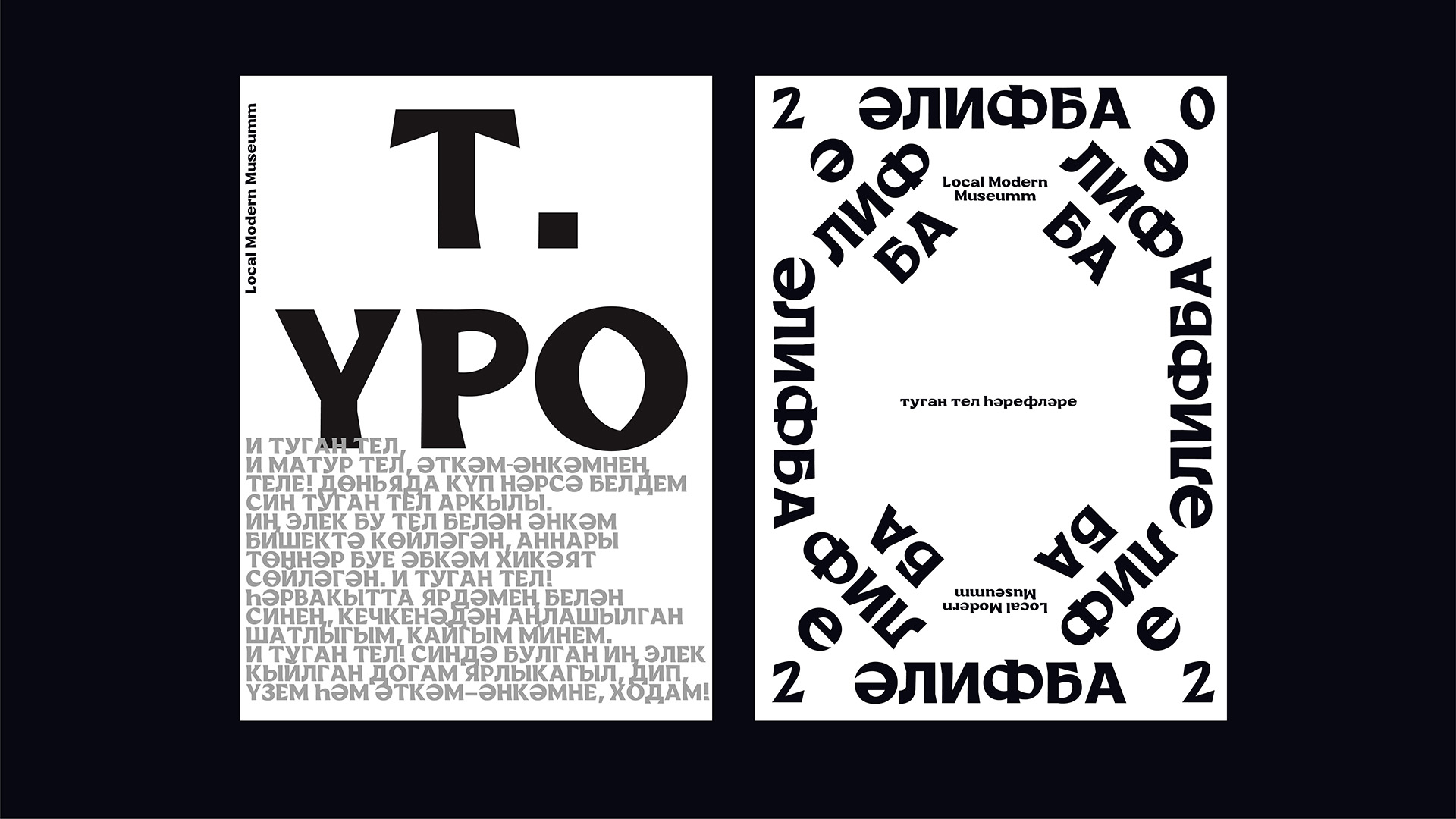
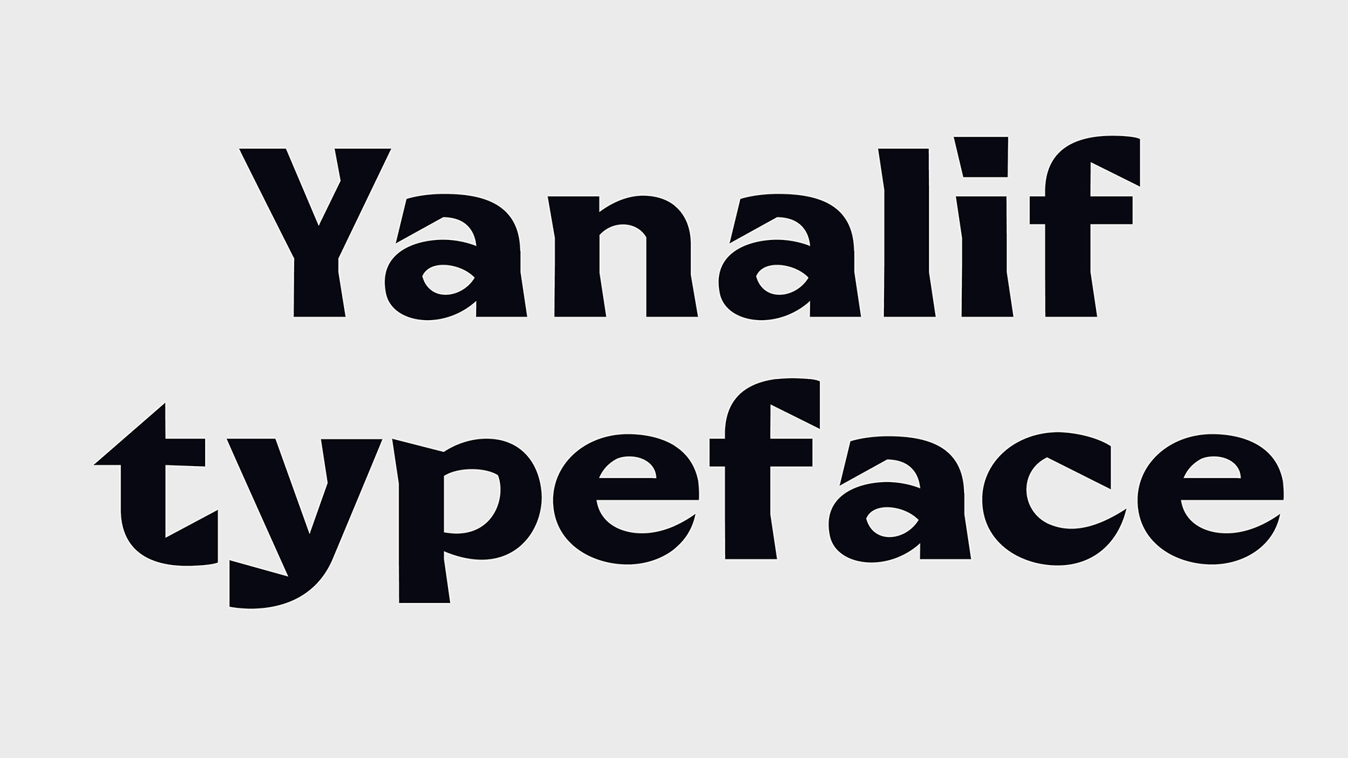
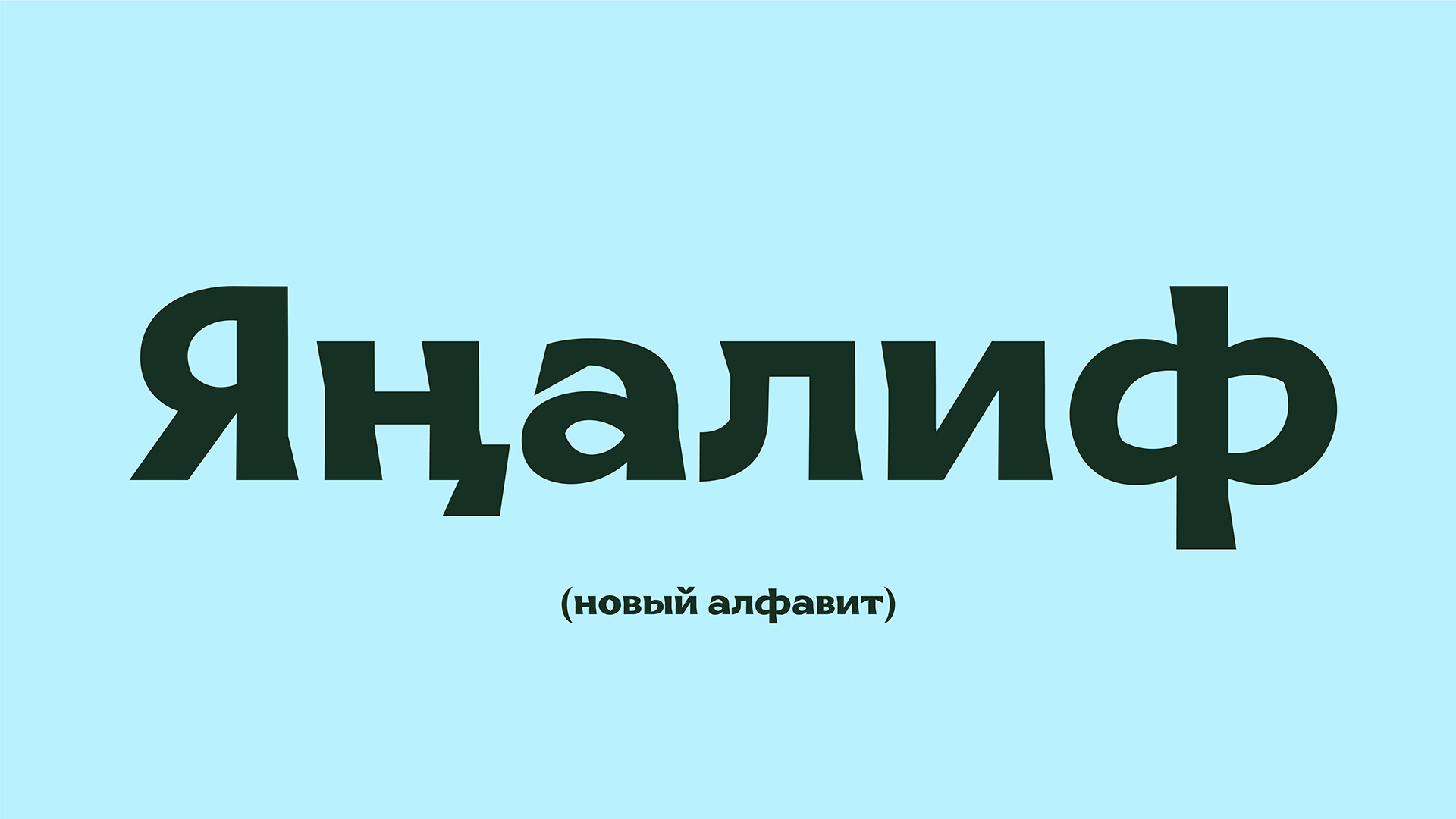
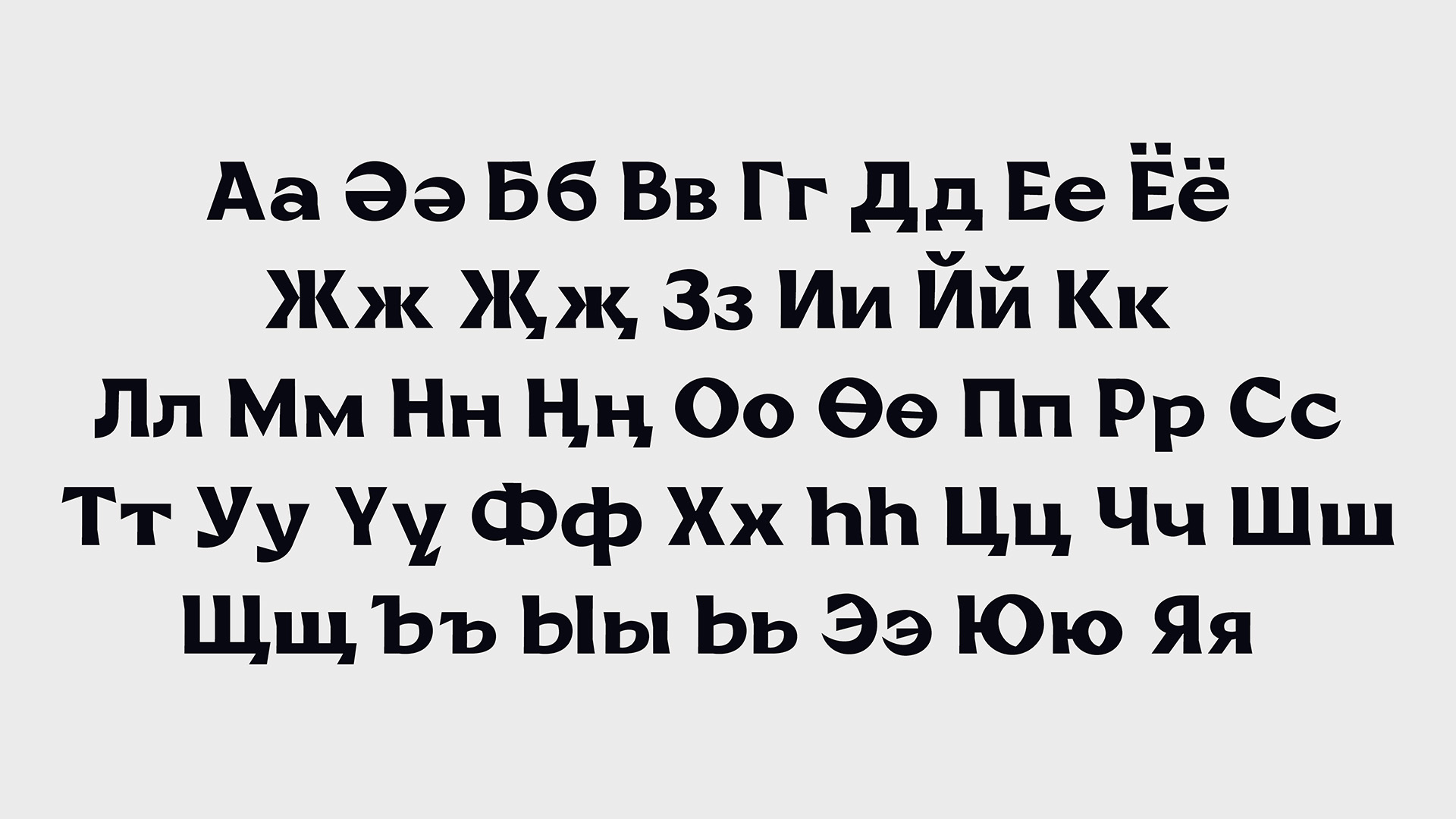
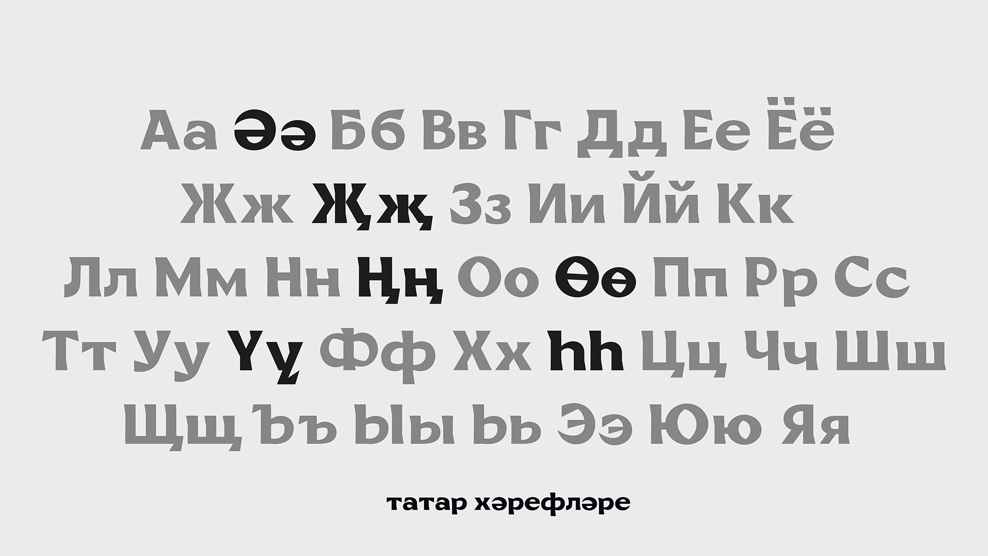
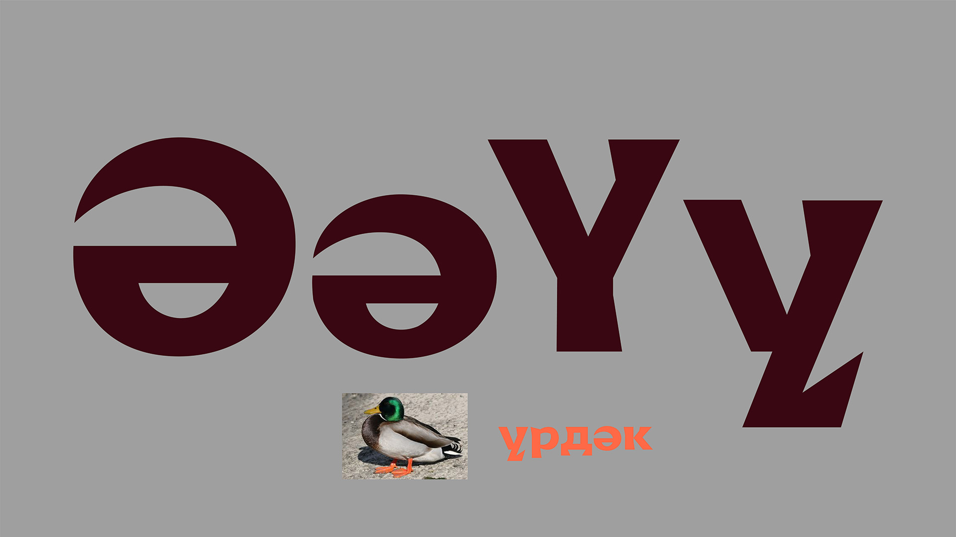
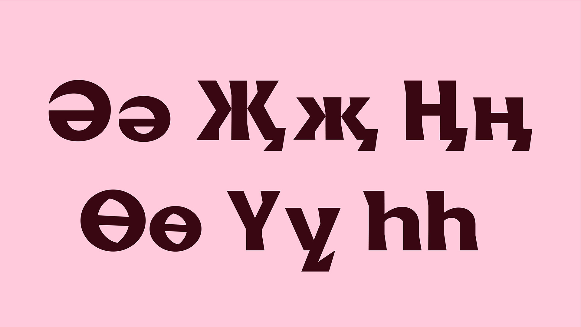
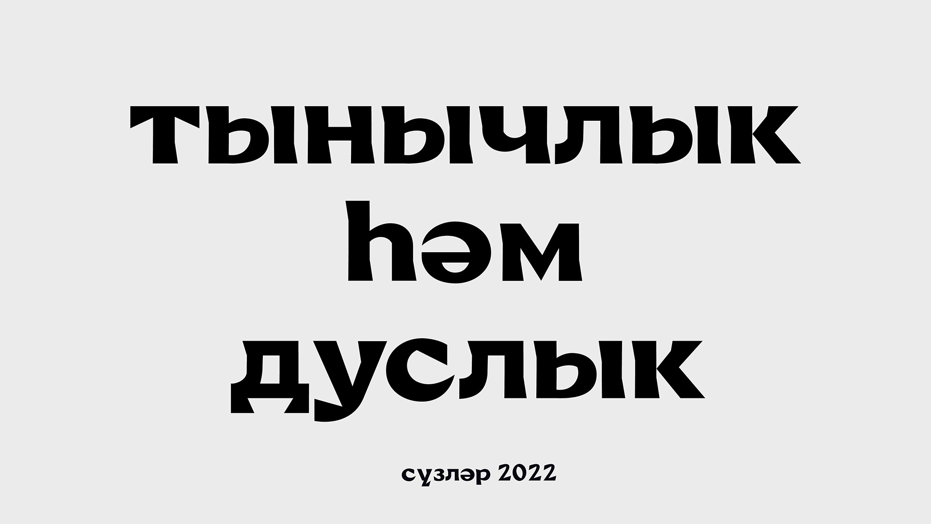
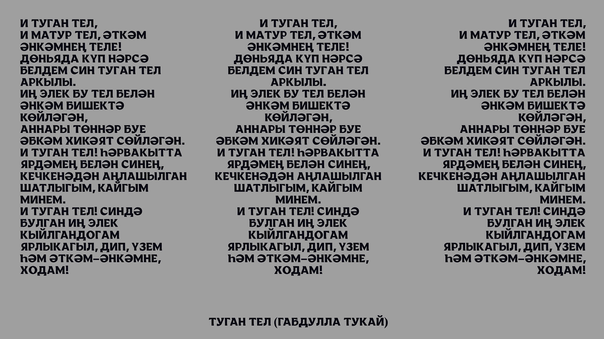
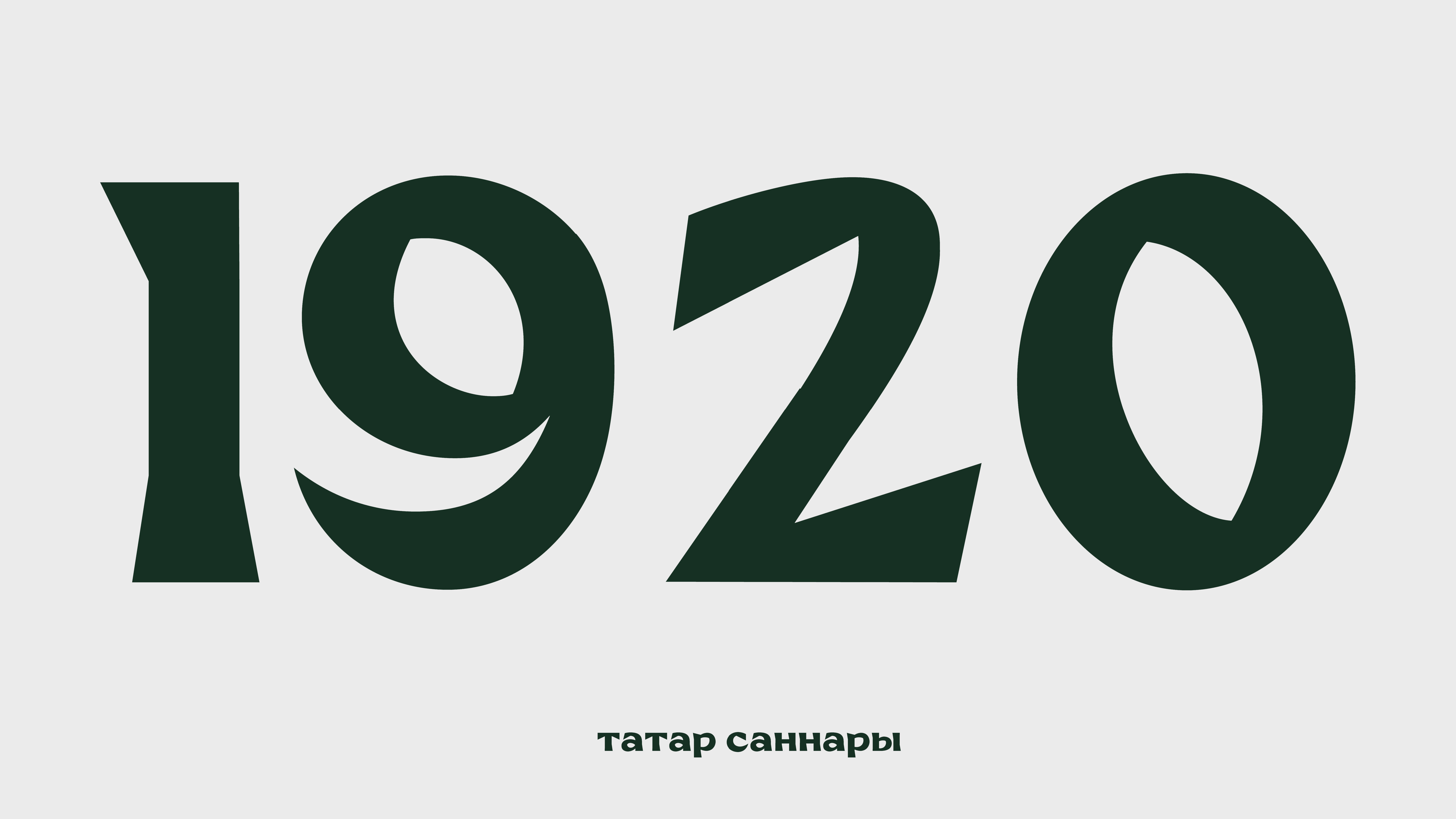
My mother tongue is Tatar, which is why I took a personal approach rather than cultural or religious when designing this font. I did not focus on Islam or the Tatar ethnic visual elements, such as the ornaments or the Arabic script. I looked into my own experience and feelings for this project. The atmosphere of my Tatar family and culture, the beauty of literature, the unique, colorful, and saturated textiles, the music, and life dynamics were the key elements in this project. Yanalif typeface (“Yañalif” in tatar—new alphabet). YT is a transitional serif with a smaller stroke contrast, dynamic ovals, and catchy serifed endings, presented in both Latin and Cyrillic alphabets with a set of additional characters. This font is made to work equally well for movable type and display typefaces. It does get even more unique and distinctive once its uppercase comes to play.
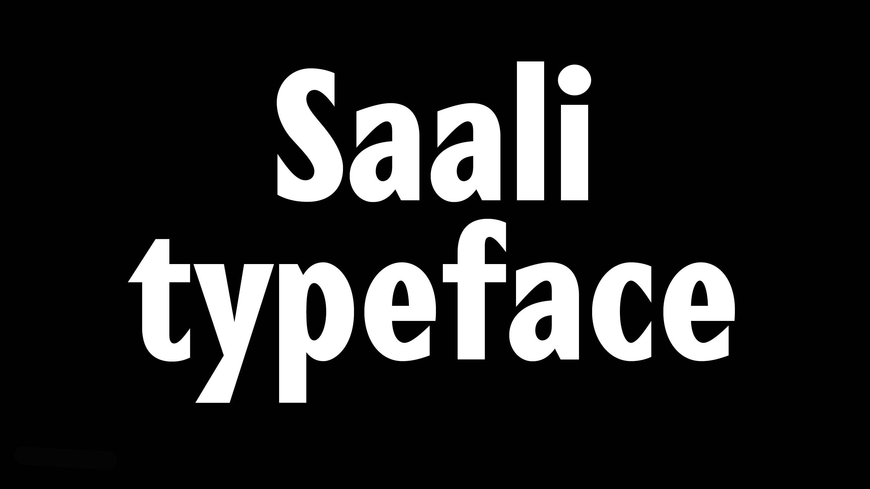
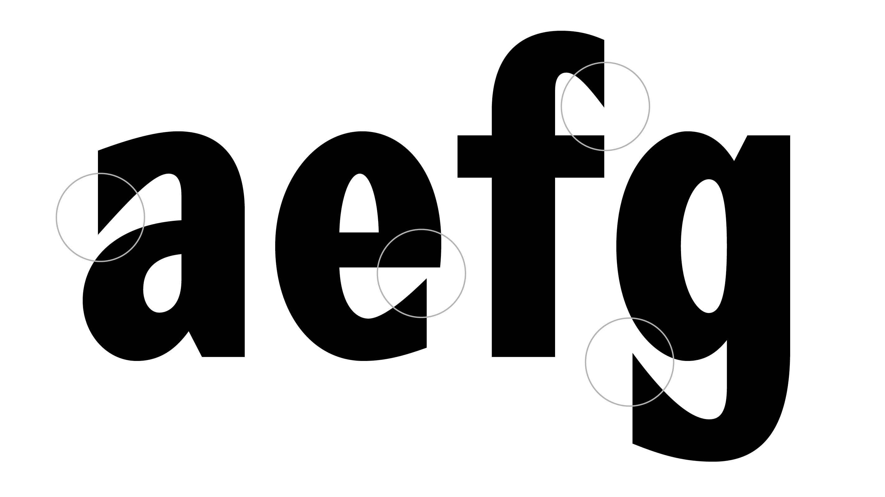
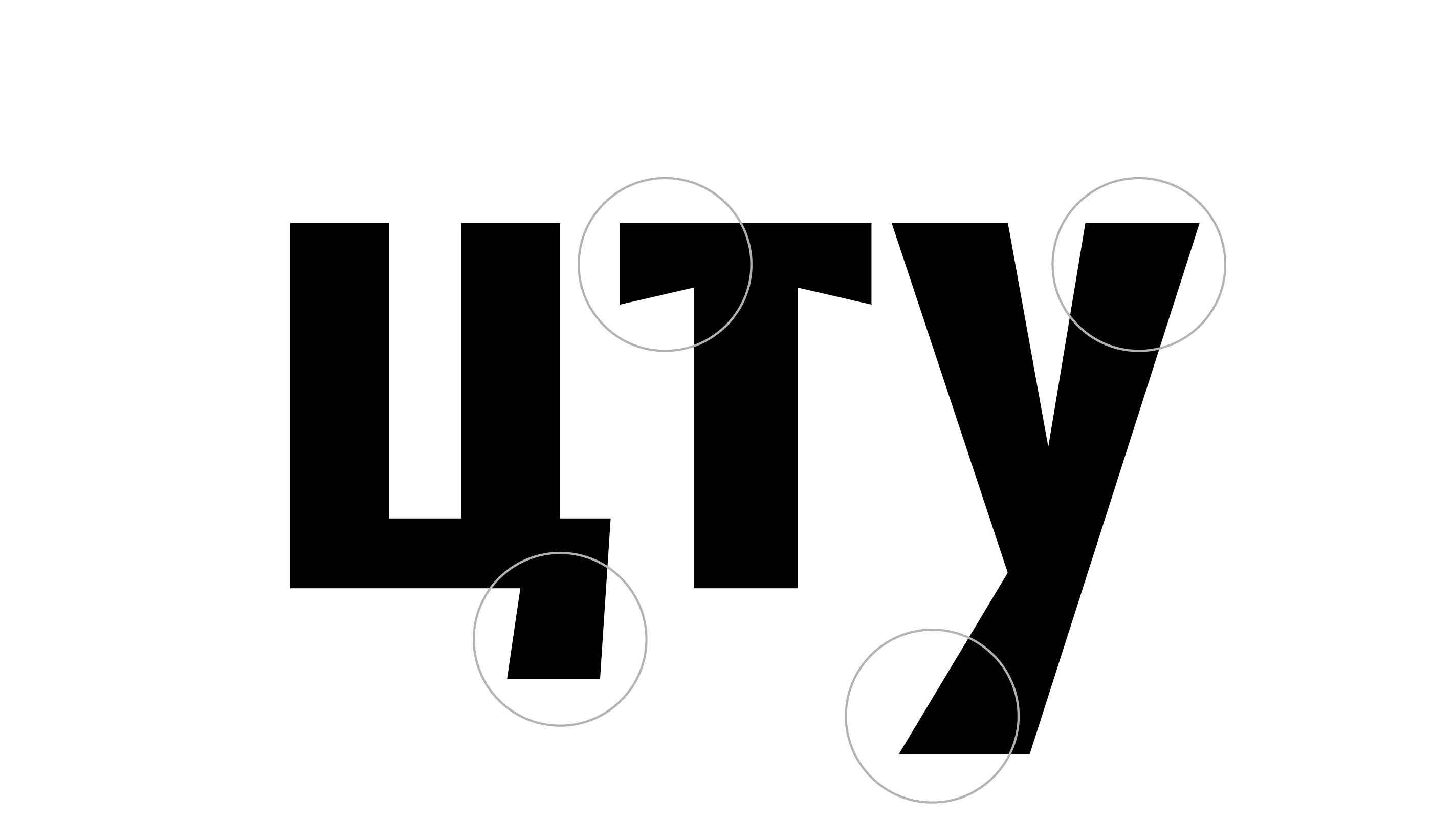
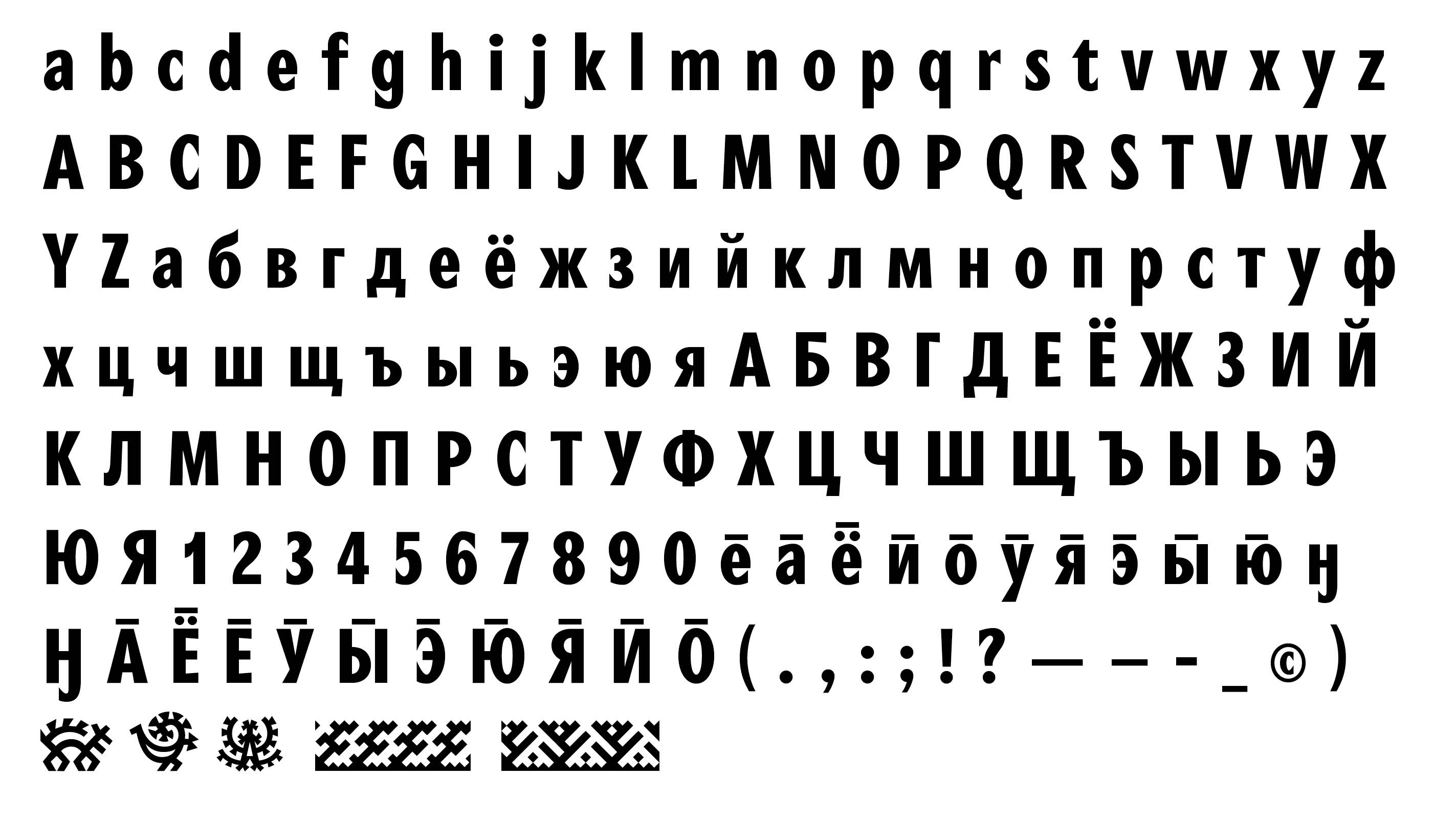
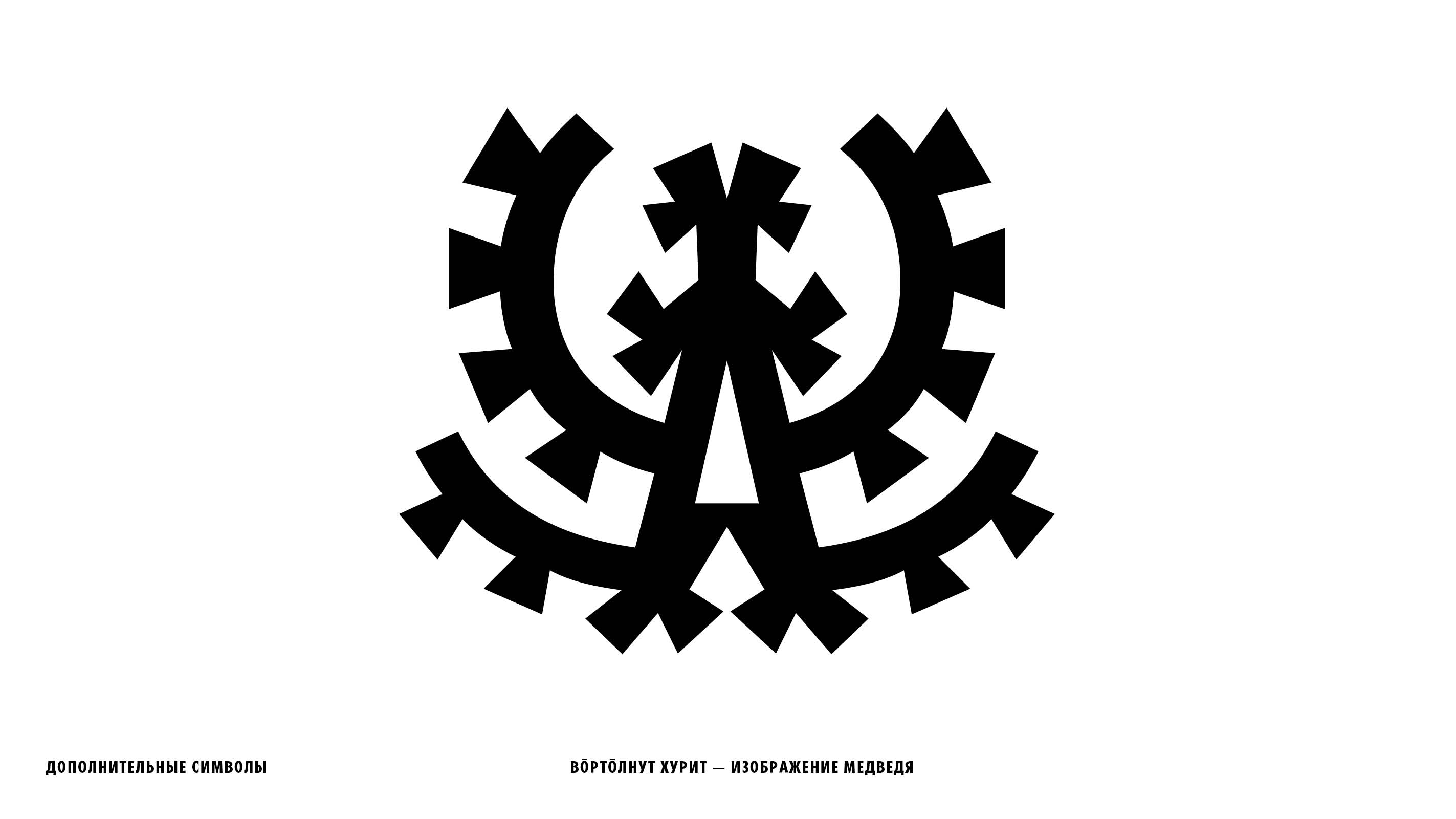
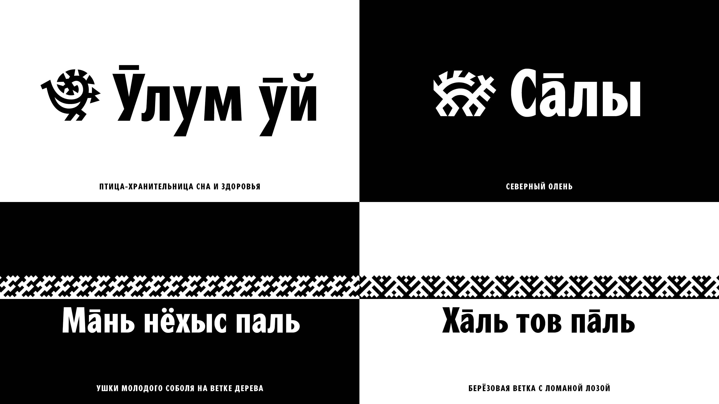
The Saali Typeface got its name from the Mansi word “сāлы”, which means “reindeer”. The sharper serifs remind us of the prickly snowflakes and the ferocious spirit of the northern people. The additional characters contain the traditional Mansi ornaments, which once were used as the written communication system. The typeface has the typical narrow proportions and clear legibility, fully showing its character through the uppercase text.
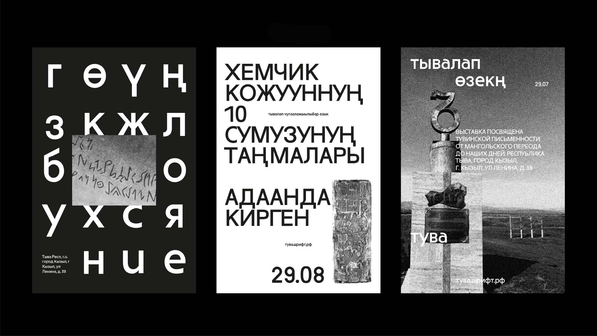
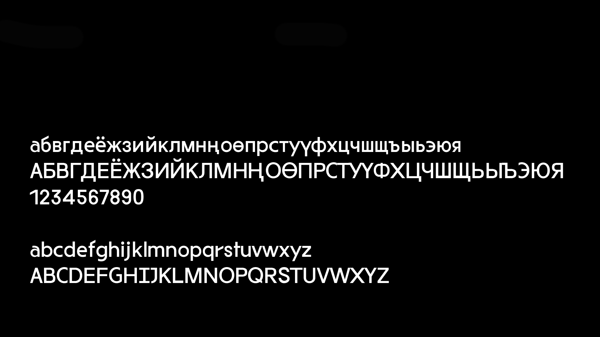
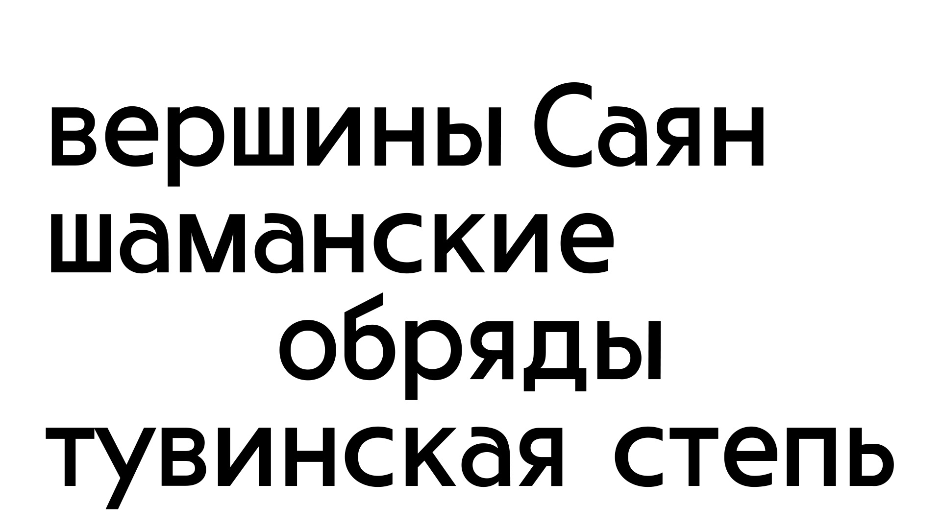
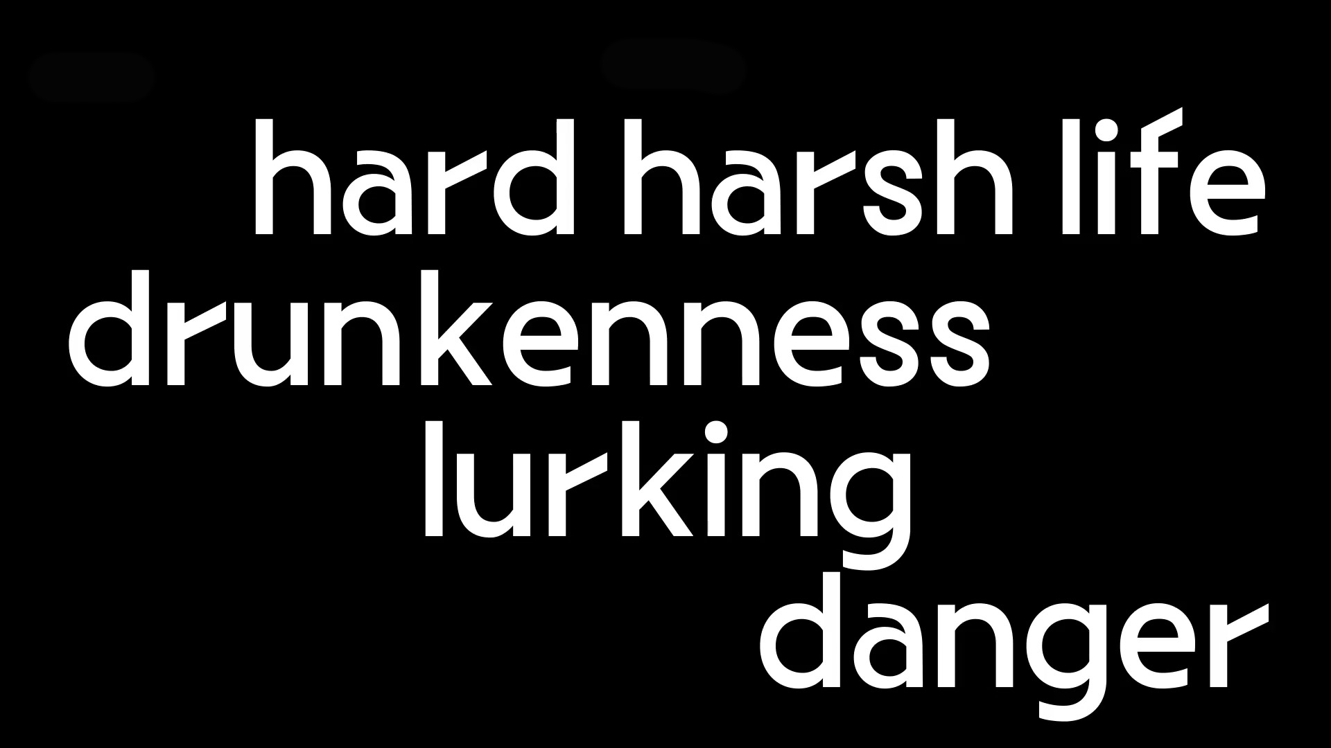
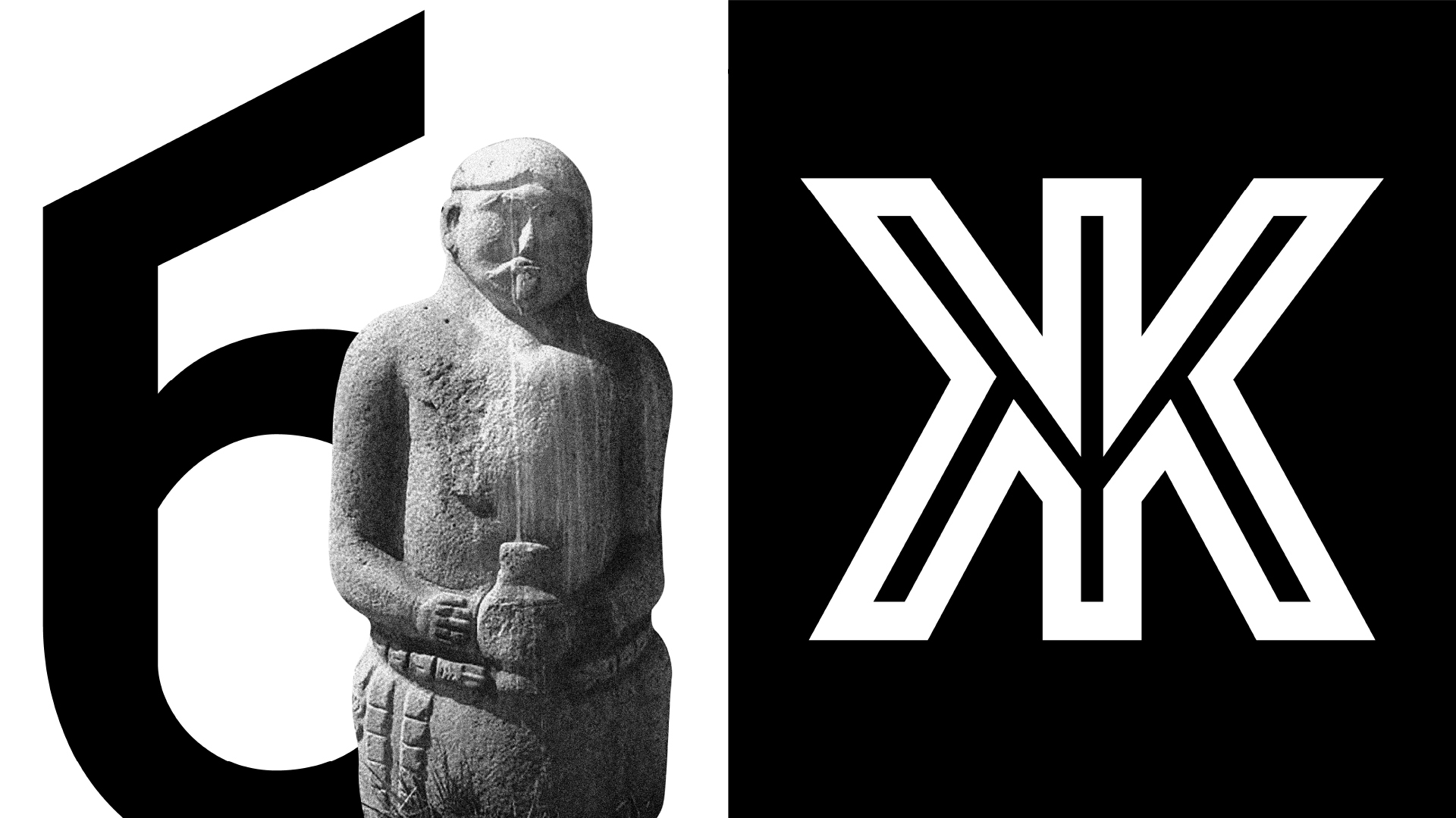
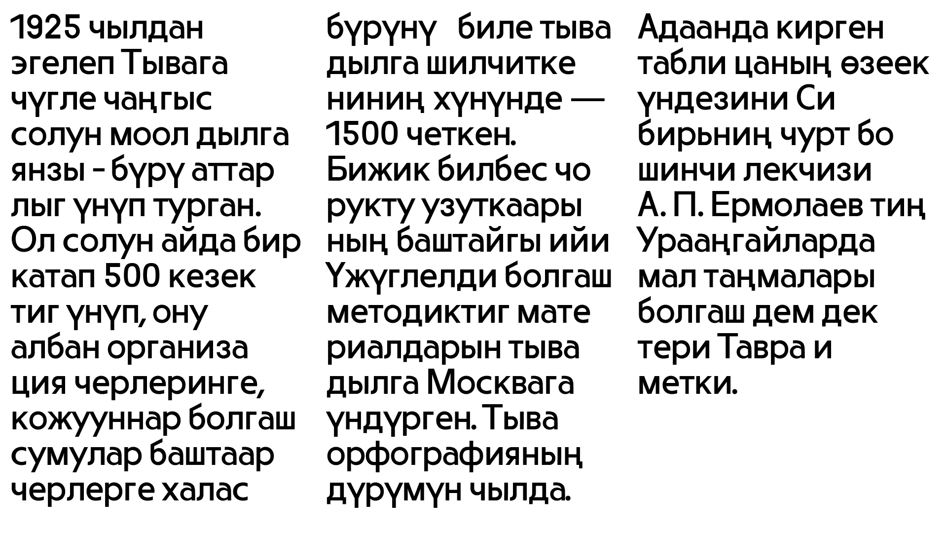
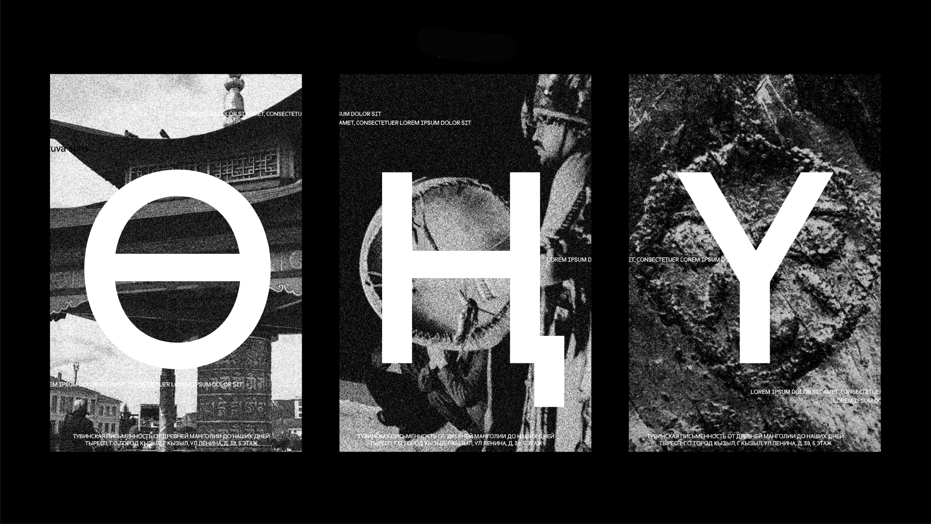
My typeface is called Tuva Sans, since it represents the conflicting distinctiveness of the Tuva Republic of Russia. Its nature is beautiful and vast, but it is getting destroyed by pollution and trash. Its history is ancient, yet in the present day it promises danger to the people walking through its towns and streets. Its eccentric cuisine inspires curiosity, yet the alcoholism became so severe that it put the Republic under the prohibition law. These contrasts define the everyday life in Tuva, making it a land of contrasts. That is what I wanted to communicate through my typeface. I based my design on the spoken form of the language, jagged yet smoothed out through the double vowels. I was impressed by the throat singing, the evenness and monotony of which put me in a trance. The resulting typeface was a sans serif with a small contrast, almost unilinear, but with clear accents and dynamic details. Its character fits Tuva: unique like the local shamans, plain and even, like the Tuva’s steppes, yet at times sharp as the Syan mountain peaks. The alphabet has three additional Tuva characters (Ө Ң Y) in addition to the Cyrillic alphabet. The typeface looks equally good in the small and large point sizes.